Muay_Thai_Dan
TPF Noob!
- Joined
- Nov 23, 2007
- Messages
- 140
- Reaction score
- 0
- Can others edit my Photos
- Photos OK to edit
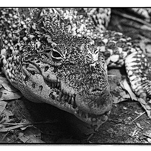
1.

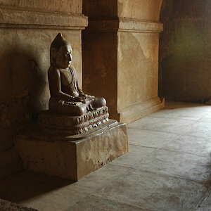
2.

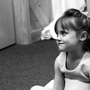
3.

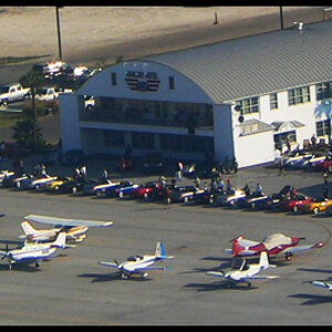
let me know what you people think!
thanks!!
-Dan
2.
3.
let me know what you people think!
thanks!!
-Dan