
- Joined
- Mar 8, 2011
- Messages
- 25,160
- Reaction score
- 9,010
- Location
- Iowa
- Website
- pixels.com
- Can others edit my Photos
- Photos NOT OK to edit
For a long time, I've been searching for that 'perfect' B&W conversion for my images. I have always wanted a process that had contrast, fine detail,
.. yet a bit of 'grunge' look to it that sort of mimics film grain. I've tried a lot of processes, but none have ever really left me satisfied.
Until a couple weeks ago. Rambling around the innernets, I stumbled across an article about B&W conversion techniques with GIMP. I thought I had exhausted all the options there but I was proven wrong.
Buried deep in the innards of GIMP is a plug-in that is a vestigal left-over from it's early developing days. Fact is, I was fully aware of it being there, but had never fully explored all the options. Under the Tool menu is a GEGL Operations . option. (GEGL is an acronym for GEneric Graphics Language) Another window will pop up, and you can choose from about 20 rather cryptic option. I had dabbled with some of 'em, but they mostly seemed useless. For instance, "Color" merely filled the image with a chosen color. Oh, whoop-de-do! "Grey" converted most of the image to black, with random vertical bars with gray patterns in it. Fractals was sorta fun to play with, but I didn't see any practical use for my type of work. But for the most part, I quickly dismissed everything in the GEGL Operations drop-down menu choices. Most of the choices are much more readily accessible under other Menu items, and work much faster and better there.
One of the more puzzling choices was c2g. I must admit, I don't ever recall clicking on that to see what happened. Boy, I wish I had years ago.
c2g is an acronym for Color (to) Grayscale. Now, this isn't just any ordinary desaturation routine. It's more like tonemapping the colors of an image and using the results to generate the grayscale RGB for a given pixel. Its hard to describe, and theres precious little out there in the vast innernets world to explain it. What does exist is full of techno-babble gobbledeegoop that few understand.
Suffice it to say, this long-forgotten old-school method is quickly becoming one of my favorite B&W conversions. Its not suited for every image, but Im discovering it works for most of the images in my archive that I was still in search of a proper process for.
Once you open the c2g window, theres three sliders, labeled Radius, Samples and Iterations. I have yet to find anything online that explains their functions. Suffice it to say, the default choices (300, 4 and 10) will most likely render an image that will make you puke. It typically looks like an HDR gone terribly, horribly and totally wrong .. black shadows, halos to beat the band, and poor tonal rendering in the mid-range. But I decided to take the advice found on the site that caused me to revisit the function and try other settings.
Heres what I found: The larger (in pixels) your image it, the more you need to increase the 3 settings. For instance, a 2000x1500 pixel might be fine at 800, 6 and 10 (respectively), but a larger image that comes from my D600 may require me to go to 1500, 12 and 15 to garner the look Im after. So my Radius setting usually is between 800-1500 (depending on the image size), Samples is 6-12 and Iterations is set from 10-15.
A word of warning here: The process is both a total pig on your computers resources (meaning, youll likely notice everything else slows down or even halts for a while), plus its painstakingly s------l-----o------o------o-------o--------------w. Honestly, it can take up to 10 minutes to work its way through a single image.
Despite all its shortcomings, Im finding its as close to what I have been looking for in a B&W/monochrome/desaturation process as Ive ever seen.
I know a lot of folks look down their noses and GIMP, and some will view such an ancient, obscure and undocumented process as unworthy of their work. But thats the beauty of photography . If it works for me, Im all for it!
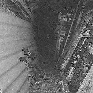
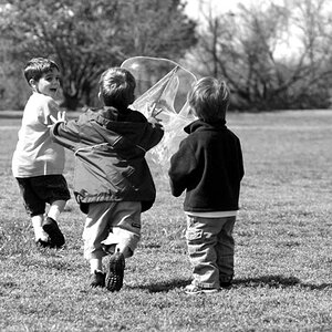
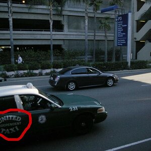
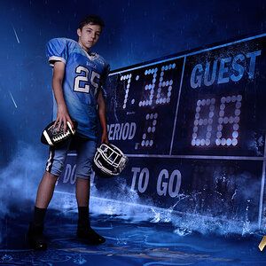
With that, I offer up 15 images for your perusal and comments:

1

2

3

4

5

6

7

8

9

10

11

12

13

14

15
In short, given that GIMP is free, it might be worth downloading it just to try this process out!
Until a couple weeks ago. Rambling around the innernets, I stumbled across an article about B&W conversion techniques with GIMP. I thought I had exhausted all the options there but I was proven wrong.
Buried deep in the innards of GIMP is a plug-in that is a vestigal left-over from it's early developing days. Fact is, I was fully aware of it being there, but had never fully explored all the options. Under the Tool menu is a GEGL Operations . option. (GEGL is an acronym for GEneric Graphics Language) Another window will pop up, and you can choose from about 20 rather cryptic option. I had dabbled with some of 'em, but they mostly seemed useless. For instance, "Color" merely filled the image with a chosen color. Oh, whoop-de-do! "Grey" converted most of the image to black, with random vertical bars with gray patterns in it. Fractals was sorta fun to play with, but I didn't see any practical use for my type of work. But for the most part, I quickly dismissed everything in the GEGL Operations drop-down menu choices. Most of the choices are much more readily accessible under other Menu items, and work much faster and better there.
One of the more puzzling choices was c2g. I must admit, I don't ever recall clicking on that to see what happened. Boy, I wish I had years ago.
c2g is an acronym for Color (to) Grayscale. Now, this isn't just any ordinary desaturation routine. It's more like tonemapping the colors of an image and using the results to generate the grayscale RGB for a given pixel. Its hard to describe, and theres precious little out there in the vast innernets world to explain it. What does exist is full of techno-babble gobbledeegoop that few understand.
Suffice it to say, this long-forgotten old-school method is quickly becoming one of my favorite B&W conversions. Its not suited for every image, but Im discovering it works for most of the images in my archive that I was still in search of a proper process for.
Once you open the c2g window, theres three sliders, labeled Radius, Samples and Iterations. I have yet to find anything online that explains their functions. Suffice it to say, the default choices (300, 4 and 10) will most likely render an image that will make you puke. It typically looks like an HDR gone terribly, horribly and totally wrong .. black shadows, halos to beat the band, and poor tonal rendering in the mid-range. But I decided to take the advice found on the site that caused me to revisit the function and try other settings.
Heres what I found: The larger (in pixels) your image it, the more you need to increase the 3 settings. For instance, a 2000x1500 pixel might be fine at 800, 6 and 10 (respectively), but a larger image that comes from my D600 may require me to go to 1500, 12 and 15 to garner the look Im after. So my Radius setting usually is between 800-1500 (depending on the image size), Samples is 6-12 and Iterations is set from 10-15.
A word of warning here: The process is both a total pig on your computers resources (meaning, youll likely notice everything else slows down or even halts for a while), plus its painstakingly s------l-----o------o------o-------o--------------w. Honestly, it can take up to 10 minutes to work its way through a single image.
Despite all its shortcomings, Im finding its as close to what I have been looking for in a B&W/monochrome/desaturation process as Ive ever seen.
I know a lot of folks look down their noses and GIMP, and some will view such an ancient, obscure and undocumented process as unworthy of their work. But thats the beauty of photography . If it works for me, Im all for it!
With that, I offer up 15 images for your perusal and comments:
1
2
3
4
5
6
7
8
9
10
11
12
13
14
15
In short, given that GIMP is free, it might be worth downloading it just to try this process out!
")


![[No title]](/data/xfmg/thumbnail/37/37623-b930ccd802f79b9c9cea990a7a5e5462.jpg?1619738153)


![[No title]](/data/xfmg/thumbnail/37/37626-4a6ffc3f17ab3a8e97170fda3276640e.jpg?1619738154)
![[No title]](/data/xfmg/thumbnail/39/39533-c2c39d37e833a4689533c897ace8c348.jpg?1619739073)
![[No title]](/data/xfmg/thumbnail/39/39295-230d6dc9ce62e92561457d4c8fb67dc6.jpg?1619738959)
![[No title]](/data/xfmg/thumbnail/32/32706-50b778fbc110c8ea4472547d54c6a923.jpg?1619735610)