What's new

Full Portraits in Film

JPmkV

TPF Noob!
Joined
Dec 26, 2011
Messages
192
Reaction score
14
Location
Brigantine NJ
Can others edit my Photos
Photos OK to edit
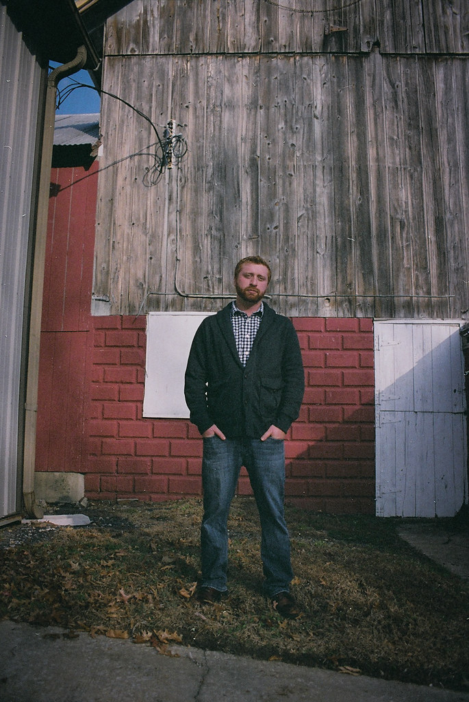
1.) Tommy infront of a barn.


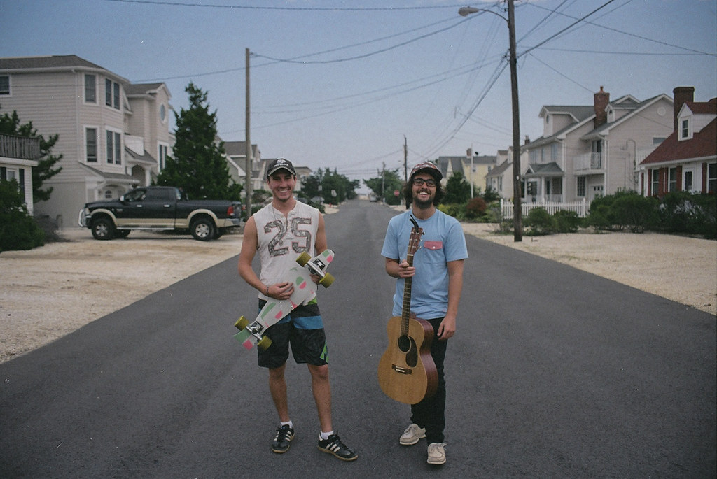
2.) Zack and Timmy with the the things that perfectly personify who they are.

 
Both images appear under exposed and the subjects are too centered (bullseyed) in each image to really keep interest. There is also way too much space around them.
A portrait is about the person, make them the biggest part of the image. In keeping with that thought, also work on softening the distraction of the backgrounds with a shallower depth of field.
 
I know these aren't like "Proper Way To Do A Portrait" portraits, but I think everything about them adds a lot of character to the photos and the people in em and sometimes that matters more imo, I also really enjoy the colors and grain from the film of these photos something I try to emulate in my work sometimes, the toning is coo too, and I love the vanishing point in the second photo.
 
Both images appear under exposed and the subjects are too centered (bullseyed) in each image to really keep interest. There is also way too much space around them.
A portrait is about the person, make them the biggest part of the image. In keeping with that thought, also work on softening the distraction of the backgrounds with a shallower depth of field.

I'm going to have to go ahead and disagree with just about everything you said. The images have a pretty true exposure which accurately show the conditions of the natural light, I feel. The fact that the subjects are "too centered to really keep interest" seems ridiculous to me. And the reason I left the space around them is because I wanted the location to hold some weight in the images without taking away from the subject(s).
As for the depth of field, I wish I had a lens with a larger aperture. Both of these shots were taken wide open, and have the shallowest depth of field I was able to achieve with this lens.
Sorry if I come off as cross. It's just that I really love these two images and felt the need to defend the vision I had with both of them. I really do appreciate your input. Thanks for taking the time to give your opinion. =)
 
I know these aren't like "Proper Way To Do A Portrait" portraits, but I think everything about them adds a lot of character to the photos and the people in em and sometimes that matters more imo, I also really enjoy the colors and grain from the film of these photos something I try to emulate in my work sometimes, the toning is coo too, and I love the vanishing point in the second photo.

Yeah, like Tony said, the people in the images should should hold the most weight to make it a proper full portrait. However, like you said, I too feel that the framing adds a lot of character to the images. I really like the tones and the grain I can get out of my film slr. I sometimes prefer it to my dslr! =D
Thanks for your input!
 
Both images appear under exposed and the subjects are too centered (bullseyed) in each image to really keep interest. There is also way too much space around them.
A portrait is about the person, make them the biggest part of the image. In keeping with that thought, also work on softening the distraction of the backgrounds with a shallower depth of field.

I'm going to have to go ahead and disagree with just about everything you said. The images have a pretty true exposure which accurately show the conditions of the natural light, I feel. The fact that the subjects are "too centered to really keep interest" seems ridiculous to me. And the reason I left the space around them is because I wanted the location to hold some weight in the images without taking away from the subject(s).
As for the depth of field, I wish I had a lens with a larger aperture. Both of these shots were taken wide open, and have the shallowest depth of field I was able to achieve with this lens.
Sorry if I come off as cross. It's just that I really love these two images and felt the need to defend the vision I had with both of them. I really do appreciate your input. Thanks for taking the time to give your opinion. =)

Well I'm going to agree with both of you;

The first image doesn't do a lot for me - the barn is not all that interesting - not enough to be such a large environment and a tighter crop might have been better -- there is some interesting texture in the barn, which could perhaps have been better used if it was a little more abstracted.

The second is great imo and I wouldn't change the crop or position of the subjects.

A lot of people round here seem rather obsessed with perfect white balance, exposure, and 'rules' of composition etc as if these things are not negotiable, like photography is a science not an art. I'm just waiting for someone to give feedback saying that someones B&W photo looks under-saturated.

Tony, that's not a dig at you - I just see it a lot around here and it confuses me a little. It's fair enough to not to like, or even hate something, but to say it's not correct is... I dunno, just odd in my view.

On a side note, looking at the amount of shadow detail (eg the sweater in the first) - i'd say they were actually just quite low contrast, rather than underexposed as such - the mid-tones looks to be about where they should be - the road is grey, not black, etc.

I for one quite like it - esp on the second one :D quite a vintage / polaroid feel to it without cheezy photoshop effects.
 
Last edited:
I think that it's weird how there's a guy standing in the middle of a road holding up a guitar. The skateboard is understandable, but having the two objects together in that setting doesn't really seem very cohesive.

The first one is better than the second, I believe, but I still don't know what the story is. Does he build barns? Is this a special place in his home town? idk

I mean...I know that this is kind of a negative buzz word, but they seem very hipster-ish. I mean, I think they hinge too much on the fact that they were done on film, and in the processing...or maybe it's the scanner. The blacks aren't true blacks, and while that's not at all "wrong" to do, I don't think the rest of the elements live up to it. If the film is naturally kind of hazy like that I don't mind, but otherwise the vintage...ness...of the photos seems kind of "meh" because I can imagine that one of those guys owns an iPhone and not a cancer inducing brick phone from the early nineties. They aren't bad photos. They just don't tell a story as effectively as I think they could have.

I'm all for breaking rules in certain situations, and I think that number one would be stronger if it was a part of a set of images that are equally as strong, but alone it's not that spectacular of a photo.

That's my honest opinion. Take it how you will.
 
Both images appear under exposed and the subjects are too centered (bullseyed) in each image to really keep interest. There is also way too much space around them.
A portrait is about the person, make them the biggest part of the image. In keeping with that thought, also work on softening the distraction of the backgrounds with a shallower depth of field.

I'm going to have to go ahead and disagree with just about everything you said. The images have a pretty true exposure which accurately show the conditions of the natural light, I feel. The fact that the subjects are "too centered to really keep interest" seems ridiculous to me. And the reason I left the space around them is because I wanted the location to hold some weight in the images without taking away from the subject(s).
As for the depth of field, I wish I had a lens with a larger aperture. Both of these shots were taken wide open, and have the shallowest depth of field I was able to achieve with this lens.
Sorry if I come off as cross. It's just that I really love these two images and felt the need to defend the vision I had with both of them. I really do appreciate your input. Thanks for taking the time to give your opinion. =)

Well I'm going to agree with both of you;

The first image doesn't do a lot for me - the barn is not all that interesting - not enough to be such a large environment and a tighter crop might have been better -- there is some interesting texture in the barn, which could perhaps have been better used if it was a little more abstracted.

The second is great imo and I wouldn't change the crop or position of the subjects.

A lot of people round here seem rather obsessed with perfect white balance, exposure, and 'rules' of composition etc as if these things are not negotiable, like photography is a science not an art. I'm just waiting for someone to give feedback saying that someones B&W photo looks under-saturated.

Tony, that's not a dig at you - I just see it a lot around here and it confuses me a little.

On a side note, looking at the amount of shadow detail (eg the sweater in the first) - i'd say they were actually just quite low contrast, rather than underexposed as such.

Given you do clearly have these in electric form, so assuming you know how to work the brightness control in photoshop, your monitor is in the ball-park of being calibrated, and you're not blind or stupid, then I'll assume the exposure was intentional... and I for one quite like it - esp on the second one :D quite a vintage / polaroid feel to it without cheezy photoshop effects.

You hit the nail right on the head, for me at least, Ralph! I am an amateur at best , and still am not too familiar with all the "rules" of photography, but I am slowly learning =) I have a basic understanding of these rules, but I would never want those rules to absolutely void the artistic side of my work.
Your critique was very insightful. Thank you!
 
Joey
since you indicate that it's ok to edit your photos I've gone ahead and done the editing I would do if these were my own photos. The photos are not bad as they are. This is just a different treatment that I would prefer myself. I like the subject to be larger without extraneous elements to distract. But that's just my own take on things.

8396245402_1a2db6e5b0_bcropped_zps70fcca30.jpg


8395161131_b54ee02d0d_bcroppped_zps12d1f3af.jpg


I should have gone even tighter on the 2nd one to get rid of the pole on the right completely. but you get what I'm going for
 
The first one doesn't do much for me. The dude's just some guy and there's a lot of interesting stuff behind him. The conduit on the wall running through is neck is slightly distracting, as well.

The second one seems to hit some iconic tropes for me. I see it as an album cover, somehow, and I feel like I oughta know who those guys are but of course I don't. I think it might just be hitting some cliches, but I can't quite identify them, and I'm not sure if that's all it's doing. Anyways. It works, somehow, for me.
 
I think that it's weird how there's a guy standing in the middle of a road holding up a guitar. The skateboard is understandable, but having the two objects together in that setting doesn't really seem very cohesive.

The first one is better than the second, I believe, but I still don't know what the story is. Does he build barns? Is this a special place in his home town? idk

I mean...I know that this is kind of a negative buzz word, but they seem very hipster-ish. I mean, I think they hinge too much on the fact that they were done on film, and in the processing...or maybe it's the scanner. The blacks aren't true blacks, and while that's not at all "wrong" to do, I don't think the rest of the elements live up to it. If the film is naturally kind of hazy like that I don't mind, but otherwise the vintage...ness...of the photos seems kind of "meh" because I can imagine that one of those guys owns an iPhone and not a cancer inducing brick phone from the early nineties. They aren't bad photos. They just don't tell a story as effectively as I think they could have.

I'm all for breaking rules in certain situations, and I think that number one would be stronger if it was a part of a set of images that are equally as strong, but alone it's not that spectacular of a photo.

That's my honest opinion. Take it how you will.

First off let me start by saying that these images have been barely altered in post processing, aside from a slight boost in exposure. Any grain or artifacts you see come from the film and or camera, and were not added in post processing. To say that they are just hipsterish, and hinge only on the fact that that were shot using film is a little bit insulting. Maybe I'm being a bit over sensitive, but I like them as they are. However, I do appreciate the constructive criticism, because I know that all my work has a lot of room for improvement.
On the point that these shots don't tell a story, you said you couldn't tell if, in the first image, he builds barns or if its a special place to him. How would I convey this in the image itself without a written description or him holding up a sign...? Should I have had him wear a tool belt if he had built the barn, or possibly hugging the barn to show it's a special place to him? I only used the barn as a random back drop because I thought it was ascetically pleasing.

The second image is a bit more candid then the first image. Zack was skating outside his house and Tim was playing the guitar in the street while Zack skated around him. They stopped for a second and I asked them to smile, and I felt the image conveyed the sense of random fun that was being had that day.
And I have to say the fact that the people in the pictures use smart phones, with the exception of Zack who is stuck in the early 2000s technologically, should not matter. I think the use of film kind of makes the shots timeless in a sense, which I really like. Aside from the rather new looking truck in the second image haha!

Anyway, I'm done getting all butt hurt over that, overall I'm glad to get your input and I do appreciate you taking the time to critique my work! =)
 
Last edited:
Joey
since you indicate that it's ok to edit your photos I've gone ahead and done the editing I would do if these were my own photos. The photos are not bad as they are. This is just a different treatment that I would prefer myself. I like the subject to be larger without extraneous elements to distract. But that's just my own take on things.

8396245402_1a2db6e5b0_bcropped_zps70fcca30.jpg


8395161131_b54ee02d0d_bcroppped_zps12d1f3af.jpg


I should have gone even tighter on the 2nd one to get rid of the pole on the right completely. but you get what I'm going for

Thanks for taking the time to do that! I do really like the cropping on the first image and I was actually very close to doing something similar while I was editing. As for the second image, I have to be honest I'm not a fan, but I do understand why some would like it better. Mainly because the subjects hold more weight in the photo now.
 
Joey, fair enough. Like I said, that's just the way I'd do it. You should always do what you feel is correct for your images. As far as the 2nd shot is concerned, Your original framing is not bad but I still like it tighter; I do feel like it needed to be punched up a bit to make the subjects stand out a bit more. I attempted to do that with increased contrast and color saturation. You should notice that the shirts, shorts and the guitar have more oomph to to em. I am glad to see you working with film too. Can't let that die out. Film is still a viable medium for photographic expression.
 
Joey
since you indicate that it's ok to edit your photos I've gone ahead and done the editing I would do if these were my own photos. The photos are not bad as they are. This is just a different treatment that I would prefer myself. I like the subject to be larger without extraneous elements to distract. But that's just my own take on things.

8396245402_1a2db6e5b0_bcropped_zps70fcca30.jpg


8395161131_b54ee02d0d_bcroppped_zps12d1f3af.jpg


I should have gone even tighter on the 2nd one to get rid of the pole on the right completely. but you get what I'm going for

Thanks for taking the time to do that! I do really like the cropping on the first image and I was actually very close to doing something similar while I was editing. As for the second image, I have to be honest I'm not a fan, but I do understand why some would like it better. Mainly because the subjects hold more weight in the photo now.

This is why its good to take advice and let it sit for a while before responding and jumping the gun.
 
Joey
since you indicate that it's ok to edit your photos I've gone ahead and done the editing I would do if these were my own photos. The photos are not bad as they are. This is just a different treatment that I would prefer myself. I like the subject to be larger without extraneous elements to distract. But that's just my own take on things.

8396245402_1a2db6e5b0_bcropped_zps70fcca30.jpg


8395161131_b54ee02d0d_bcroppped_zps12d1f3af.jpg


I should have gone even tighter on the 2nd one to get rid of the pole on the right completely. but you get what I'm going for

Thanks for taking the time to do that! I do really like the cropping on the first image and I was actually very close to doing something similar while I was editing. As for the second image, I have to be honest I'm not a fan, but I do understand why some would like it better. Mainly because the subjects hold more weight in the photo now.

This is why its good to take advice and let it sit for a while before responding and jumping the gun.

I jumped the gun?
 

Create an account or login to comment

You must be a member in order to leave a comment

Create account

Create an account on our community. It's easy!

Log in

Already have an account? Log in here.

New Topics

Back
Top Bottom