Fun family portraits - studio version

adamhiram

No longer a newbie, moving up!
Joined
Feb 6, 2015
Messages
858
Reaction score
576
Can others edit my Photos
Photos OK to edit
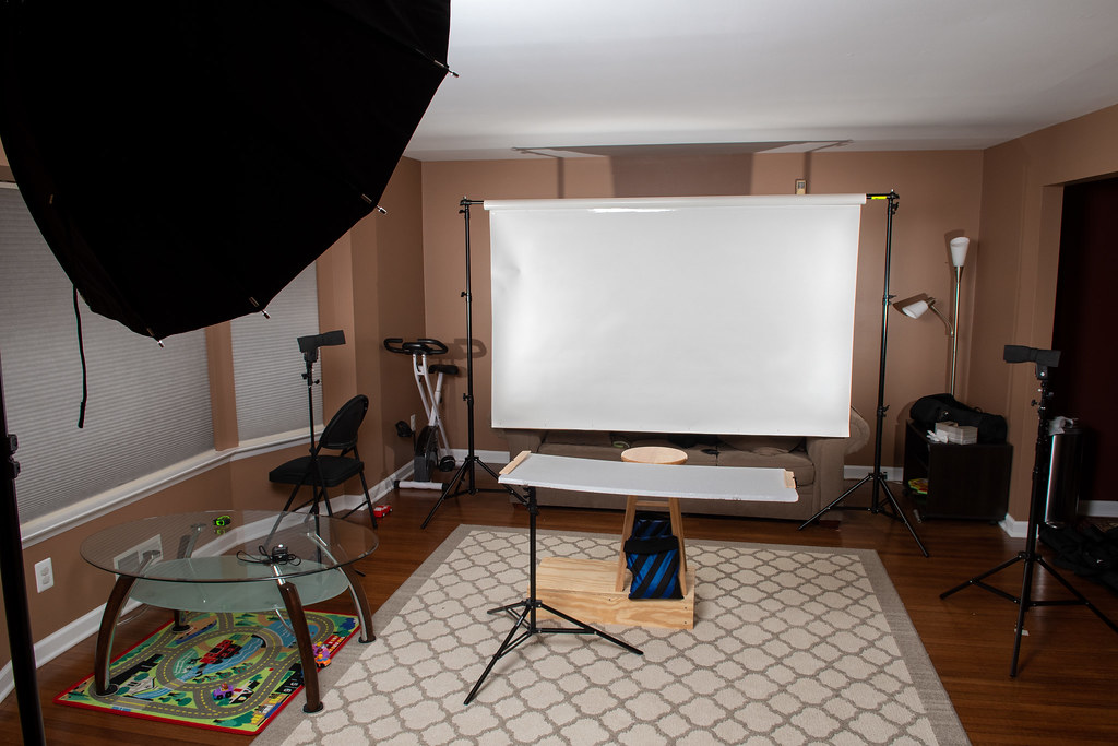
After some recent adventures in outdoor fall photos under less than ideal conditions, I took some fun family portraits in a more controlled studio environment. Since I am in the photo, I used my go-to setup, which is a smaller aperture for deeper depth of field, and a wireless remote used to trigger the camera’s built-in intervalometer, with a 5s delay before taking 9 shots in a row. As usual, the 3 year old gave me about 5 minutes before he had enough, and as @tirediron has said on more than one occasion, taking your own photo is a bit like a doctor performing his own surgery.
  • The background is basic white seamless paper. I was tempted to buy a wider roll, but decided to just cut a long piece from the 53” roll I had, turned it 90 degrees, and taped it onto a piece of PVC pipe to hang it.
  • The background is lit by a pair of speedlights metered 1 stop brighter than the key light, and flagged with black foamy things to prevent spill onto the subjects.
  • One of the challenges I discovered early was getting everyone on the same level for a half-body shot, so I built a 6” tall platform for my wife to stand on and put a 24” tall stool on top of that for my son, held in place with a couple sandbags near the base.
  • To fill in some of the shadows from below, I used a large piece of styrofoam held in place with a reflector holder mounted on a standard light stand.
  • Lastly, the key light was a 38” octabox positioned above for a butterfly pattern, far enough back to avoid too much fall-off, and slightly left of the subjects for a less flat look, as @Braineack suggested a while back.
Shot at 50mm, f/8, 1/250s, ISO 400.


20181117-DSC_0512a
by adamhiram, on Flickr


20181117-DSC_0485a
by adamhiram, on Flickr


20181117-DSC_0536a
by adamhiram, on Flickr
 
Not bad; good call on the apple boxes for height compensation. You nailed that. Background light looks pretty much spot on as well; pure white without any haloing on the hair, etc. I don't know if it was accident or design, but good plan as well having the skin tones go from dark to light as they go further from the key. My only thought here would be to have added a large on-axis fill at ~1 stop below key to kill some of those shadows, but that's getting pretty nit-picky.
 
Pretty good lighting effect over all. I'm not sure about killing that shadow with Fill light;to me at least, that shadow adds a sense of three dimensionality. Other people on the other hand might prefer to have a little bit more Fill.
 
Overall pretty awesome! I like the use of the highly technical terms like "black foamy things". :allteeth: :allteeth::allteeth:

I think the first is my favorite. Son looks to be hoot! I bet he's a live wire. I really like how you stepped through the project with plan and executed.
 
Great display of lighting style, I'm with Derrel in this case though, I prefer a more natural light/shadow, but hell, what do I know, Last time I shot a flash or any lighting was a while back! I prefer natural light portraits in general but kudos on these ones. To each their own :)
 
This is pretty good, but to me the lighting is flat. Try moving your key light 15-25 degrees off axis. (edit) Always favor the side of the lady so she gets more light than the man. This might mean placing the light toward the side of the man, but directed more face-on to the lady. experiment

One of the challenges I discovered early was getting everyone on the same level for a half-body shot, so I built a 6” tall platform for my wife to stand on and put a 24” tall stool on top of that for my son, held in place with a couple sandbags near the base.
Another quibble is the line. I think a small group portrait is often improved by creating a "triangle" of faces. Or at least not have everybody on the same level. Distance from the camera, yes, by all means, but you could have made the grouping more dynamic if the adults simply stood at their natural height and had the child stand on a box (hold him, of course) so that his head was lower than your chins. Each face being the vertex of an imaginary line, this would make an irregular triangle composition.

So; a more creative grouping, and more modeling in the lighting.
 
From what we see of your house; nice house!
 
I like the expressions, genuine happiness :) Nice work all around.
 
As always, thanks for the great feedback! It sounds like I did a few things right, and definitely picked up some good tips for future shoots.

I don't know if it was accident or design, but good plan as well having the skin tones go from dark to light as they go further from the key. My only thought here would be to have added a large on-axis fill at ~1 stop below key to kill some of those shadows, but that's getting pretty nit-picky.
Thanks! The positioning of skin-tones was just by coincidence, but a great tip I will definitely keep in mind for the future! I debated a little more fill, and originally had some side-fill/edge lighting before properly flagging the background lights, but ultimately decided to just stick with the darker shadows, which were already brought up a bit by the large reflector underneath.

I like the use of the highly technical terms like "black foamy things". :allteeth: :allteeth::allteeth: I think the first is my favorite. Son looks to be hoot! I bet he's a live wire. I really like how you stepped through the project with plan and executed.
I can't take credit for that one - Neil Van Neikerk recommended them as a nice alternative to other flags or barn doors, at a whopping $8 for a lifetime supply. The little guy is definitely a handful, with 2 out of 56 shots being usable (including 10 flash misfires since I didn't allow enough time for cycling of the key light on the intervalometer), but mostly in a good way! Thanks again for the inspiration; I get motivated to put a little more into a shoot after seeing your carefully planned sets.

This is pretty good, but to me the lighting is flat. Try moving your key light 15-25 degrees off axis.
That's an interesting observation, as I thought I was already doing that. I'm curious if I would have liked seeing more contour by moving it further camera left, or if I would have started seeing more shadows cast by one subject onto another. One issue I frequently have with the little guy is he doesn't stay still, so I need to factor in a deeper DoF in case he leans too far forward. I assumed with multiple subjects and the key light too far off-axis, leaning too far forward would have cast a shadow on me, likely on my face. Further experimentation can certainly answer that question!

Another quibble is the line. I think a small group portrait is often improved by creating a "triangle" of faces. Or at least not have everybody on the same level.
Another excellent tip. The original concept for this shot was to have mom and dad both kissing his cheeks while he made a yuck face, so having all 3 of us in a straight line made sense here. However that didn't work out at all, with shots like the ones above coming out much better. Normally we would get that triangle of faces organically when we just sit down, simply due to the obvious height differences. I will definitely keep that in mind for the future as a more deliberate decision though.
 

Most reactions

New Topics

Back
Top