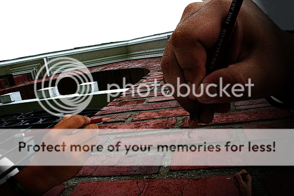
I like the idea very much.
My biggest problem, is the hands should follow the same perspective of the building, IE, the smallest hand should be placed at a distant point on the building, rather than the foreground.
Wow, excellent contribution to the C&C. I'm sure the OP has learned much from it! :thumbdown:
OP: I like the idea. I would suggest losing the smallest hand. That would help with the perspective issue that Jeweler is talking about. There's really no place to put it in the image where it's not out of place.
I understand where some think that PPing the hell out of a bad image may somehow improve it but Photoshop is not a miracle worker. Most of the images you post on here are like this - over PP'd and a bad exposure to begin with. Learn to create a correct exposure, then a proper "creatively correct" exposure, and THEN go back to Photoshop.

![[No title]](/data/xfmg/thumbnail/32/32930-09414fc020c2a60a456ff59a05c5ef8f.jpg?1619735759)
![[No title]](/data/xfmg/thumbnail/34/34347-8b81549fefc38aca163688d07a9f5ced.jpg?1619736384)

![[No title]](/data/xfmg/thumbnail/34/34345-5642c495cae8d6c7bb83c28664146cf1.jpg?1619736381)


![[No title]](/data/xfmg/thumbnail/37/37425-6c82b8d207549743954f4b99b56a8153.jpg?1619738066)

![[No title]](/data/xfmg/thumbnail/34/34346-f7996f51f0624620cfd54a488abeacf9.jpg?1619736382)
![[No title]](/data/xfmg/thumbnail/32/32929-22e23acc63d6ecb25e5ee941be87121f.jpg?1619735758)