fokker
No longer a newbie, moving up!
- Joined
- Jun 23, 2009
- Messages
- 2,829
- Reaction score
- 295
- Location
- New Zealand
- Can others edit my Photos
- Photos OK to edit
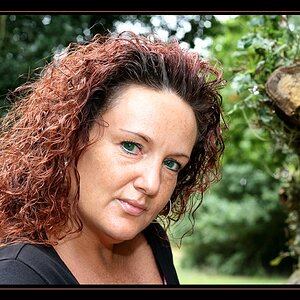
So I don't normally shoot people, but I'd like to start doing it more. This is my buddy Zvi, he's a musician and he wanted some promo photos of himself. He's an interesting subject and doesn't mind being in front of the camera so he's a perfect guinea pig for me to practise on. We spend about an hour today shooting in a dark underpass, and plan on doing some more stuff later in the week. In the mean time I'd like to know what I could have done better so please don't hold back on the C&C.
I know this is a few photos, but feel free to just choose one to critique, or more if you wish. I'd also like to know which one(s) you feel are the strongest.
Canon 60d, Sigma 50mm 1.4
Speedlight in umbrella for fill light
Speedlight with grid for main light
TIA.
1.

2.

3.

4.

5.

6.

7.

My personal critique is that I should have used a hair light to separate his dark hat from the background a bit better. Also that some of the shadows across his face and chin aren't ideal in places, due no doubt to the small size of my main light (which I chose because I wanted an element of harshness to the lighting to suit his style).
Also, I'm not sure if the white balance is accurate. In all the shots it's set just slightly cooler and purpler then the default 'flash' value, even though he is lit almost solely with flashes. It could be a case of my monitor not being accurately calibrated, or else the very small amount of natural light falling on him has just affected things slightly.
I know this is a few photos, but feel free to just choose one to critique, or more if you wish. I'd also like to know which one(s) you feel are the strongest.
Canon 60d, Sigma 50mm 1.4
Speedlight in umbrella for fill light
Speedlight with grid for main light
TIA.
1.
2.
3.
4.
5.
6.
7.
My personal critique is that I should have used a hair light to separate his dark hat from the background a bit better. Also that some of the shadows across his face and chin aren't ideal in places, due no doubt to the small size of my main light (which I chose because I wanted an element of harshness to the lighting to suit his style).
Also, I'm not sure if the white balance is accurate. In all the shots it's set just slightly cooler and purpler then the default 'flash' value, even though he is lit almost solely with flashes. It could be a case of my monitor not being accurately calibrated, or else the very small amount of natural light falling on him has just affected things slightly.

![[No title]](/data/xfmg/thumbnail/37/37602-1ef8dbb1c2d0e4ff347ee65d328c3603.jpg?1619738147)