Brinr
No longer a newbie, moving up!
- Joined
- May 16, 2011
- Messages
- 320
- Reaction score
- 63
- Location
- Reno
- Website
- www.brinrphoto.com
- Can others edit my Photos
- Photos OK to edit
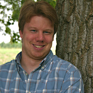
Besides it not being exactly a headshot... I know these are more of like shoulders and up, but it's for a masters business course on social media so it will "autocrop" to a square aspect ratio anyway and will zoom on the different social media platforms. What ya'll think?

3_4_2013 Matthew BADM Headshot 006 small water by BrinR Photo, on Flickr

3_4_2013 Matthew BADM Headshot 005 small water by BrinR Photo, on Flickr
3_4_2013 Matthew BADM Headshot 006 small water by BrinR Photo, on Flickr
3_4_2013 Matthew BADM Headshot 005 small water by BrinR Photo, on Flickr
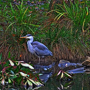
![[No title]](/data/xfmg/thumbnail/37/37658-89245697846ece2c4ecbce304510699b.jpg?1619738173)
![[No title]](/data/xfmg/thumbnail/35/35948-700e0d840da0ca73727b1bd6d99b4142.jpg?1619737257)