First and foremost is your monitor calibrated? I am guessing not because these are consistently dark. Until you are calibrated you can't see what your images ACTUALLY look like. Your colors and exposures will always be off and we really can't help you much there.
Monitors straight out of the box are set up for internet and gaming use. They are very bright, slightly blue and a bit heavy on the contrast for that reason. For photography it will make you think your images are properly exposed or over-exposed when they are not. It will also make you think that your white balance is very cool when in fact it's very warm/orangey.
the shots of the girl are very warm/orangey and are underexposed. Because you were shooting against the open sky and not in the shade you'd need to use fill flash or a reflector here to get enough light in her face to keep both the face and the background in good exposure. The positioning shows that you are trying to give good consideration to the guidelines for composition. It's not well done in the first one. The key to using the ROT is to make sure that the image also balances and makes sense. In the first she's just pushed off the edge of the image and the negative space to our left is just negative space-it has no real bearing on the image. It should be part of your story such as the girl looking that way or tilted slightly that way to lead into that negative space with some meaning. Is she talking on the phone and plugging the other ear? I like the hands up by the face, but the positioning and angle of the arms is awkward. The second is definitely better for leading into the dead space. The crop on the dog tag is a draw. As a whole there isn't any reason you couldn't crop her at the shoulders like that, however that bright spot then draws your eye there. The head tilt is really awkward in this one.
3 is not sharply focused at any point and almost looks like motion blur.
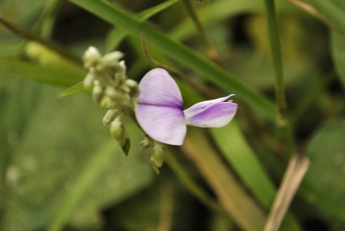
4. it's nicely focused with a better DOF than 3. The composition is pretty boring. With macro's like this you want to find a way to see the flower at a different angle than head on. Or in this case you could have used the stem as a leading line to pull your eye through the photo if it had been placed across the image instead of straight up from the bottom. A portrait crop would work better.
5 and 6 are something everyone should play about with. Clouds can be amazing and beautiful, peaceful, scary... They can evoke almost any emotion. These don't so much evoke an emotion, but they're pretty well exposed and focused. The second has the makings of leading lines, except it goes straight through from the bottom to the top instead of leading you around the image. The second is really heavy on the contrast.
They are a great start with huge potential in them. You are definitely on the right track.
 here I'll be putting random photos I took. I'm just a pure beginner and I'm using Nikon D3000 with kit lens 18-55mm.
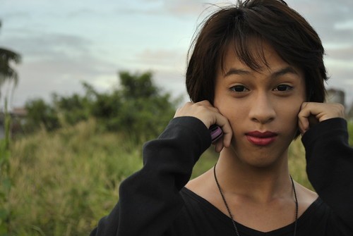 _DSC2890 by immafreebeetch, on Flickr
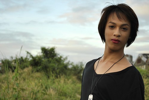


![[No title]](/data/xfmg/thumbnail/42/42453-e95056d39ba6f0ce0e7a7fff81041853.jpg?1734176993)


