What's new

Honest Opinion

BrieKayee

TPF Noob!
Joined
Aug 14, 2012
Messages
109
Reaction score
22
Can others edit my Photos
Photos OK to edit
Hey guys,

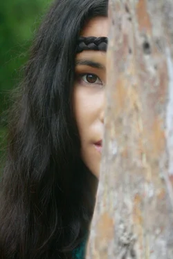
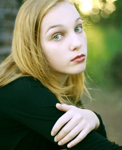
So for my next assignment, I need to take six portrait photos and ask people their honest opinions. So I am wondering if anyone could give me their honest opinions on these two photos.

Cheers

1.
$_MG_8454.webp

2.$_MG_6924.webp
 
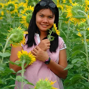
The first has a white balance problem... Her skin has a green hue to it.

I like the second, though I'd like to see just a little more of her face.
 
I agree with cowgirlMama. Skin tones are pretty wonky on the first one, but I like the composition of the image. Her eyes are beautiful. The focus is a bit soft. If you do an image like the second, we need to see more of the eyes to pull it off.
 
#1 makes pretty good use of the diagonals, not quite perfect but good. As mentioned color is 'wonky'

#2 all you needed to do was show just a wee bit more face, you are hiding more than half her nose and lips.
 
May not be on purpose, but the wonky color kinda works for me on this image, but I also would like to see it sharp. #2 doesn't speak to me at all.
 
1st image, would like to see the green hue dialed back and maybe a little more warmth. Also the eyes need to be sharper (in focus). The top of the head in the frame would also please my eye.

2nd image, Definitely need to see a little more of her face, perhaps her 'peeking' around the corner with more mouth and nose showing would be cool?
 
Honestly? :D

#1 WB has already been mentioned. Unflattering to pose a woman's hand so prominently. Cropped way too tight at the top.

#2 Unfair to hide a woman's face behind a tree.
 
Last edited:
I'd like to see a little more on the top of the frame in both of these. But both pretty nice, in their own way. They both express some idea of personality (whether the "true" personality of the subject or not, I don't know and don't much care, the point is that some personality is presented).
 
The first one is blah but I really like the second one. It probably breaks a bunch of rules but it is focused and clear and it tells a story.
 
...there is some Onion Bokeh in photo 1...

What is THAT? "Onion bokeh"? I have never so far heard of that? Could you explain?

The idea of #2 is nice and goes well with her face and outfit, but I feel that if you want to show her hiding behind a tree, the full half of her face should show.

No need to further mention the colour cast in #1.
Why is presenting a hand unflattering? Is it? She has nice hands, slim fingers... Are there rules in books on portraiture (I know next to nothing about proper portraiture, you know?)
 
...there is some Onion Bokeh in photo 1...

What is THAT? "Onion bokeh"? I have never so far heard of that? Could you explain?

The idea of #2 is nice and goes well with her face and outfit, but I feel that if you want to show her hiding behind a tree, the full half of her face should show.

No need to further mention the colour cast in #1.
Why is presenting a hand unflattering? Is it? She has nice hands, slim fingers... Are there rules in books on portraiture (I know next to nothing about proper portraiture, you know?)
Onion Bokeh is something I read up on when looking and reading up on some lenses. One here for example. TR Forums ? View topic - Onion Bokeh?
 
Ah, thanks for the link, now I see! I have lenses that create that self-same effect. Apparently, it's a sort of bokeh you DO NOT look for!?
 
Ah, thanks for the link, now I see! I have lenses that create that self-same effect. Apparently, it's a sort of bokeh you DO NOT look for!?

"onion bokeh" is a term used by people that have broken the characteristics of bokeh into every little detail possible in order to nitpick it to death.
To me, bokeh only has two options. pleasing and not pleasing. I don't really break it down any more than that. unless you are going to buy a new lens, there really isn't much you can do to change how your bokeh is shaped.

In #1, the bokeh where you can actually make out the shapes (or any detail at all) is a very small part of the photo. noticeable, but small. I find the bokeh here pleasing, and not at all distracting. Nor do I think it detracts from the image in any way. (except maybe in the most technical pixel peeping way possible)
I think people that spend that much time analyzing and critiquing every little bokeh characteristic have probably missed the photo as a whole.

however, if you want to see some examples of some different bokehs between a sigma and canon lens...
Sigma and Canon 50mm f/1.4 bokeh samples - FM Forums
 

Create an account or login to comment

You must be a member in order to leave a comment

Create account

Create an account on our community. It's easy!

Log in

Already have an account? Log in here.

Back
Top Bottom