C&C per request:
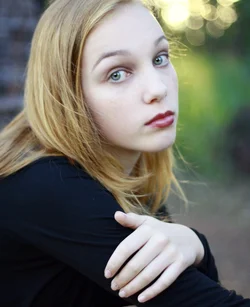
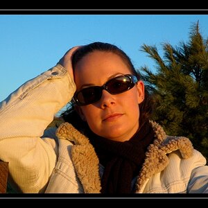
1) A few of the technical issues have been bludgeoned to death (white balance, focus), no need to rehash them. I do like the composition, and I don't mind the hand placement. Had the back of the hand been square to the camera it likely would have been too large a portion of the shot. But IMO because the fingers have small gaps between them to break up the skin area, the hand is not a large, distracting single feature. And I think that showing the fingers curled around the arm works very well with the emotion shown in her face. I quite like her hair - whether by accident or intent you've both framed her face and defined her back/tied her into the left edge of the frame.
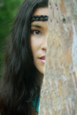
2) I'm not against out of focus foreground elements as a rule, I think a few branches or some long grass can help set the scene. But this tree is such a large block and a large portion of the frame that I don't think it works here. I do however like how much her hair wraps around toward the front of her face and helps hide it - a nice parallel to the tree. I had to go back and reread your original post to remember if this was a
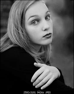
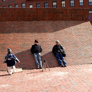
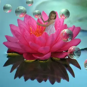
portrait assignment or not. As a standalone image I rather like it, it tells a story to me. But as a portrait I agree that not enough of her face is shown. Just for comparison, here is a similar shot I took a few years ago:
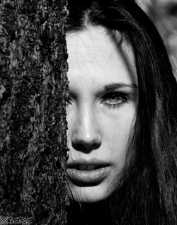
I'm not saying mine is any better, just that it has more of her face showing, and that the foreground tree is also in focus.
(Note: I am not looking to derail the OP's thread, so please don't critique this image here. Just offering it up as comparison to help visualize the points I and others have made.)