How did this photographer get these results?

jaker654

TPF Noob!
Joined
May 11, 2013
Messages
13
Reaction score
0
Location
NYC
Can others edit my Photos
Photos OK to edit
time of day and shadows There's absolutely NOTHING special about either. . in my opinion ;)
 
OP's definition of "brilliant colors" doesn't match mine, so I got nothing here.
 
OP- You should stick around and look at some of the photos posted in this forum. Most of the pictures in those links would be deleted before they were even uploaded to a computer.

I am not trying to be rude, but I think your standards are a little low, which is not a bad thing I guess.
 
Last edited:
Yeah, those are pretty lacklustre for someone who claims to be a "fine art photographer".

I would expect much more impressive results from someone with her resume...
 
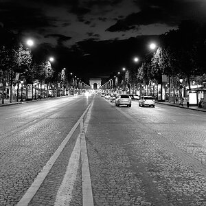
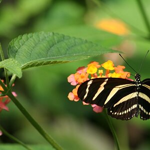
I agree that there is nothing special about these pictures, but I think I know what the OP is asking -- the first few pictures appear kind of HDRish, which might be what OP is calling "3dness". My guess is that the shooter was using a camera with high dynamic range.. For instance, using a D800 and lightroom I can make a picture appear very HDR without actually taking multiple exposures.

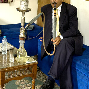
My guess is the shooter was NOT taking multiple exposures because the guy in #2 does not appear blurred.

Quite honestly, they all looked to be very snapshotish. I just don't see anything which hints at "fine art", or even "kind of HDRish"...
 
I'd say its just documentary style photography. A couple of the shots clearly have been tone mapped (scroll down), but I don't think anything here is multiple exposures (if it is then its very tame use of the method to the point where you can't tell*). That said there are enough situations where there is clear white blownout areas to suggest that multiple exposures combined isn't being used often.

In the end they are decent, but nothing special kind of photos whilst some are just snapshotish. It's not what I'd consider high art and just a serviceable level of photography. The colours are more likely the result of shooting nearer the start of the day and avoiding the middle of the day and its harsher lighting (you've quite a lot of long shadows so you've got morning or evening light with the sun at a lower height).


*which HDR addicts would say is actually a good use of the method
 
Anna Beeke's work shows up superior over the other photographers from those two shown above (esp if you scroll down past the first shot shown). I wouldn't call it auto mode shooting and the exposures are certainly very solid and some good compositions in there. It's just nothing that I'd consider "special" or outstanding but - as a set - it works well as a documentary style.
 
The first set is all wide angle, saturation pushed up a bit in post, and has some good architectural ideas. Architecturally Anna Beeke is all about the trees. I wouldn't characterize it as a particularly strong portfolio, but there are definitely some winners in it, and she has some ideas. That's the main thing about Fine Art photographers, they have ideas, and they can carry those ideas across multiple frames.

Being able to get the histogram just so and the focus just so and clean up skin properly and so on isn't gonna get you to first base in Fine Art. Being able to find and take a beautiful photograph of an Awesome Old Barn isn't gonna get you to first base. Having an idea, any idea at all, and expounding that idea through a bunch of pictures shot over weeks and weeks, that's gonna actually be useful.

The second set is much more people oriented, and is going for a grittier look, more of a traditional approach to "life in the projects" shooting or whatever. It's purely documentary in style, and looks like it is almost deliberately avoiding any pretense of art in favor of some sort of verity. It's also a bit more scattered, and the pictures presented don't strike me as having any specific visual ideas they're working on. They're all just 'hey, look at the all kinds of people there are here' pretty much.
 
Sorry.. I disagree.. TPF standard IS pretty low. Mostly talk here. Did these photographers come here and asked to be criticized?

OP- You should stick around and look at some of the photos posted in this forum. Most of the pictures in those links would be deleted before they were even uploaded to a computer.

I am not trying to be rude, but I think your standards are a little low, which is not a bad thing I guess.
 
^ Just my opinion. You are free to have yours.
 

Most reactions

Back
Top