How tough are ya'?

manaheim

Jedi Bunnywabbit
Staff member
Supporting Member
Joined
Sep 2, 2005
Messages
14,455
Reaction score
3,328
Can others edit my Photos
Photos OK to edit
I'm bored and I feel like giving some hard-core critique. If you want some perspective, post your image on this thread and I'll tell you what I think.

The rules...

1. I'm not looking for fixer-uppers, post something you're proud of.

2. I'm not going to pull any punches. I'll be nice, but I'm going to give it to you straight, so be prepared.

3. Give me a bit of a sense of what you were trying to do in your image, but please post this AFTER the image so I can look at the image first and then see if it meshes with what you were intending.

That's it. Ready? Go.
 
6531_1202629066702_1257857905_30567537_997063_n.jpg


Hit me
 
3783227466_4a750cb311_b.jpg

New to digital photography, shooting with a d40 and upgrading to the d90 in a few weeks! Tell me how I did, its my first B&W photo so I'm sure theres much to be said. Thanks for the critic man!
 

hmmm... interesting...

Ok.

You're trying for some symmetry, but when you go for symmetry you have to be extremely careful.

First off, perspective becomes more important... for example, you're not looking STRAIGHT at the bench, so it's bit torqued in the image and needs correction. Also your "horizon" here is off-kilter. You also don't have the bench actually dead-center. It's off a bit. Like I say... if you're going for symmetry... it has to be TRULY symmetrical. Note... you can fix ALL of this with a bit of post processing.

The flags are pointing in opposite directions, which is very neat, but they're different enough for you to take notice... mostly unavoidable.

There's a lot of dead space in here... the sky is washed out and dull... you chose to put more of the grass in (perhaps to compensate), but the grass is essentially featureless and not terribly interesting. A single object in the foreground on the grass would have helped.

The somewhat portly gentlement almost goose-stepping onto the scene breaks the image completely. Without him, you could be saying all kinds of things about patriotism... being alone... waiting for a returning seaman... whatever. With him, it's kinda like... "errr, what's with the chubby dude walking funny?" I think removing him would bring a lot of value to the image.

Overall, the image is tough... that blank sky is going to hurt. That being said, making some perspective corrections and possibly (I hate to say this) cloning out the dude would help.

Good eye overall, however. The scene has obvious potential.
 
Ok Manaheim..I want to hear what you have to say on a post we did yesterday regarding a model shoot. Here's the link. Give us a brutal honest critique. Btw I posted like 9 images so it might take some time :mrgreen: . The objective of the shoot is mentioned on top of the thread.
 
3783227466_4a750cb311_b.jpg

New to digital photography, shooting with a d40 and upgrading to the d90 in a few weeks! Tell me how I did, its my first B&W photo so I'm sure theres much to be said. Thanks for the critic man!

Hey there.

Unfortunately, I think the core scene is a bit weak. The road is interesting, the thing up on the top of the hill has some small amount of interest to it, but neither of these two subjects is dominant enough or compelling enough to really grab you. I think if you could have framed more of the curve of the road (shoot more to the right), that might have helped, but I'm not sure. The sky is very cool and interesting, but I think the conversion has left it a bit flat.

That being said, you (like previous poster) have noted the items of interest and composed the scene reasonably well. I just think in the end it wasn't as great as a spot as it might have been. Color may help. Not sure.

You may also be able to do a bit of creative cropping to bring a bit more attention to one part of the frame or the other. You'd have to play... I might try cropping a good bit of top and left, though I would lament the loss of the sky.

On your conversion... with black and white images (or toned grayscale ones), you gotta boost that contrast. Make sure a good bit of your photo is absolute black, and some portion of your photo is absolute white. Sometimes you even want to push it further than that.

BTW, you have a bit of sensor dust... start from the upper right and move directly towards the part where the two cloud-lines cross. You'll see a small darkish dot. That's sensor dust.
 
Ok Manaheim..I want to hear what you have to say on a post we did yesterday regarding a model shoot. Here's the link. Give us a brutal honest critique. Btw I posted like 9 images so it might take some time :mrgreen: . The objective of the shoot is mentioned on top of the thread.

Whoa, check out the hair. :lol:

Post your favorite one in this thread and I'll give you my thoughts.
 
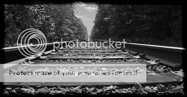
IMG_0174copy.jpg

First of the many shots to come taken with my new camera. I wanted to try doing some black and white shots but with a little more contrast. I had seen some examples or railroad tracks on here and since I live right next to a railroad, I wanted to go out and shoot something I have never shot before.
 
Ok Manaheim..I want to hear what you have to say on a post we did yesterday regarding a model shoot. Here's the link. Give us a brutal honest critique. Btw I posted like 9 images so it might take some time :mrgreen: . The objective of the shoot is mentioned on top of the thread.

Whoa, check out the hair. :lol:

Post your favorite one in this thread and I'll give you my thoughts.

Yeah it's pretty wild. You should've seen the make up artist who got more time with her(trying to fix it) then we did because the wind blowing it all over the place lol.

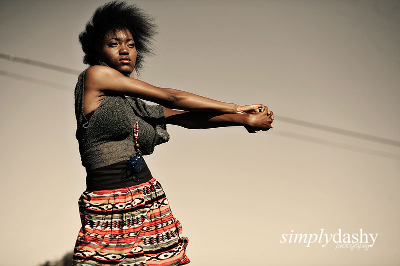
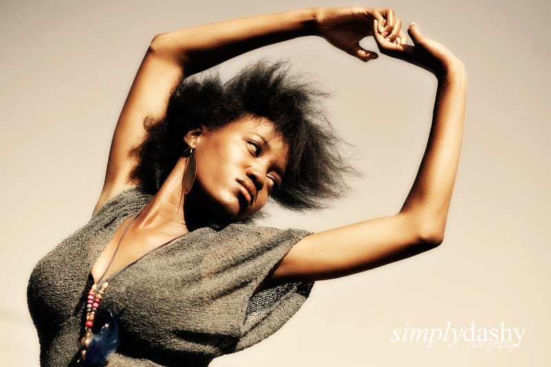
So here it is. The objective is stylish and edgy. All of these were done in natural lighting.

1
3778239361_e3113ec517_o.jpg


2
3779045138_5069262d3d_o.jpg
 
Ok, well, first of all thank you for taking the time to look at my photo, secondly i wanted to say that i posted this photo because i had mixed feelings for it and that you helped me figure them out.

I wasn't going for strong simmetry and the man is strongly intended, but i guess it dosn't work for you, and i understand, let's just say that i am going thru an artistic moment in which i need human presence in all of my shots, plus it was a street ( people ) photography assigment for my class, so yeah, i needed somebody, it may just be that it's not the right somebody...

Peter


I wanted to convey the size of the art piece with this one, as well as the multitude of colours. I think the child playing on it is a bonus. Technicalities of the shot: 24mm *1.6, 1/10, f/2.8, ISO 800 (the lights on the wheel cycled through the entire spectrum of visual light, so if I exposed any longer they started noticeably shifting to white).

I'm proud of it, and can't see things wrong with it (too close), so beat it to death manaheim. ;)
 
Camz, honestly, I think these are extremely good and far better than I could ever do.

1. The shots bring out the sexiness of her, despite the fact that I don't personally find her that attractive. Something particularly about the way her breasts are separated by the necklace is quite alluring.
2. The poses are interesting, but look relatively fluid and not at all posed.
3. The lighting is both interesting and complimentary... it's somewhat a shame that you don't have more detail in her hair, but where it's a darker part of the shot, I think that might have been unavoidable.
4. The power lines in 1 are kinda unfortunate, and yet you perfectly lined up her arms with the lines, which winds up being kinda cool.
5. The lines in her skin under her arms in 1 is a -little- distracting.
6. The muted colors fit her complexion and clothes very well.

Seriously great stuff, IMO. (keeping in mind, of course, that I am NOT a portrait photog)
 
Thanks alot for the reply man, you really know your stuff! I had the same feeling of showing off more of the road to the right to balance the photo. Thank you for you reply I will be asking you more of your opinions in the future.
 
Ok, well, first of all thank you for taking the time to look at my photo, secondly i wanted to say that i posted this photo because i had mixed feelings for it and that you helped me figure them out.

I'm glad I could help!

I wasn't going for strong simmetry and the man is strongly intended, but i guess it dosn't work for you, and i understand, let's just say that i am going thru an artistic moment in which i need human presence in all of my shots, plus it was a street ( people ) photography assigment for my class, so yeah, i needed somebody, it may just be that it's not the right somebody...

Peter

A soldier would have been killer in this shot... any kind of tradesman might also have been really interesting. I think the dude himself was just too nondescript.

BTW, keep in mind (and this is for everyone), I'm just some random moron on the internet. If you think my critique is off and you don't agree with it, just ignore me. I tend to think I know what I'm talking about, but art is art.
 

Most reactions

New Topics

Back
Top