How would you have lit this?

R0ck3tm@n

TPF Noob!
Joined
Jan 11, 2017
Messages
12
Reaction score
2
Location
Michigan
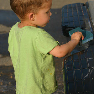
So I was asked by my church to champion a Christmas photo wall. I shoot with a Sony a7iii, 24-70 2.8 GM and 70-200 2.8 GM. I used to shoot Canon, had a half dozen L-series lenses, but recently jumped ship and downsized my lenses to the 2 that I used most.

Anyway, in terms of lighting, all I have are 64” shoot-through Paul Buff umbrellas and 150WS Flashpoint strobes. As seen I only used 1 strobe and 1 umbrella, however I did add a reflector next to the tree for a little fill.

My end results were adequate, all of the recipients loved what they received but I, of course saw room for improvement. It was the 1st year we did this so it was a learning platform for everyone. I’m just a hobbyist and I saw about 1,000 people through my line. It was quite the day.

I shot tethered with my 24-70 at 5.6, 1/125 and ISO 100. I found that in almost every shot my highlights and shadows were high, which were quickly fixed in LR before we printed onsite with a 4x6 photo printer. I quickly added a lens correction and a bit of contrast, then printed.

Because artificial light is new to me, I’m all ears for suggestions. Please help. I’m looking to improve in this area as I believe my church will continue to ask me about these types of projects. It was a HUGE hit on Christmas Eve for families. Thanks in advance my friends!

BTW, I’ll buy whatever is necessary. I want to do this right. I’m already planning a new tripod and head, mine is Manfrotto but annoys the heck out of me.
IMG_0179.JPG
IMG_0180.JPG


Sent from my iPhone using ThePhotoForum.com mobile app
 
I would have added an on-camera-axis fill light. This would help your highlight problem, as the on-axis light would be providing an even base exposure on the subjects, then your key light wouldn't have to work as hard to bring up the exposure.


I'd also put the reflector back on the strobe so you're not losing light -- especially with such a low-powered strobe.


this is a great writeup which outlines: 45 degree Portrait Lighting Setup

what I love is how he shows the light provided by each light. As you can see the key light alone exposes the face nicely, but the shadows are very dark and the image is very harsh.

Add in the on-axis fill directly behind/above the camera to bring all the shadows up. You can see in this shot that overall it's really underexposed but now there's information in areas that were pitch black in the previous shot.

Then you can see in the final shot with all the lights together, he was able to get a really nice exposure. I've always liked this post as a good workflow for setting up my lights.


Just try not to make the images look so straight out of 1970 as this guy does. rofl.
 
Last edited:
Thanks for the replies! I’ll pull my own SOOC and post as soon as I can.

Great advice, I’ll definitely check out that link. I’m looking to really step it up this next year in the artificial light arena without braking the bank preferably.


Sent from my iPhone using ThePhotoForum.com mobile app
 
First off, your results are decent, and honestly, in this situation, that's more than sufficient. That said I think a few small tweaks would definitely have improved things. The nice thing about a large shoot-through is that it scatters light everywhere and you have a fairly wide range of "decent lighting". The annoying thing about a large shoot-through is that it scatters light everywhere and you get no control, and no planned shadows.
The main thing I see for improvement in the set-up you used was raising your light. Light normally falls on us from above; we're used to seeing that (sunlight, overhead structure lighting, street lighting, etc). In your set-up the light is almost directly in the talent's face. I would have gone up probably another 3' from where you are (estimating based on tripod height and assuming you're somewhere in the 5'6" - 6' height range). If you look at the as-shot you posted, you can see that the child's face is probably a full stop brighter than the father's. Increasing your light-height would have helped with this.

I don't know that an on-axis fill would have helped greatly; the exposure is decent, and there are no harsh shadows that need filling. If you do this again, consider going with two lights and reflecting umbrellas. When I do this sort of work (and I do a LOT of it) I use a 42" reflecting umbrella as key about 30 degrees off-axis and with the light head at about the 8-9' mark and aimed down at about 30-40 degrees. I use a large (72") reflecting umbrella just off the opposite axis (maybe ten degrees; just enough for a clear shooting path) with the light head parallel to the floor (or aimed very slightly down) at about 6' in height and 1.5 stops below key.

A couple of general comments: Try to avoid pushing the talent right against the backdrop; 3-4' of separation is generally a minimum if you can. As well, give people something to do with their hands. In this case Mom and Dad could have each rested a hand on the child's shoulder, held hands, or Dad could have tucked his fingers/thumb into a pocket.
 
on-axis. 10° off-axis. same idea.

But I agree, the large shoot-through really helped out here -- looking at the SOOC photo and the setup again, I see the light is pretty much 10-20° and why it worked out well here and didn't leave a lot of empty eye-sockets, it was pretty much able to completely flood the face with light and fall off sharply on the very side.

I also agree I think I would have raised it a touch, but I would have also moved it closer to 40-50° and added the on-axis fill. Which will work to bring out the BG and the really harsh shadows, and it removes any harsh contrast and makes skin look better imho.
 
First off, your results are decent, and honestly, in this situation, that's more than sufficient. That said I think a few small tweaks would definitely have improved things. The nice thing about a large shoot-through is that it scatters light everywhere and you have a fairly wide range of "decent lighting". The annoying thing about a large shoot-through is that it scatters light everywhere and you get no control, and no planned shadows.
The main thing I see for improvement in the set-up you used was raising your light. Light normally falls on us from above; we're used to seeing that (sunlight, overhead structure lighting, street lighting, etc). In your set-up the light is almost directly in the talent's face. I would have gone up probably another 3' from where you are (estimating based on tripod height and assuming you're somewhere in the 5'6" - 6' height range). If you look at the as-shot you posted, you can see that the child's face is probably a full stop brighter than the father's. Increasing your light-height would have helped with this.

I don't know that an on-axis fill would have helped greatly; the exposure is decent, and there are no harsh shadows that need filling. If you do this again, consider going with two lights and reflecting umbrellas. When I do this sort of work (and I do a LOT of it) I use a 42" reflecting umbrella as key about 30 degrees off-axis and with the light head at about the 8-9' mark and aimed down at about 30-40 degrees. I use a large (72") reflecting umbrella just off the opposite axis (maybe ten degrees; just enough for a clear shooting path) with the light head parallel to the floor (or aimed very slightly down) at about 6' in height and 1.5 stops below key.

A couple of general comments: Try to avoid pushing the talent right against the backdrop; 3-4' of separation is generally a minimum if you can. As well, give people something to do with their hands. In this case Mom and Dad could have each rested a hand on the child's shoulder, held hands, or Dad could have tucked his fingers/thumb into a pocket.
Thanks a million for your input, your suggestions make perfect sense and their simplicity has me excited to try again. I really wish the shoot weren't over and I could go back and try your suggestions, definitely next time!

Let me ask you this, in the case of a lower ceiling and the large-size umbrella I used, how would you handle that if I could not get 3' higher? Smaller umbrella? Softbox?

So I currently have (2) Buff 64" shoot-throughs and (1) Buff 64" reflecting. To be honest I've been afraid to use the reflecting as I thought it would produce too harsh of a light. Now you have me wanting to invest in the 86" Buff reflecting to match with my 64". Again, just been so afraid to use it, that silver coating is intimidating.

I really didn't want the talent right up against the backdrop, however I didn't make the backdrop and I was asked to "frame the scene" with the 'r' church logo, and trim of garland left, top and right. While this wasn't my preference, it was leadership's preference so I obliged. Next year I plan on suggesting a larger backdrop and that they brand it top-left or top-right so it isn't blocked.

"Mom and Dad" were my wife and I, lol, we were rushed so my 'poser' wasn't nearby to pose us (and of course I didn't take the shot or I would have re-taken. I've never been much of a poser, hate to be in front of the camera but my wife wanted the photo. Other photos were done very well, I just didn't want to post without permission. My 'poser' (who I rewarded dearly) spent 2 decades as a professional before chasing another line of work; I was thankful for her that day.

on-axis. 10° off-axis. same idea.

But I agree, the large shoot-through really helped out here -- looking at the SOOC photo and the setup again, I see the light is pretty much 10-20° and why it worked out well here and didn't leave a lot of empty eye-sockets, it was pretty much able to completely flood the face with light and fall off sharply on the very side.

I also agree I think I would have raised it a touch, but I would have also moved it closer to 40-50° and added the on-axis fill. Which will work to bring out the BG and the really harsh shadows, and it removes any harsh contrast and makes skin look better imho.
Thanks man! I'll definitely give you guys' suggestions a try next time around!
 
Is this what you guys mean by on-axis and off-axis? "On" being what they have labeled as "fill" and "off" what they have labeled as "main"?

Screen Shot 2018-12-28 at 4.25.59 PM.png
 
really didn't want the talent right up against the backdrop, however I didn't make the backdrop and I was asked to "frame the scene" with the 'r' church logo, and trim of garland left, top and right. While this wasn't my preference, it was leadership's preference so I obliged. Next year I plan on suggesting a larger backdrop and that they brand it top-left or top-right so it isn't blocked.

Lighting, posing etc pretty much covered, so a comment on the logo, which you mentioned. It's an orange blob of distraction that is going to be a distraction pretty much anywhere you locate it in the frame. IMO I would seriously try to dissuade them from affixing it to the background. Perhaps incorporate something recognizable from the Church as the background, or if they are determined to have the logo on the print, then place it as a watermark at lower opacity, along with the year.
 
Last edited:
really didn't want the talent right up against the backdrop, however I didn't make the backdrop and I was asked to "frame the scene" with the 'r' church logo, and trim of garland left, top and right. While this wasn't my preference, it was leadership's preference so I obliged. Next year I plan on suggesting a larger backdrop and that they brand it top-left or top-right so it isn't blocked.

Lighting, posing etc pretty much covered, so a comment on the logo, which you mentioned. It's an orange blob of distraction that is going to be a distraction pretty much anywhere you locate it in the frame. IMO I would seriously try to dissuade them from affixing it to the background. Perhaps incorporate something recognizable from the Church as the background, or if they are determined to have the logo on the print, then place it as a watermark at lower opacity, and along with the year.

I like the watermark idea.

Also, for a low ceiling I’ve used it as my reflector and bounced the flash off it.
 
In the case of low ceinglings, I get things up as high as I can, and smaller modifiers are definitely an option, as is using the ceding as a modifier as mentioned by @TreeofLifeStairs. Smoke's comments on the logo are spot-on. It's large (and in a photographic sense) ugly. A lot of times our role as a photographer is correcting people's less than optimal ideas. Non-photographers get an idea but they don't understand all of the ramifications. The big thing that strikes me here from a branding perspective is that you'll almost never see the whole logo, generally considered a 'no-no'.

Don't go crazy buying huge umbrellas. They have their uses, but they're not the be-all and end-all. There's no portrait scene you can't light decently with two 42" umbrellas. You will get significantly different light from a white shoot-thru compared to a silver reflector. The silver will be a lot more specular and 'crisper'.
 

Most reactions

New Topics

Back
Top