
FITBMX
Been spending a lot of time on here!
- Joined
- May 11, 2014
- Messages
- 3,860
- Reaction score
- 1,423
- Location
- Burns, KS, USA
- Can others edit my Photos
- Photos OK to edit
I have kind of found a love for B&Ws, and want to keep improving. So any CC would be great! ")
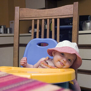
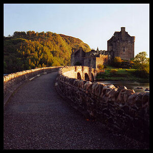
1. Self-portrait.

2. Self-portrait.

3. Not a self-portrait!

1. Self-portrait.
2. Self-portrait.
3. Not a self-portrait!
![[No title]](/data/xfmg/thumbnail/38/38263-ad5e4c9e677626ddb5b1e7cdf9ebe40e.jpg?1619738548)


![[No title]](/data/xfmg/thumbnail/38/38261-db20f6f92ee8f0d4c5cf1536e308638b.jpg?1619738546)