antongorlin
TPF Noob!
- Joined
- Oct 12, 2017
- Messages
- 22
- Reaction score
- 18
- Can others edit my Photos
- Photos OK to edit
This post consolidates all my expertise and skill, and it took me over 6 months to get together. I believe anyone could learn something new from it. There are many articles, but I still decided to create a big composition guide beautifully displayed and easy to follow. I tried to keep it straightforward and brief with loads of materials to download for future use. Also, I keep it as compact as possible for such a significant volume of information. Less noise, more useful info with illustrations, diagrams and charts.
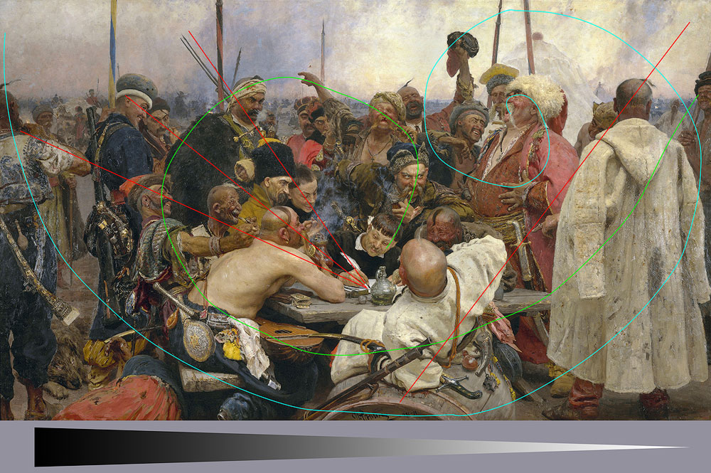
COMPOSITION CONCEPT AND PRINCIPLES
Before going far into the composition building methods, we must realise what the composition truly is, how it is produced, what milestones it has and how it influences our thought.
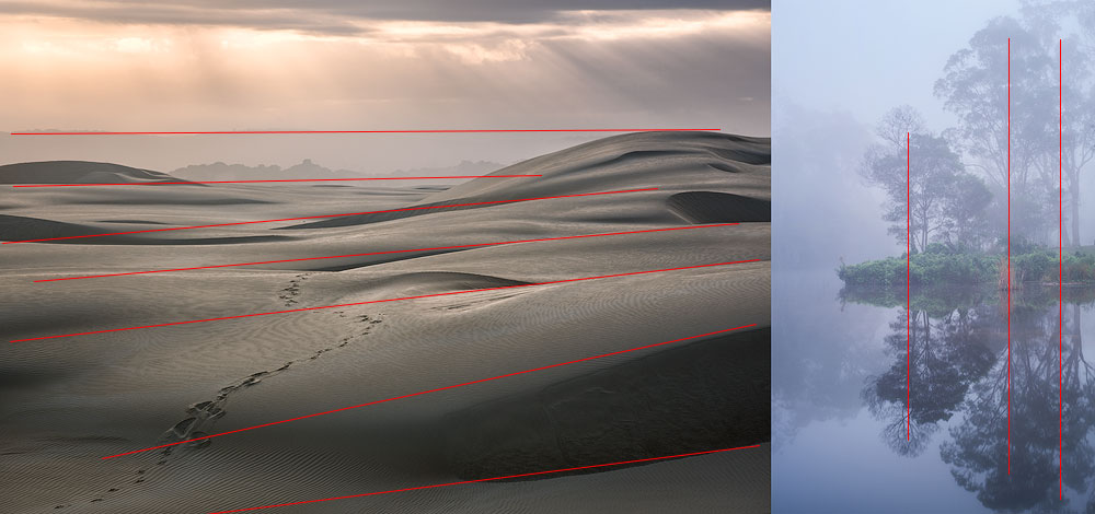
VERTICAL AND HORIZONTAL ALIGNMENT
The general approach is to pick a horizontal frame when the frame dynamic is mostly horizontal and vice versa. In some cases, you could do the reverse to raise tension leaving some breathing space around it.
STORYTELLING USING PHOTOS
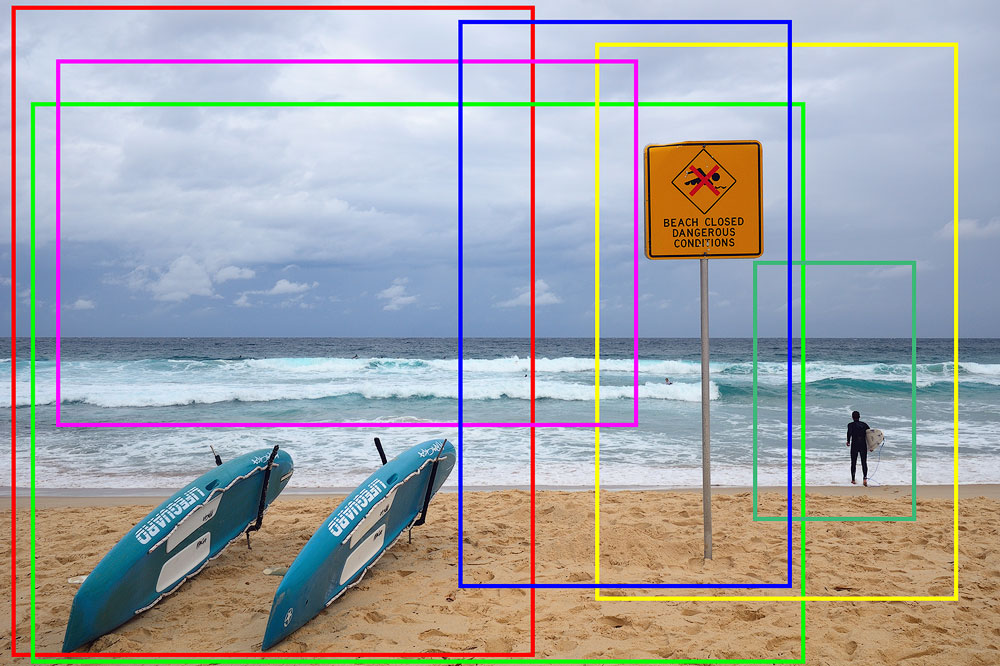
Storytelling is the reason of any photo. We want to show what we have seen. If it has nothing to convey, it’s a snap. This entire tutorial is about various means of storytelling. As an example, you start reading a book from the beginning to understand what is it about. It should have a plot, a narrative and a defined structure. It is the same in visual arts. A photo must have a subject, a layout and a context. They form your visual narrative. Therefore, consider composition a storytelling tool.
Please review an illustration below and see how the crop changes the story. Try to decide what’s the idea behind every final picture.
COMPOSITION TECHNIQUES
Let's go deeper and learn some rules and methods that you can execute for immediate results. Some of the ways could seem to oppose each other, but that simply indicates you can’t use them both simultaneously.
I must warn you – none of these methods will transform you into a great photographer. Practice and study will. How long do musicians study? How many out of them become composers? In the modern age of digital cameras and editing tools, one can advance to generate good pics in a year or less. But it doesn’t mean these photos have a good layout. Majority of photographers stop at the Rule of Thirds. It could be enough to do OK images, but there’s a ton of work to master all of them.
LEADING LINES
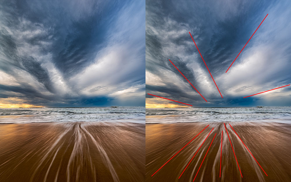
A leading line makes the observer’s eyes follow it. This line traverses across the image and helps to understand it. There are many ways to create a leading line. The easiest one is to use some solid line, like a wall or a road. Another one is a broken line made of different objects, which imply a connection between them.
DIAGONALS
Building diagonals is simple and straightforward. They are everywhere, always try to add some to the photo. A sparse change of angle converts a horizontal line into a diagonal, and the observer will readily follow it with their eyes. The diagonals operate best when they commence from the corners.
There are two methods to put diagonals in the picture:
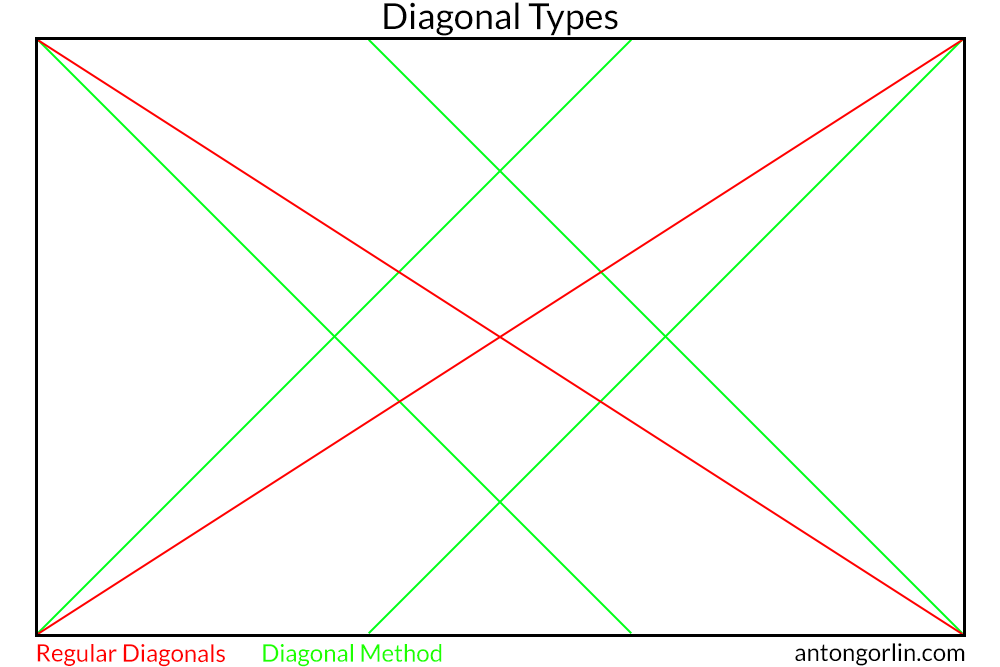
The most common is to draw lines from one corner to another. The other way is to use 45 degrees lines forming a diamond in the middle.
ASCENDING/DESCENDING DIAGONAL
The direction of the diagonal influences how we perceive it. So does the ascending/descending aspect. As we scan the photo left-to-right, we see some diagonals as a challenge to overcome and others as an easy way down.
STORYTELLING EXAMPLE
Let's use the below example to see how we perceive the situation.
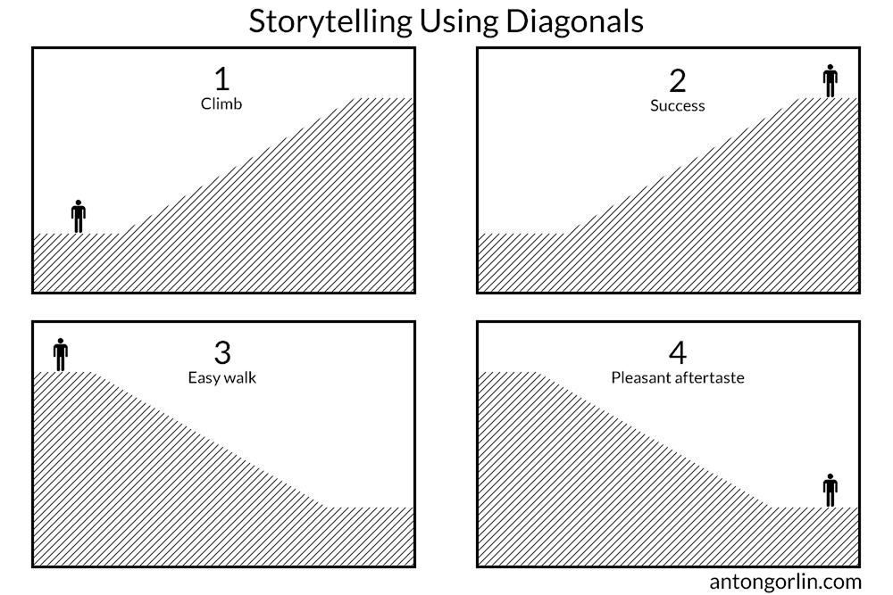
It's obvious that just positioning and flipping of the picture gives an entirely different context and tells a different story.
GOLDEN TRIANGLE
Golden triangle is formed by a diagonal line and perpendicular lines to it from other corners.
S-SHAPED CURVE
S-shape is compelling and charming. It smoothly arcs through the picture without any tension. The curve is gentle and catchy rather than straightforward. Such shots look natural, and the spectator has no chances to avoid the flow.

CENTRAL COMPOSITION
Nearly every guide wants you to avoid putting elements in the middle. But that's not right! You surely can build everything around one most important object. Consider this as a more centrist, egoistic strategy. It’s important to have just one hero for this type of frame. It has to be the core of gravity.

Another tale is that you can't put the horizon into the centre. This is correct when foreground and background have an equal weight. You can put it in the middle in many other cases:
1. One part is stronger than the other one.
2. When the horizon is not one of your important lines.
3. Panoramic shots.
RESEMBLANCE
An elegant technique is to discover a resemblance between completely different objects. The key is to see similar forms and emphasise them with the composition. Once you have witnessed similarities, use different composition rules to produce the photo. The likeness could be straight or mirror.

FINAL WORD
This article is merely a part of the full guide found on my site. The entire tutorial contains a lot more examples, recommendations, principles and concepts to consider and has a new chapter not covered here - the Composition Building Blocks. If you liked reading this little excerpt covering 10% of the full article, please navigate to my blog and enjoy the whole thing. The format and size of this post have been approved with the admin.

COMPOSITION CONCEPT AND PRINCIPLES
Before going far into the composition building methods, we must realise what the composition truly is, how it is produced, what milestones it has and how it influences our thought.
VERTICAL AND HORIZONTAL ALIGNMENT
The general approach is to pick a horizontal frame when the frame dynamic is mostly horizontal and vice versa. In some cases, you could do the reverse to raise tension leaving some breathing space around it.

STORYTELLING USING PHOTOS
Storytelling is the reason of any photo. We want to show what we have seen. If it has nothing to convey, it’s a snap. This entire tutorial is about various means of storytelling. As an example, you start reading a book from the beginning to understand what is it about. It should have a plot, a narrative and a defined structure. It is the same in visual arts. A photo must have a subject, a layout and a context. They form your visual narrative. Therefore, consider composition a storytelling tool.
Please review an illustration below and see how the crop changes the story. Try to decide what’s the idea behind every final picture.

COMPOSITION TECHNIQUES
Let's go deeper and learn some rules and methods that you can execute for immediate results. Some of the ways could seem to oppose each other, but that simply indicates you can’t use them both simultaneously.
I must warn you – none of these methods will transform you into a great photographer. Practice and study will. How long do musicians study? How many out of them become composers? In the modern age of digital cameras and editing tools, one can advance to generate good pics in a year or less. But it doesn’t mean these photos have a good layout. Majority of photographers stop at the Rule of Thirds. It could be enough to do OK images, but there’s a ton of work to master all of them.
LEADING LINES
A leading line makes the observer’s eyes follow it. This line traverses across the image and helps to understand it. There are many ways to create a leading line. The easiest one is to use some solid line, like a wall or a road. Another one is a broken line made of different objects, which imply a connection between them.

DIAGONALS
Building diagonals is simple and straightforward. They are everywhere, always try to add some to the photo. A sparse change of angle converts a horizontal line into a diagonal, and the observer will readily follow it with their eyes. The diagonals operate best when they commence from the corners.
There are two methods to put diagonals in the picture:

The most common is to draw lines from one corner to another. The other way is to use 45 degrees lines forming a diamond in the middle.
ASCENDING/DESCENDING DIAGONAL
The direction of the diagonal influences how we perceive it. So does the ascending/descending aspect. As we scan the photo left-to-right, we see some diagonals as a challenge to overcome and others as an easy way down.
STORYTELLING EXAMPLE
Let's use the below example to see how we perceive the situation.

It's obvious that just positioning and flipping of the picture gives an entirely different context and tells a different story.
GOLDEN TRIANGLE
Golden triangle is formed by a diagonal line and perpendicular lines to it from other corners.
S-SHAPED CURVE
S-shape is compelling and charming. It smoothly arcs through the picture without any tension. The curve is gentle and catchy rather than straightforward. Such shots look natural, and the spectator has no chances to avoid the flow.

CENTRAL COMPOSITION
Nearly every guide wants you to avoid putting elements in the middle. But that's not right! You surely can build everything around one most important object. Consider this as a more centrist, egoistic strategy. It’s important to have just one hero for this type of frame. It has to be the core of gravity.

Another tale is that you can't put the horizon into the centre. This is correct when foreground and background have an equal weight. You can put it in the middle in many other cases:
1. One part is stronger than the other one.
2. When the horizon is not one of your important lines.
3. Panoramic shots.
RESEMBLANCE
An elegant technique is to discover a resemblance between completely different objects. The key is to see similar forms and emphasise them with the composition. Once you have witnessed similarities, use different composition rules to produce the photo. The likeness could be straight or mirror.

FINAL WORD
This article is merely a part of the full guide found on my site. The entire tutorial contains a lot more examples, recommendations, principles and concepts to consider and has a new chapter not covered here - the Composition Building Blocks. If you liked reading this little excerpt covering 10% of the full article, please navigate to my blog and enjoy the whole thing. The format and size of this post have been approved with the admin.
Last edited by a moderator:


![[No title]](/data/xfmg/thumbnail/30/30886-4d4f2b370f36c175a23901cc8689aea4.jpg?1734158893)


![[No title]](/data/xfmg/thumbnail/30/30890-45d8875af0c79f0f727d7d55132972b0.jpg?1734158906)

![[No title]](/data/xfmg/thumbnail/30/30888-e7fd3f6ad2e0d85268f086de6d796459.jpg?1734158899)