Industrial sunsets

lizheaemma

TPF Supporters
Supporting Member
Joined
Nov 5, 2003
Messages
683
Reaction score
38
Location
Canada
Website
www.alipearsonphotography.com
Can others edit my Photos
Photos OK to edit
I'm really torn over these photos, I like them, but hate all the brown tones in then, pollution or user error?

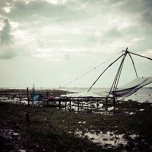
I was trying to capture the beauty in the industrialization, really wasn't the mist spectacular sunset for the amount of particle matter in the sky over the steel plant.

Maybe I just need to shoot it again!

1.
sunset3-1.jpg


2.
sunset2-1.jpg


3.
sunset-2.jpg
 
First off correct the horizon.

1 has great colors.

2 and 3 are a little underexposed, even in the sky.

The brown could be from haze. You can correct that in photoshop using photo filters, gradients, or color balancing. None of them have anything very compelling in them. Not really sure why, maybe the lack of detail?
 
Great idea, definitely a plus that your going out with a goal in mind.

I dont think the brown haze is a bad thing, it could add to the industrial feel your going for. The first shot is my favorite because you caught sunset nicely but there are a few things that I think could help you pull these off more succesfully.

1. Exposure - try braketing your shots +-1 EV, this will give you 3 shots at different exposures to work with after and can save your shots when your still learning the ins and outs of exposure . The second and thrid shots are under exposed as photocist mentioned (you might have metered from the dark areas and not the sky)
2. Get a tri pod and try long exposures. You will be able to capture incredible color after the sun goes down and it will smooth out water and light reflections. Shot 3 with a 15 second exposure could have been awesome.
3. Look into Graduated ND filters or graduated filters in lightroom/photshop. these allow you to expose correctly for the bright sunset and at the same time capture more of the foreground detail ie your industrial features.
4. Keep the foreground composition simple, since its just a shadow a basic outline is best. The bridge outline ini 3 works better for me than 1 because it is simple and recognizable where in 1 there are two bridges overlapping and it is confusing to look at.

just 2 cents but hope it helps
 
I really like the first one.
 

Most reactions

New Topics

Back
Top