Iron Hinge, Mineral Spring Park, Rdg, Pa

Rick58

Been spending a lot of time on here!
Joined
Jun 23, 2012
Messages
4,227
Reaction score
1,473
Location
Reading, Pa
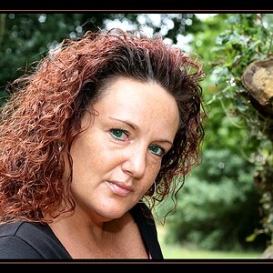
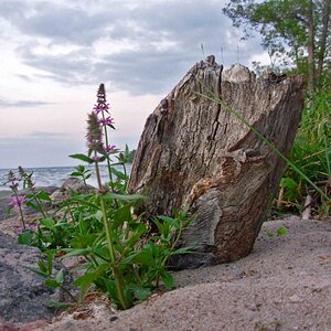
Can others edit my Photos
Photos OK to edit
Iron%20Hinge%20Mineral%20Spring%20Park%20Rdg%20Pa_zpsb7le6y0n.jpg


or possibly color?
Iron%20Hinge%20Mineral%20Spring%20Park%20Rdg%20Pa%20C_zps83drburc.jpg

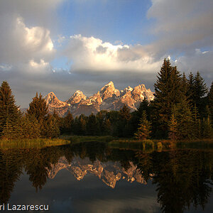
Took a 9 degree stroll through the abandoned park today. I welcome any and all comments.
 
Last edited:
nice textures in both, but I prefer the colour version. And the 6 holes are intriguing.
 
Thanks Brian, I went after this with B&W in mind, but then I begin leaning towards the color version.
 
Pretty nice - great, well-balanced composition. I like the B&W, although I might give it just a slight sepia tint. There's something a little "off" about this, perhaps oversharpening and/or contrast pushed too much?
 
There's something a little "off" about this, perhaps oversharpening and/or contrast pushed too much?
Thanks Ken...Probably a little of both. I did push it pretty hard with contrast and sharpening trying to pull as much out of that texture as possible. I may have gone a little over the top.
 
Sometimes I found amazing to go against what is expected. When there's a lot of texture, go down with clarity and sharpness and contrast.
Beside this...something is wrong here. I don't know if it's overcropped (so that you lost definition) or may be micro-moved or may be slightly OOF or may be artifacts. I expected a typical "Rick58 photo" here to be crystal clear and pixel-peeled. ;)
 
Iron%20Hinge%20Mineral%20Spring%20Park%20Rdg%20Pa_zps1vhio0to.jpg

I went back for a second take on this hinge. The first posts were an after thought crop of the entire door. Such a tight crop lost a lot of sharpness. Also, I knew I processed them hard to pull out the texture, but I didn't realize just how over the top I went, until I looked at them again this morning.
The more I looked at this hinge, the more I liked it, so I felt it was worth a second trip to grab a full frame shot and back off the processing to a more natural look. Thoughts?
 
Sometimes I found amazing to go against what is expected. When there's a lot of texture, go down with clarity and sharpness and contrast.
Beside this...something is wrong here. I don't know if it's overcropped (so that you lost definition) or may be micro-moved or may be slightly OOF or may be artifacts. I expected a typical "Rick58 photo" here to be crystal clear and pixel-peeled. ;)
Hey Benjo, you're absolutely right... It's a train wreak...WAY over cropped...AND...way over processed. I'll leave them up as a "Post of Shame" to show everyone how NOT to do it
 
Last edited:
Oooook, the new one is a Rick's one! :D And, of course, I love it!
 
I really like the "updated" hinge!
 
Bump coming off the weekend. Going one, going twice...
 

Most reactions

New Topics

Back
Top