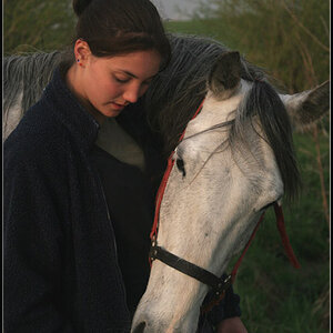
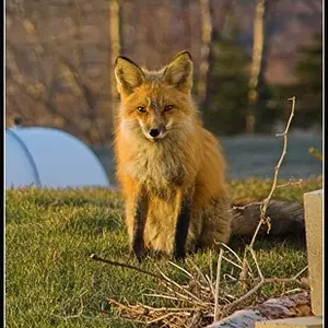
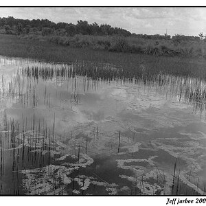
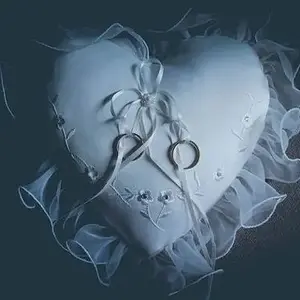
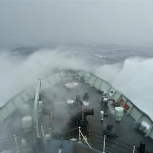
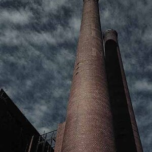
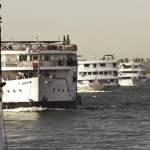
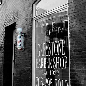
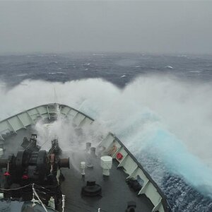
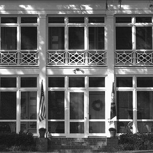
Actually, the colors seem too rich for me. The first pic is very dark, and the reds in pic 3 are distracting -- they feel cheesy. I appreciate the simplicity of pic 2, though.
Actually, the colors seem too rich for me. The first pic is very dark, and the reds in pic 3 are distracting -- they feel cheesy. I appreciate the simplicity of pic 2, though.
yes 'my' image is a bit dark. but hey, thanks for taking the time to critique the other two images someone else posted in my thread. it's good to know everyone's paying attention
yes 'my' image is a bit dark. but hey, thanks for taking the time to critique the other two images someone else posted in my thread. it's good to know everyone's paying attention
I agree... :lmao:
Poor JonMikal, I think my first photo post here got hijacked like that. :lmao:
I love that effect you've been putting on your photos, it really gives them a surrealistic feel. btw, I don't think it's too dark, I like that look. :thumbup:



 That made my stomach hurt from laughing. You're the bestest, Johnny. :hug::


![[No title]](/data/xfmg/thumbnail/42/42059-61b97bbebb00e6276672551f4e3b3e43.jpg?1734176455)