C&C per req:
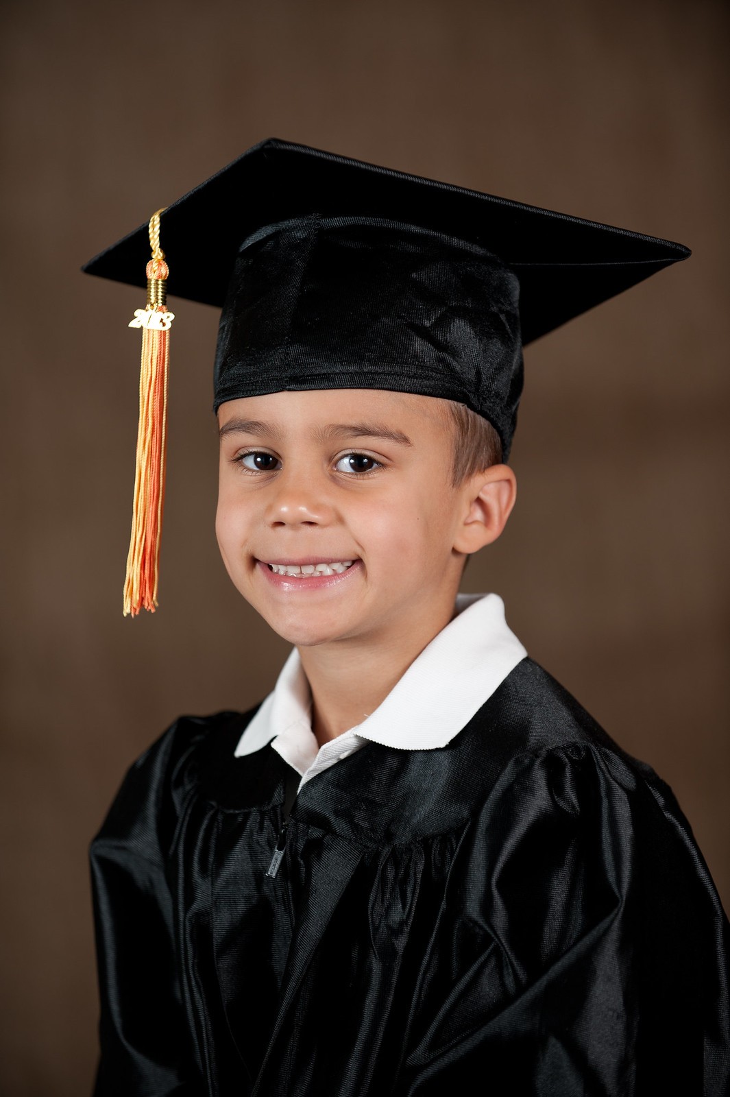
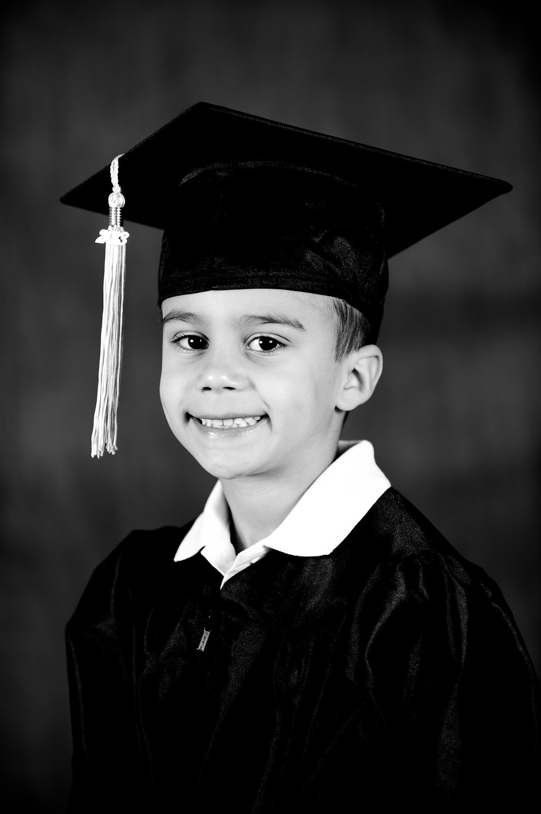
the lighting isn't bad, but it could be improved; judging by the catchlights and specular highlights on his face, the lights were a bit low, and a bit close together. The overall lighting feels a little 'flat' to me. It's not bad, but a bit more shadow definition would have gone amiss. I think raising your key a bit more and then reducing your fill output to 1/3 - 1/2 stop under key would have worked well. Try not to have the subject turn their head quite so far, ideally a little bit of sclera should be visible on either side of the pupil.
I think of the two, the colour image is the stronger, based on the tonal range. It rather runs together in the monochrome, whereas in the colour, the subject stands out nicely from the brown background.
Just my $00.02 worth - your mileage may vary.
~John






![[No title]](/data/xfmg/thumbnail/35/35597-714b74cc48992e5353856abfe325df68.jpg?1734167220)