Some of my favorites from 2011.
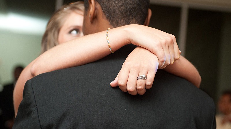
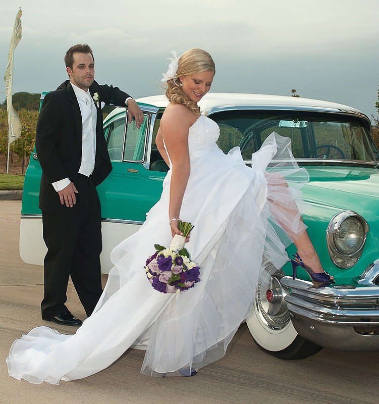
1.
Good. I would burn the people on the top a little bit. They are too bright. OR you can maybe add graduated filter on LR.
2.
Crop it better. Seeing someone's finger on the right is just weird.
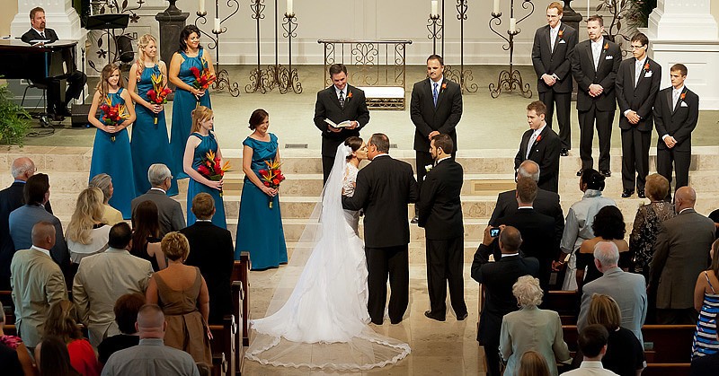
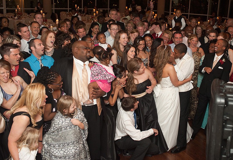
3.
I personally rather see a lot wider shot where you can see people are watching them like they are the main attraction.
4.
Dirty sensor bottom left. Cant explain it.. just not enough wow factor on the shot.
5.
Same as above
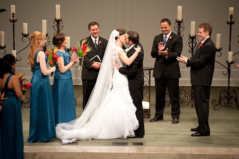
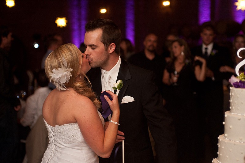
6.
It may be a special moment.. but you only put her by her self. Shoot wider so viewers understand what is going on. She looks retarded with double chins. This for sure is not a good photo unless you collage it with different angle shots. This definitely wont make it to my "best" thread.
7.
Nice pose. Someone is walking in the background. Mix lighting is very visible. Direct flash is very visible.
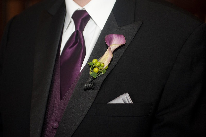
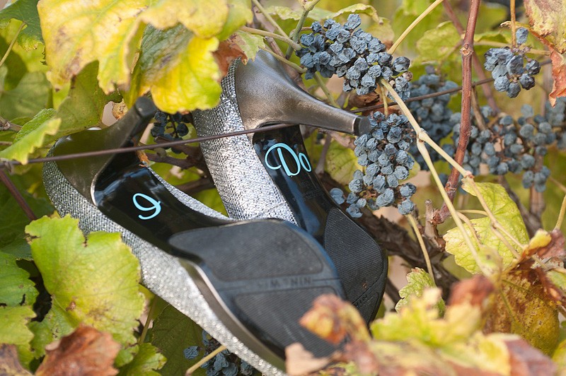
8.
Detail shot again but not big enough.
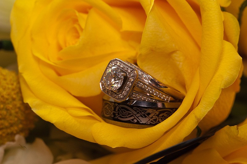
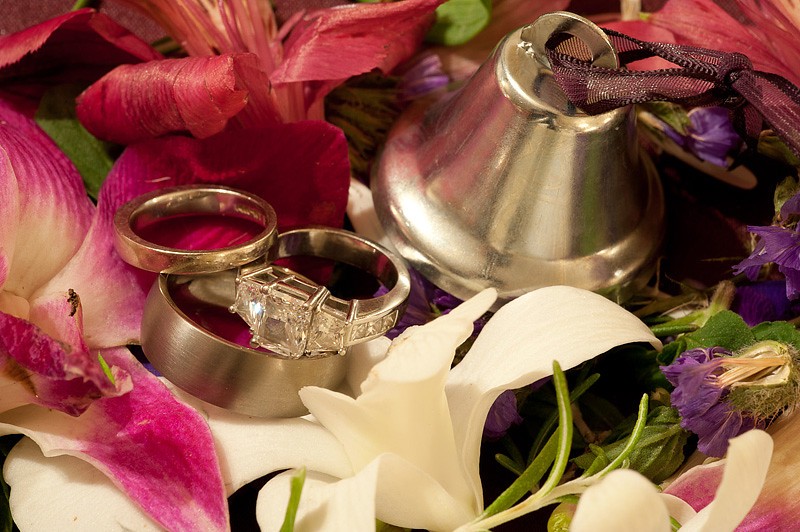
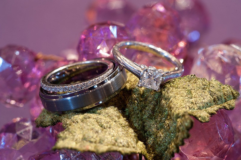
9.
Main diamond is not in focus
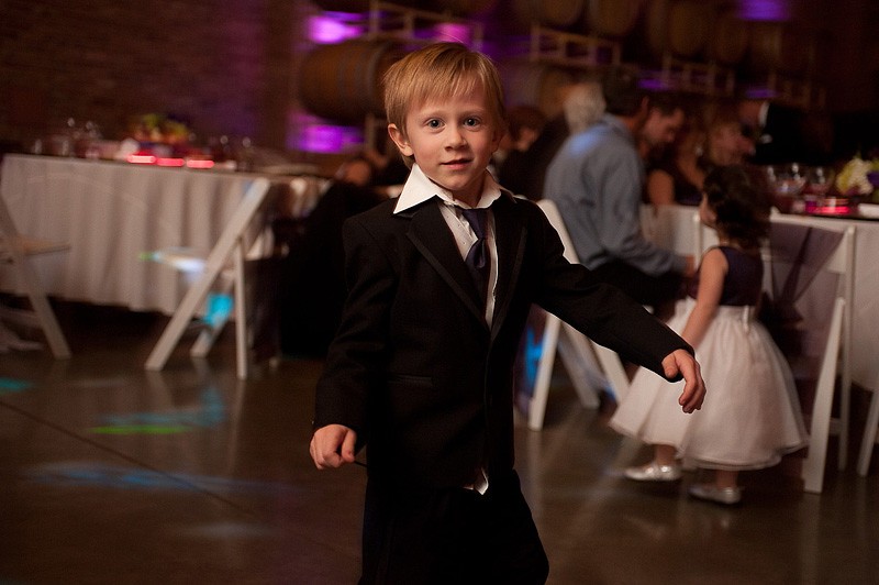
10.
Snapshotish. Most of the people look goofy (probably on purpose but most viewers wont know that). Nice speaker on the right.
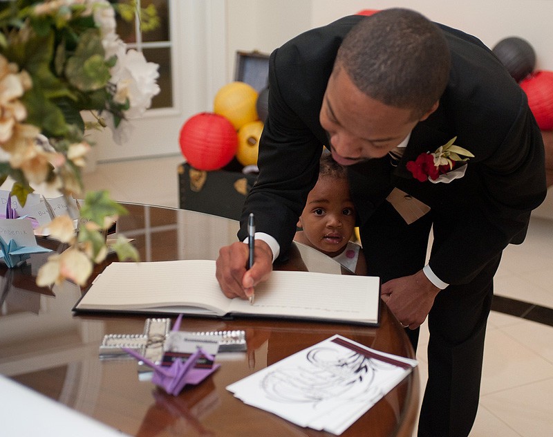
11.
Black and white treatment, crop tighter, put the top cutting his forehead, the bottom right under the guest book, put her face right on 1/3 from the right.
12.
I dont understand the square crop. Clone out the little vegetation sticking out from the hood.
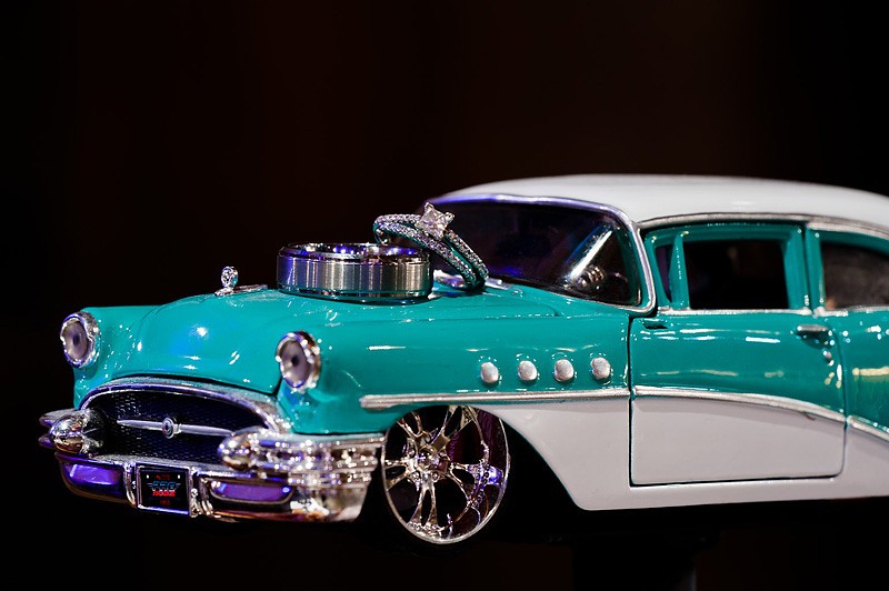
13.
The car is very dominant on this photo. Then you really need to make the headlight in focus as well.
14.
Not bad.. the lighting can be improved.
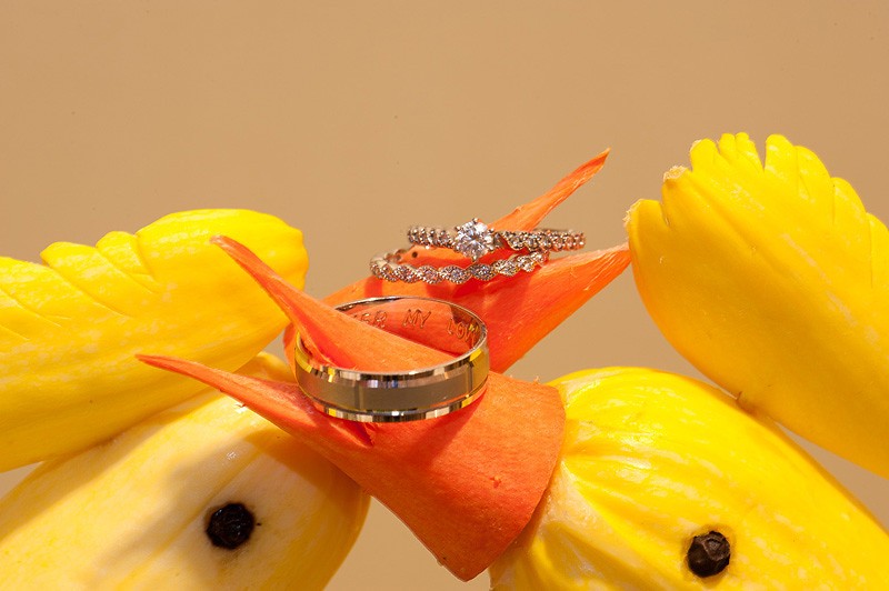
15.
Yellow diamond, yellow platinum
16.
I have ccd this.
17.
Not wide enough IMO.
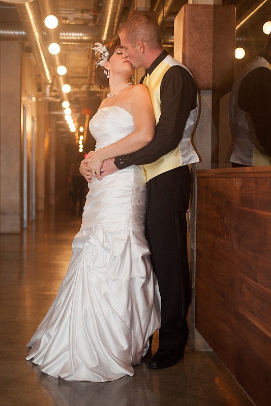
18.
Yeah.. she is cute.. doesnt really tell me anything. Definitely wont put it in my best of 2011.
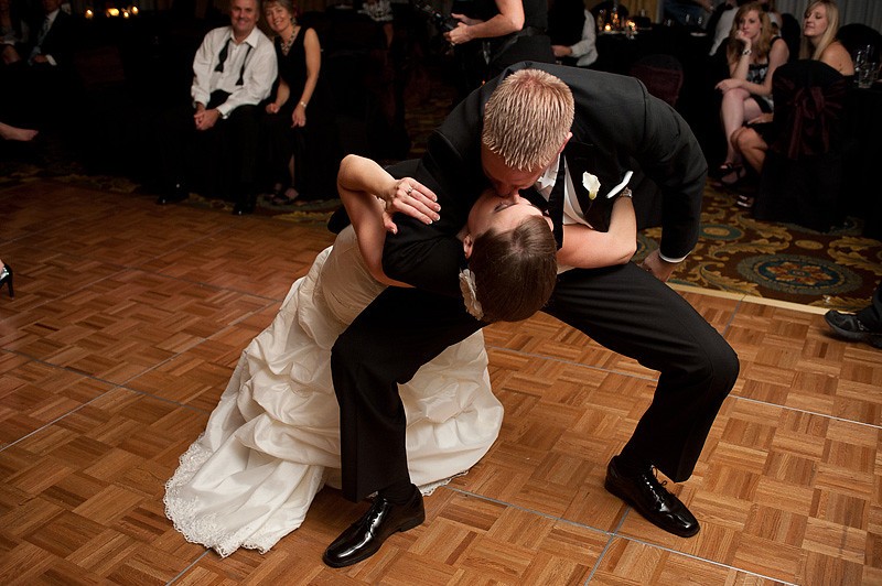
19.
A lot better than the last one. Need wider shot though. Show his feet would be nice. He is dancing after all.
20.
Definitely not best of 2011 material.
21.
Definitely not 2011 material. Boring.
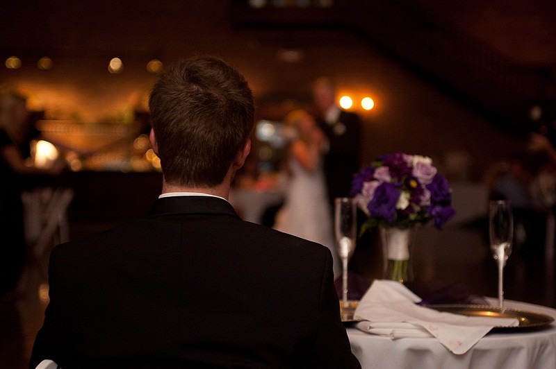
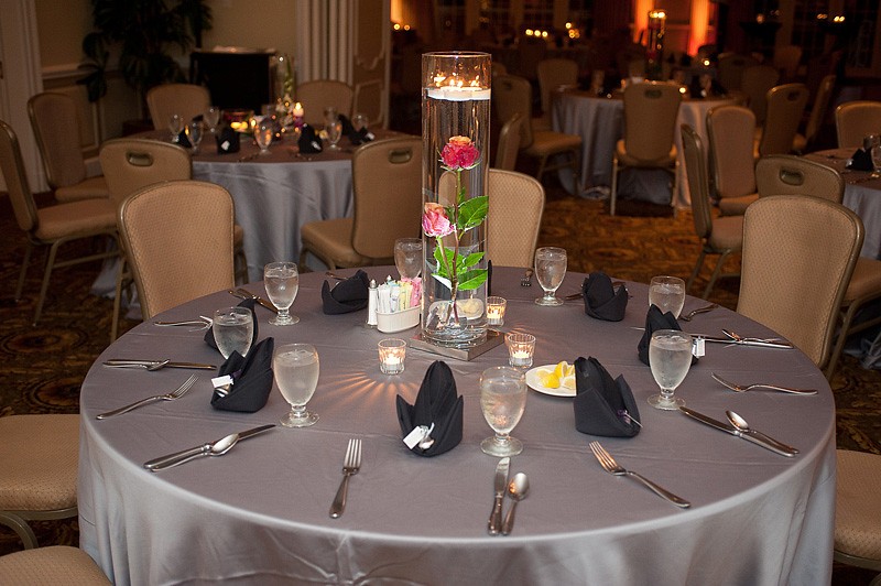
22.
Why flash it? Show the ambiance of the whole room.
23.
underexposed. Mixed lighting is very visible.
24.
Detail shot again....
25.
Great.. someone's hand (not sure whose) is pouring a glass of champagne. Definitely not best of 2011 material.
26.
Tacky
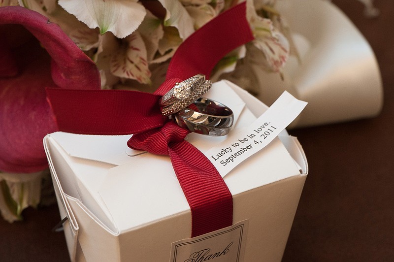
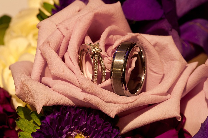
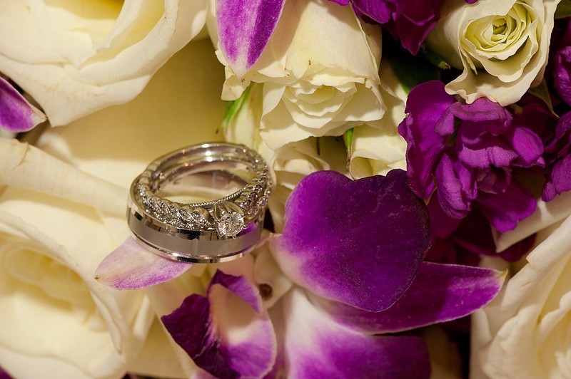
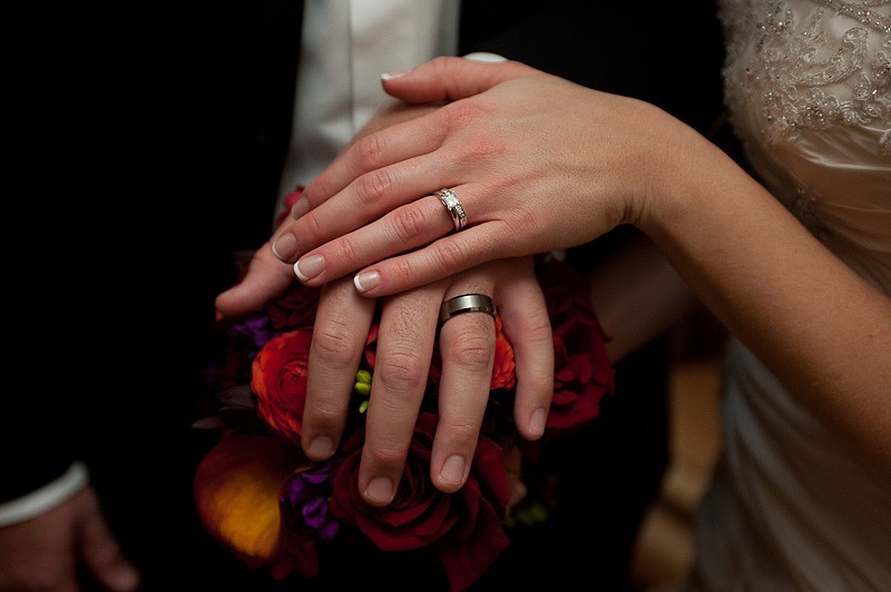
27.
another ring shot in front of flowers. I see the pattern here
28.
Detail shot again.. direct lighting.. boring.
29.
Finally.. something interesting.
30.
Definitely not best of 2011 material.
31.
Same of above
32.
What is that? Algae on the rock?
33.
Nice bicep on the right. Who is that? Cindy's husband? He must works out.
34.
Not best of 2011 material
35.
Too tight.. You guys really need to learn not to be in each other's shot.
C&C always welcome. Hope you guys have a great New Year...
Regards,
George