Photosensitive
No longer a newbie, moving up!
- Joined
- Jan 2, 2010
- Messages
- 221
- Reaction score
- 78
- Location
- Calicut, Kerala, India
- Can others edit my Photos
- Photos OK to edit

For your thoughts
")
Follow along with the video below to see how to install our site as a web app on your home screen.

Note: This feature currently requires accessing the site using the built-in Safari browser.

Thank you very much xDarekLooks really cool.I love it, nice job! I like these kind of thing, a little bit Sci-fi
Thank you very much DesignerExcellent!
Thank you very muchVery interesting! not the norm....Me likey
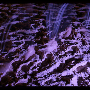
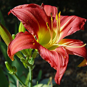
Boosted contrast/saturation defined by black again.
I've nothing in particular against this shot, only that I've seen it many times before, not these particular leaves but the way that every element in the image is defined by how it contrasts with black. It's a consequence of positive movements of the contrast/clarity/sharpness and saturation sliders that you remove the brightness and add black, it's just the way all these shots go because it's the way 'positive' movements always lead you. I saw, on this site just the other day, the same thing with yellows contrasted against black.
"What's wrong with that?" I hear you cry.
"It mis-understands yellow and mis-understands colour in general." I retort, with an example. Imagine a dark yellow, hard isn't it? That's because yellow is a bright colour not a dark one. Yet many process it with chiaroscuro (light dark shading) to black. But look at the difference if you shade it to white. Which is brighter and which has the only pastel shades?
View attachment 114947
Red is a little different in that it can be vibrant at darker shades, black has it's uses here. Again it's fully saturated red to black and to white below. But below that I've added a darker saturated red to white, see the differences in colour:
View attachment 114948
The top layer shows fully saturated colour as the brightest fading to, and contrasted against, black - a complete lack of colour. The bottom layers show more confidence and use the colour as the darker element and bring forth vibrance by contrasting with white. Which bands have the only pastel colours? Why are your pastel colours removed from the top band? There is room for both (I've only shown a gradient not a transition), but so much of the processing I see pushes images towards the top band.
I would like to see more of the bottom layers, how you can use white to add contrast and colour, not just black. I so often hear photographers saying that the've added black to bring out the colours (??!!). How? look at the examples, does the red-black really show more colour than my separated image below, or is it more to do with bringing out a relative lack of colour by contrasting it with the complete lack of colour? Remember it's exactly the same red I've started with in the images and exactly the same black was mixed with the bottom line. I just can't see how removing the white and replacing it with black adds colour.
There's a whole world of pastel colour out there, white is your friend, don't be so quick to remove it.
Here it is with the bottom reversed and without any black at all:
View attachment 114949
![[No title]](/data/xfmg/thumbnail/31/31092-7ba73f844ad8efedd3d5fd94799a866d.jpg?1619734609)