Photo_Mama2
TPF Noob!
- Joined
- Jan 8, 2013
- Messages
- 47
- Reaction score
- 1
- Location
- Ohio
- Can others edit my Photos
- Photos OK to edit
 #1
#1 #2
#2  #3
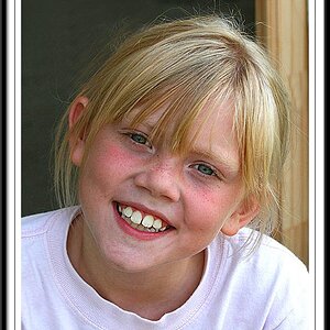
#3 #4 These are sr. pictures I did for my best friends sister, Used my Canon t4i, YN-565ex, 18-55mm, "household floor lamp" just starting out, did edits on PSE11... C&C please... (only have a few background options btw)
 I do this in my living room so space is very limited...
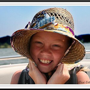


![[No title]](/data/xfmg/thumbnail/32/32945-a29b33c040ad72e4b783ea5e431cec65.jpg?1619735778)