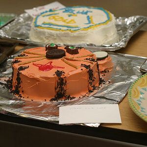
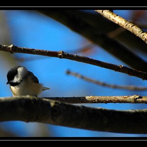
Err... Yuk.
I'll show you something, not because I think it's correct but because it's different, and only so you can see the visual differences.
Your histogram for this image:
View attachment 127669
It tells me a couple of things. that there is very little blue in the image that exists only in the deeper shadows, there is very little variation in luminosity for the vast majority of tones, (they're all clumped around the same narrow band in your histogram).
View attachment 127670
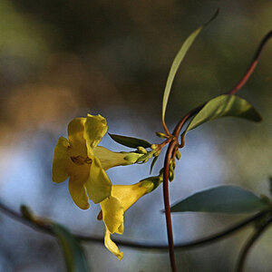
Compare the two flowers, above and below. Which flower looks more yellow?
The answer may surprise you a little. Actually the top one is more yellow. The yellows (the brighter parts) are pretty even in hue and saturation with saturation at about 86-87%. In the image below the saturation of the brighter yellows is between 63-73%.
So why doesn't it look more yellow? Because it's the differences in colour that we see that makes colour stand out and there's very little variation in either colour or tone on your image.
View attachment 127671



![[No title]](/data/xfmg/thumbnail/39/39440-bc17565eb7adee7f9859c53933e8543c.jpg?1734173530)
![[No title]](/data/xfmg/thumbnail/39/39442-c7791194bfea1b4d6bd382b004fb8488.jpg?1734173531)
![[No title]](/data/xfmg/thumbnail/39/39438-1eb8b5f82b59d9d0c72ae9025778ed4c.jpg?1734173528)

![[No title]](/data/xfmg/thumbnail/36/36966-71220579619c9a335442302fce0e57aa.jpg?1734169703)