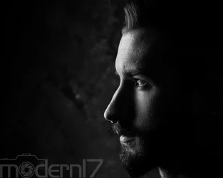
I like KmH's edit.
I guess I'm just so darned old-fashioned that I don't understand why, if the subject is mostly vertical, you have chosen to frame his portrait horizontally. Yes, there are those portraits in which a horizontal format is best, but IMO this is not one of those times. Hair too close to the top edge. Neck not showing. WAY too much space in front of his face. (unless of course, you actually need that much room for your watermark, then sure.
The one thing I cannot overlook is the eye shot side-on. The reflection is doubled here as a result of the extreme side view of his eye. If only he were looking at the camera, it might have been much better. A bit of eye contact and this might have been wonderful.








![[No title]](/data/xfmg/thumbnail/37/37136-40f690dc7da693c09d7c99c3782954b8.jpg?1734169835)

![[No title]](/data/xfmg/thumbnail/35/35966-4f59fb71a71adfe775ae568f8c534699.jpg?1734167835)
![[No title]](/data/xfmg/thumbnail/37/37930-501fdf314a05686acde53d9899f68091.jpg?1734171674)