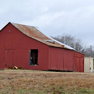
Looking for Feedback!

RigbyhasStripes

TPF Noob!
Joined
Jan 26, 2018
Messages
2
Reaction score
1
Location
Arizona
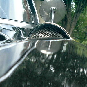
I'm new here, new to photography, and thought I'd get some constructive criticism on what I've been working on lately. Photo taken with nothing special... Panasonic DMC-TS20....:boggled:

Thanks for your time!
afterfocus_1518738453300.jpg
 
I like it. Good focus & DoF on the subjects, nicely-OOF background. Interesting contrast and contrasting colours.
 
Good use of leading lines, though I probably would have backed up or changed the angle such that I could have gotten all the lettering on the right. The shadow at the bottom is a distraction.
 
I like taking pictures of signs, too. I see the possibility for some cool textures going on here. I have a few comments:
  • To me, this doesn't work in the aspect you have it in. The subject is horizontal spanning the image, so square crop to me makes it slightly awkward.
  • Agree with smoke665, that getting more of the lettering in might be better for the overall image. A different angle might help, as well.
  • I see some fake blur/fake shallow depth of field going on here:
    • Fake blur/shallow DOF isn't bad if (1) it is correctly applied--i.e., it looks real--and (2) it makes sense for what you mean to convey
    • IMO, the fake blur here is overt, which detracts from the photo.
    • What was the reason for wanting a shallow DOF?
 
I don't like the fake depth of field on the image. Its quite obvious and rather distracting/unsettling. The image is in focus then goes out of focus then back in focus.

The sign is in focus then suddenly the pole/gate coming in from the left holding the sign is out of focus and yet the large rock that is behind that gate is in focus.
 
Thank you for all your feedback! Being a complete noob with photography, I completely missed a lot of what has been pointed out.
Good use of leading lines, though I probably would have backed up or changed the angle such that I could have gotten all the lettering on the right. The shadow at the bottom is a distraction.
I see what you're saying, and I will take that in to reference for future pictures I take of similar subjects.
I like taking pictures of signs, too. I see the possibility for some cool textures going on here. I have a few comments:
  • To me, this doesn't work in the aspect you have it in. The subject is horizontal spanning the image, so square crop to me makes it slightly awkward.
  • Agree with smoke665, that getting more of the lettering in might be better for the overall image. A different angle might help, as well.
  • I see some fake blur/fake shallow depth of field going on here:
    • Fake blur/shallow DOF isn't bad if (1) it is correctly applied--i.e., it looks real--and (2) it makes sense for what you mean to convey
    • IMO, the fake blur here is overt, which detracts from the photo.
    • What was the reason for wanting a shallow DOF?
A big reason for how this photo is later out would be that I really just took it on instinct; I framed the sign how I saw it in the moment and snapped away. In all honesty, depth of field wasn't even in my mind(HUGE newbie mistake), as well as a lot of what you all pointed out today.
Now, the blurring I did figure would get noticed as fake considering I used the AfterFocus app on my phone to edit the original image. The camera I currently have is really just a quick point and shoot Lumix (he says with slight embarrassment). Apologies for the fake aspects of the photo, as I have yet to find out how to get good focus and DOF out of it(if it even is completely capable). Apologies for not statung thes nuances earlier; I still am very grateful for the responses and expertise of this community as I continue to learn!
No need to apologize! You are open to learning, and that’s the best thing you can be!

There’s also no embarrassment in a point and shoot. You’ll find that many of us use point and shoots when we can’t or don’t bring our main cameras. I often use P&S while on vacation.

Shallow DOF on a P&S will be kind of hard.

Keep shooting and posting here for feedback!
 
I actually like leaving half of the sign out. In my opinion, it adds to the image, as the viewer must fill in the pieces. It's a more interactive and engaging style. But as I said, that's just my opinion, based off my own preferences.
 

Most reactions

Back
Top