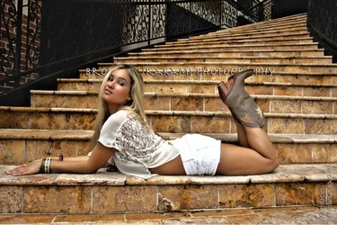
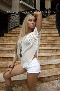
With respect to the first shot:
- I love the location. The curve of the stairs is great, and I think you exposed perfectly for the setting.
- The only problem exposing for the setting is that it looks like her bright white shorts are blown a bit. I'd try using the burn tool on the shorts, particularly her rear, to get the detail back and so the brilliant white doesn't draw your attention so completely.
- What I don't care for about this shot is, frankly, the model. Her pose is uninspired and her expression does nothing for me. She's also too centered (horizontally) - not much else you could do with her lying across the stair, but still. I would have like to see her sitting up, there are plenty of interesting sitting poses on stairs, and off to the left side of the frame. Putting her off center would make for a more interesting image than if she were centered, and putting her on the left side of the frame would make the curve of the stairs lead to her.
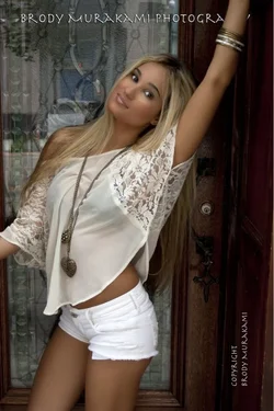
From your next batch (of four):
- I like the first one. Nice composition, nice lighting for using all-ambient. Her expression is meh, she seems a little uptight. (She seems that way to me in all of this bunch, almost as if she's trying too hard to be sexy when a relaxed expression would have worked better.)
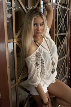
- There's a lot I like about this shot, it's almost a keeper for me. I like the location, that window is a great backdrop. I'm guessing you were shooting at a pretty wide angle, there's noticeable distortion in the lines of the window (look at the lean of the near and far vertical edges of the window). It doesn't bother me that her proportions are a bit distorted by it (her head looks relatively larger in this shot than the next two, for example), but it does affect the composition I would suggest. I would have recomposed, stepping or turning the camera to the right. If you could have had the near edge of the window actually vertical, I would use that edge as the edge of my frame (or maybe even move in a bit from that, so that the second vertical line - the one next to the model - is the first one you see in the shot, letting the thin panes run off the edge of the frame). Then you can have more room on the right, which a) moves her off center and b) allows you to not have to crop off her raised leg at the knee. I'd also suggest burning those window panes, particularly where this a bright, discernible reflection.
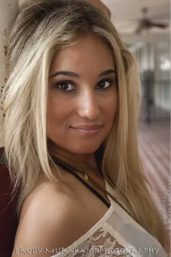
- Is that...? It is! The smell-the-armpit/duckface double whammy! Sorry, couldn't resist, but that alone would make this shot bin-able for me. From a technical standpoint this looks pretty good to me - nice use of the stairwell again, and nice lighting. Here you've filled the frame so well with her that I think having her centered works for this pose. I might have suggested a little more space on the bottom, you're cropping a little close to the knee, but that's minor.
- My favorite of her expressions, she looks relaxed here. I would suggest a slightly different composition, more to the left. Her head is pretty centered, but her body is to the left of the frame and facing out. Shift to the left a little - her head is off center (good) and her body is either centered or off-center facing into the frame. I'm not a fan of the fact that you've cropped off all four limbs. I think if you let her left arm hang down loosely, or keep it raised but have the forearm bent back over her head, you can still have the relaxed look but not crop that arm. Combined with a recompose to the left so that you maybe see what that arm is holding onto and a slight shift vertically (you're cropping pretty close to her knee) and I think it might have worked better.
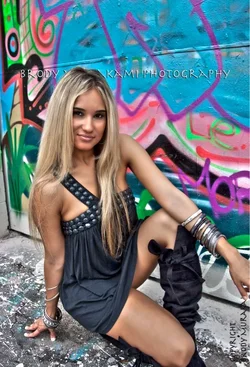
And for the HDR shot:
- I kind of like the model's expression and pose in this one, even though her right leg is bent back at just the right angle to hide her lower leg from the camera. I think this would have worked better in portrait orientation, or at least zoomed out a bit. I like the amount of the graffiti wall, particularly the big chunk of blue, but you've cropped off her fingers and toes (and come so close to her bent knee that it makes it hard to tell her leg is bent back under her and not amputated at the knee). Is it possible to get in and lighten around her eyes? For some reason I don't particularly mind the raccoon eyes in this shot, but I'd be curious to see it without them.
I hope you take this in the spirit it is given, of constructive criticism. There's a lot of the technical stuff you're doing well, some things I think you can improve (composition). And a lot of my points are directed at the model, but once you are nailing the technical aspects it falls on the photographer to also keep an eye on the artistic, such as directing the model and keeping an eye on / controlling wardrobe, hair (flyaway hair is a weak point of mine), etc.




 I really like it. And, I agree with everything WhiskeyTango said. The signature going through her head is awful. The boots distract. Barefoot would be better.




![[No title]](/data/xfmg/thumbnail/32/32162-dd2cfb373402c59de9c6f13cee73b0fb.jpg?1734161046)

![[No title]](/data/xfmg/thumbnail/32/32160-4e45e524b050f1afae9fd21bf696d61b.jpg?1734161046)