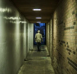
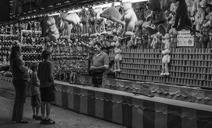
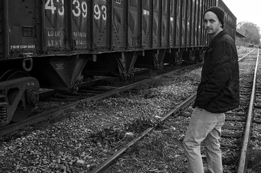
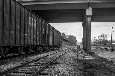
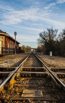
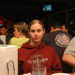
Difficult questions to answer without knowing what you are trying to do. As for "boring or even cliche", what fits in these categories for one person may not for another. For me, the last two aren't very interesting. Any time I see a set of tracks leading off to infinity, the image doesn't hold my interest. The third one has a figure on the tracks, which lends more interest, but I don't care for portraits with only the feet cut off. To me, if you're going to show almost all of the body, you should include the feet as well, otherwise viewers will be thinking about why you cut off the feet.
The first two are more interesting to me. In the second I might crop closer to make the people occupy more of the frame because their interaction seems to be what the image is about. Cropping the top would also get rid of that bright light. I'm not sure how much I would crop on the right because I like the sign, but my inclination would be to crop between the guy behind the counter and the sign.
Your processing seems pretty good, but again I don't know what you're after. The white balance on the first could be changed to a more neutral setting, but perhaps you want the contrast between the fluorescent light and the evening sky. Otherwise, you have good contrast and tonal range in the black and whites and good sharpness.