theraven
No longer a newbie, moving up!
- Joined
- Oct 16, 2012
- Messages
- 677
- Reaction score
- 102
- Location
- Stoke on Trent, Staffordshire, UK
- Website
- www.ravenphotography.co.uk
- Can others edit my Photos
- Photos OK to edit
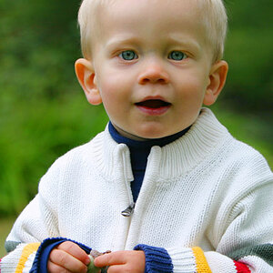
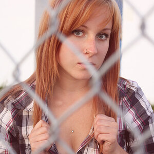
Am I headed in the right direction? Hints, tips and general help to improve much appreciated! First attempt!

Emz by Raven Photography by Jenna Goodwin, on Flickr
Emz by Raven Photography by Jenna Goodwin, on Flickr
")

![[No title]](/data/xfmg/thumbnail/34/34345-5642c495cae8d6c7bb83c28664146cf1.jpg?1619736381)