
- Joined
- Oct 16, 2012
- Messages
- 14,632
- Reaction score
- 7,562
- Can others edit my Photos
- Photos OK to edit
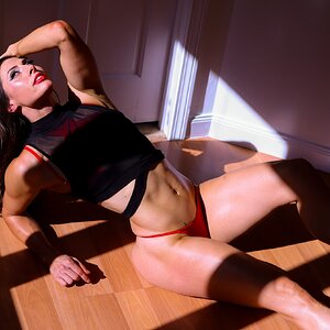
Thank you. I actually tried to make it so the beard was a main focal point, but didn't want it to overshadow the model completely.The beard was the subject; great beard
Sent from my iPad using Tapatalk
Did he keep having to say "my eyes are up here!".


![[No title]](/data/xfmg/thumbnail/37/37104-99933b18ee16678a8299f12747336d48.jpg?1619737882)
![[No title]](/data/xfmg/thumbnail/34/34064-66d345cd6eebe4b9f97597e03008d3b7.jpg?1619736260)