What's new

Michael Jackson Tribute - Too Much?

Lazy Photographer

TPF Noob!
Joined
Jul 4, 2009
Messages
648
Reaction score
5
Location
Toronto, Canada
Can others edit my Photos
Photos OK to edit
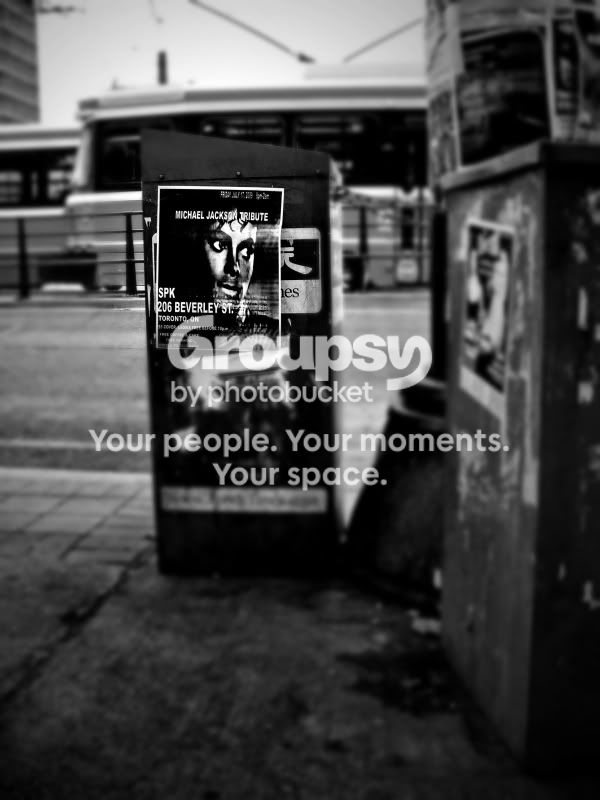
I shot this a while back and only tonight got to playing around with it. I like it, but it's a bit radical even for me. Be great to hear what others think of it. Thanks.
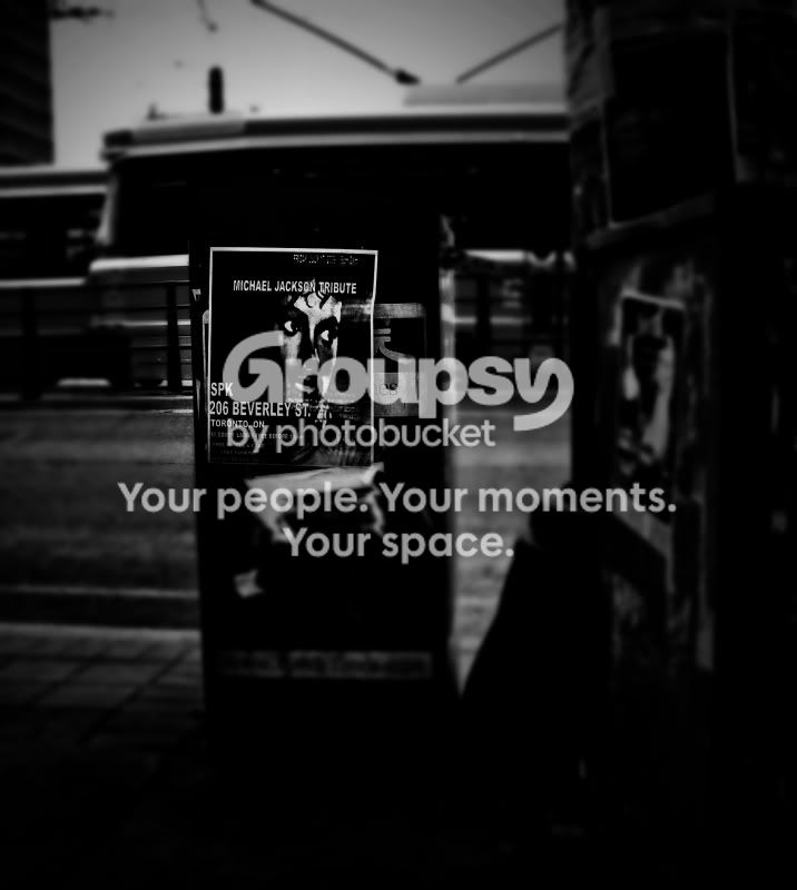
BloorStWest-136-EDIT3-1.jpg


P.S. I'm not a MJ fan but liked the subject.
 
Even if i loved MJ i would still not like this photo.
 
Waaayyy too dark.

Why are you doing a tribute to MJ, did something happen to him?
 
I suspected as much. I was just playing around trying to get his eyes to stand out or something. I wanted the photo to look dark and almost sinister. Here's another kick at the can. Loses a bit of what I was trying for. Or maybe it's just a lost cause. As for whether or not one loves MJ I don't think that really applies to the photo, does it? Oh, I should point out I'm not doing a tribute to anyone, especially not him. The title is based on the copy on the poster.

BloorStWest-136-EDIT4.jpg
 
I kinda like the first one better. It made the poster pop and overall looked more dramatic to me, but I am new to photography so it may just be my newb eyes.
 
See, someone's getting it! :)

Dramatic. That's exactly the word I was looking for. The second one, to my newbe eye, allows the viewer to see too much going on around the poster. The first looks like it belongs in a Japanese horror flick.

But your mileage, as always, may vary.
 
I do think that the first one could use a bit of detail on the sidewalk below the poster. The shadow looks a little harsh. Not much, just enough to bring out a tiny bit of detail...


I agree with you that in the second one there is too much detail. It also kinda looks like the poster is floating...
 
IMO #2 is better but it still looks odd. Did you blur the area around the poster. Sorry It looks fake too me.
 
#1 is good, but I like dark moody pics.
 
IMO #2 is better but it still looks odd. Did you blur the area around the poster. Sorry It looks fake too me.

Yeah, I did blur around the poster. You're right, it is dialed up, so to speak.

Thanks everyone for your comments and criticisms. I ended up posting a modified colour version of #2 on my blog, if anyone's interested.
 
This looks odd because you blurred everything on the same focal plane as the poster, which is not logical.
Also, the blur is even across the entire image. Your treatment makes the poster look composited in, and floating. Also, you left a post on the railing to the left in sharp focus. Which visually brings it to the same plane as the poster. Which is again, visually illogical.
 
Yeah, isn't it GREAT!!! :)

Joking aside, here's the thing: When your only tool's a hammer, every problem looks like a nail. While I do have Photoshop on my computer, I still haven't spent time trying to figure it out, so I'm using ACDSee to edit my photos, which doesn't really allow for much in the way of advanced options. Plus, and this is the real important part, I don't know what the hell I'm doing half the time. :)

I do see what you mean about the poster "floating," though. And I never noticed the railing post focus. I'm sure in the hands of a savvy Photoshop user the outcome could have been much better.

Thanks for your technical critique. One day I'll revisit this photo and try to fix 'er up a bit.
 
Q: How does Michael Jackson pick his nose?
A: From a catalogue.

Q: What has 18 balls and 3 pubic hairs?
A: A Michael Jackson slumber party.


Too much???????? :)
 

Create an account or login to comment

You must be a member in order to leave a comment

Create account

Create an account on our community. It's easy!

Log in

Already have an account? Log in here.

Back
Top Bottom