Misty lake + rowboat - C&C welcome

Flush

TPF Noob!
Joined
Sep 14, 2008
Messages
4
Reaction score
0
Location
Stockholm, Sweden
Can others edit my Photos
Photos OK to edit
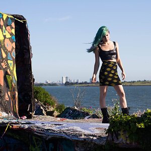
Okay, I'll let this be my intro post as well. I've been a member for quite some time, but have only been lurking actively for a few months,
ever since I became really interested in photography. Also, I'm swedish, so please go easy on my english skills. ;-)

I haven't asked for any constructive criticism on any of my photos before. I figured I'd pick something recent that I'm pleased with,
to make the critique sting a bit more.

So what's good, what's not? Tips on composition, lighting? How could it be improved? Any comments are greatly appreciated!

mistyf.jpg
mistyf.jpg


I'm aware of the motion blur. It was dark and windy. Shot with nikon d7000, shutter 3s, f/5.6, ISO 200.

Be harsh if you must, I'm here to learn. Thanks!


EDIT: Oh, and by all means, go ahead and edit it to your liking, as long as you show me the result. :)
mistyf.jpg
 
Last edited:
Whats good? I like the composition, the lighting and even the motion blur.

What's not? Ummm, can't see anything that I don't like! Initially, I wondered if the orange buoy on the right was distracting but, looking at it on my screen it makes a nice triangle with the lights. I think it's a winner :thumbup:
 
Firstly, great shot.

I'm torn as to whether or not I'd get rid of the lit windows (and whatever that is on the right side). On one hand, when executed well...the shots that look all dark and moody like this, but with a building/house that has warm glowing windows...can really work well. They tell a story and that makes for successful images. And I think that this image does have some of that feel to it.

On the other hand, I think that because we can really only see the windows and not the houses around them, the windows don't tell the story as much. But because they are still so much brighter than the rest of the image, they draw a lot of attention. I'd think that if you darkened them (or just got rid of them), the whole image would take on a different feel and the dock/pier (not to mention the mood) would take more of a lead role in the image.
 
Thank you for the insightful comment, Big Mike!

I hadn't even considered the windows before, but I think you're absolutely right. I tried getting rid of the windows and the red floating thingy, and now the image has a
more serene feel to it. Maybe tranquil is the word I'm looking for. And I agree with what you said about seeing the houses around the windows. A warm, cozy cottage would
have told a totally different story. Only seeing the windows feels like something in between that ends up detracting from the feeling of...well, tranquility. (streaming my consciousness here)

Here's the image without windows and red floating things:
misty2.jpg

 
Last edited:
I'm glad you liked the edit. :)

I guess I might as well upload the b&w version too, then.

 
now that it is b&w, you can put back the orange buoy LOL JK. I like the b&w better.
 
I liked the photo but taking away the windows and buoy works much better - my favourite version is the B/W.
 
I don't dis-like the B&W version, but I think that the blue version coveys the tranquil mood much better. And yes, I think the first edit (windows gone) works very well.
 
I like the original image very much; actually i liked the orange light at distance because it adds some enigma.... also it brings some 'warmth' to an otherwise 'cold' image; but the orange dingy is a disturbance.... even though black and white removes the feeling of the image, it is also very powerful
 
I think they all work, although the second probably conveys the mood best. The first with the red light closest to the center dimmed a bit would also work well. The bw is also good, but the sky and foreground need to be a little darker.

BTW, your English is better than that of many native speakers on this forum, so stop apologizing for it!
 
I like this photo quite a bit but only the first (or original) version. Sometimes you just have to go with your gut feeling.

Asking others' thought about the creative side of an image will only give a whole bunch of different edits, none of which may be any better than what your mind's eye saw in the first place. In this case I don't think the edits are as strong and the B&W I actually find kinda boring.

I don't like the B&W nearly as much either, but it's a quick edit so I gave it a go.

I'm still quite new to photography and so far I've just concentrated on the technical aspects of it. As I said earlier, I hadn't even thought about how the lights affect the mood of the image. When this was shot, I was concentrating on keeping the ISO low and giving the lake a soft look by having a long shutter speed. And tried to compose it nicely, of course. Not much more.

So getting all this artistic feedback is not what I was expecting, but it's great, very refreshing. Shooting manual has made me think of photography in numbers, it might be time to start going a bit further. So far all my edits have been done in camera raw to adjust contrast, white balance etc. My idea of a good photo has been one that is technically correct.

Time has come to unleash the creative powers of a repressed soul. This thread marks the beginning of a new era.

Seriously though, thanks for taking the time to comment.
 
Anyway you look at it you have a nice image here. I do prefer it without the lights. Nice work.
 

Most reactions

Back
Top