What's new

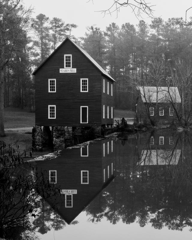
Misty Mill

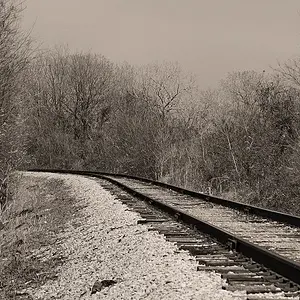
When I saw the snapshot, I got this impression...
View attachment 131592
I'm going to be blunt: Ugh!

IMO, the reflection is absolutely key to this image and cropping that out destroys most of its impact. The sepia-esque treatment and contrast increase has also resulted in blocked shadows and loss of details. If one wanted a more traditional crop (4x5), than I would suggest something like this:
Mill.jpg
 
As for the metal print, I've had some done by Adoramapix and they came out very nicely. I do agree that the contrast should be bumped a bit as this could turn out a bit flat on metal. Adoramapix offers four finishes: glossy white, white satin, glossy silver, and silver satin. I think one of the silver finishes could look nice with this shot to bring out a bit of luminescence in the sky and help give it a more dimensional feel.
 
I like the edit by @tirediron the bump in contrast really makes it pop. As he pointed out the reflection on the mill is an important part of the image but I'm not sure that the treeline reflection in your original isn't important as well. Would be nice to see your original crop with the increased contrast for comparison. In any case you have the makings of a great capture.
 
I like the edit by @tirediron the bump in contrast really makes it pop. As he pointed out the reflection on the mill is an important part of the image but I'm not sure that the treeline reflection in your original isn't important as well. Would be nice to see your original crop with the increased contrast for comparison. In any case you have the makings of a great capture.

^^This. I like the original crop. The reflection is important, but so are the lines of the shore. The composition is not the issue. The black point is fine, but I think the highlights need to be bumped and the midtones are a bit muddy. That's what makes the right side of the image feel flat, making the left side with the building, which has more tonal range, feel heavier.

I like those wisps of branches on the top right corner - they help balance and frame the shot. I'd try to bring them out a bit more. I wish I knew the best way to do that, but I'm not skilled enough in software processing. My first thought would be to go in close and use the burn tool just a touch on a few of the branches. I just don't know how useful that thought would be ;)
 
I like the edit by @tirediron the bump in contrast really makes it pop. As he pointed out the reflection on the mill is an important part of the image but I'm not sure that the treeline reflection in your original isn't important as well. Would be nice to see your original crop with the increased contrast for comparison. In any case you have the makings of a great capture.

^^This. I like the original crop. The reflection is important, but so are the lines of the shore. The composition is not the issue. The black point is fine, but I think the highlights need to be bumped and the midtones are a bit muddy. That's what makes the right side of the image feel flat, making the left side with the building, which has more tonal range, feel heavier.

I like those wisps of branches on the top right corner - they help balance and frame the shot. I'd try to bring them out a bit more. I wish I knew the best way to do that, but I'm not skilled enough in software processing. My first thought would be to go in close and use the burn tool just a touch on a few of the branches. I just don't know how useful that thought would be ;)

Yep! I don't actually like my crop better than the original, but it was the only way I could see to crop that image into a traditional print size without ruining (IMO) utterly.
 
Exactly what I was looking for, it was an image that came to mind from an old text book in grade school that I was looking to demonstrate to other members, as I said it is what I was reminded of when I saw the original pic., not what I think should be done with the original pic, so I guess I agree and disagree. :)
 
I thought
When I saw the snapshot, I got this impression...
View attachment 131592

i would delete whatever bizarre set of instagram filters you used on that otherwise nice photo.
instagram was a website, not a filter set, live and learn. I obviously don't use that site or filters but I guess you must or you wouldn't know about them either. :) I use other software for editing though. The edits I did were to show what I was reminded of, I don't see how anyone thought otherwise when my post said as much, lol I suppose a lot of people don't read the text all the time.
 
Thank you for all the comments. I appreciate the input. I see the need for increased contrast and will adjust it accordingly.
I like the original framing. That was on purpose. I know it's weighted heavily on the left with the barn, but also take into consideration the trees and their reflection on the water as the "entire body" and symmetry of the composition. Do you find your eyes focusing on the barn first and then drifting to the right finding the stream? If you say yes, then I did well as an artist.
I believe that when I saw this photo through the lens, the misty swamp really added to the story of the photo. It was a really misty/foggy day, and I wanted to do my best in showing this. @tirediron, that is a really nice crop. I do like it. It could stand on its own, but I also think there is a piece of the story being cut out.
This barn is very heavily photographed in my community, so I enjoyed catching it in a rare, new atmosphere.
 

Create an account or login to comment

You must be a member in order to leave a comment

Create account

Create an account on our community. It's easy!

Log in

Already have an account? Log in here.

Back
Top Bottom