What's new

Mother and Daughter C&C Welcome

CMfromIL

No longer a newbie, moving up!
Joined
Oct 11, 2011
Messages
710
Reaction score
132
Location
Illinois
Can others edit my Photos
Photos OK to edit
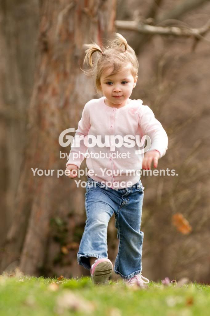
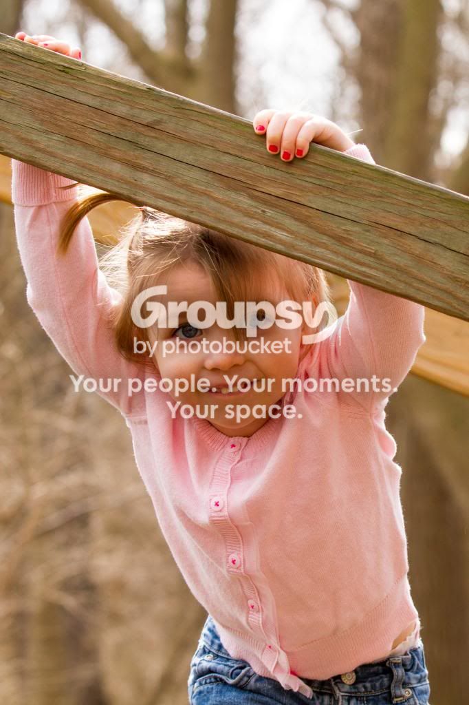
Took a few portraits this weekend, thought I would post a few up for suggestions.
Originally we had planned this a couple of weeks earlier, but due to bad weather pushed it to this weekend.
After further review, I think I would have best done them around 8am, or maybe 4pm. And it was windy. Like 20mph gusts, with sustained winds of 10-15. Hair was everywhere. The lighting was pretty bright. The little girl was delightful, but took some serious time to warm up. We started with a few 'posed' pictures but she wasn't too thrilled with that idea (#1). The rest we worked out on the fly.
I ended up taking a majority with my 70-200, but at the end I used my 50mm.
Thanks for suggestions to improve.
1. The session started.
AbbyandLilly6_.jpg

2. Walking to the next area.
AbbyandLily4.jpg

3. At the bridge
AbbyandLily9.jpg

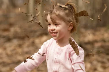
4. She wanted to throw leaves in the air. So she did.

AbbyandLilly11.jpg

5. We finished with bubbles.
AbbyandLily21.jpg

6. All done.
AbbyandLilly24.jpg
 
Last edited:
Nothing? Come on, I'm not that good. No tips for improvement? Thanks for any suggestions or comments on things that worked well.
 
#2 is my favorite of the set. Overall, they're a nice group, but all could do with a little fill.
 
Watch them thur highlights on #1 and #2.

I like the one with the leaves and the last one the best, although I do wish that the last one wasn't quite so tight.
 
I dunno...I've looked at these images, and it seems almost like the color depth is not sufficient...almost as if some kind of compressing of the color range has occurred somewhere in the imaging chain. The color does not look like it's quite optimized...it seems, well "compressed"...there doesn't seem to be as much depth and richness and tonal variation as I would expect. Tirediron mentioned that these could use some fill light, and I think that normally, that might be what photos made in this kind of light could easily benefit from...but...there's something I cannot quite put my finger on. What mode are you shooting to??? sRGB? Are you assigning an sRGB profile for web display? DO these look vivid and saturated to you in your image editing software, but perhaps not so vivid and rich when seen in your browser?

Overall, the windy conditions are going to play havoc with HAIR, first of all; the shot of the wind-blwon leaves and the bubbles being blown with the wind's direction--both excellent ideas. The child running, cute, the mom and kid on blanket at the bottom of the set, okay, workmanlike. Not every shoot comes together ideally--gusty wind and 10-15 MPH steady....meh...I don't like that kind of weather.
 
I dunno...I've looked at these images, and it seems almost like the color depth is not sufficient...almost as if some kind of compressing of the color range has occurred somewhere in the imaging chain. The color does not look like it's quite optimized...it seems, well "compressed"...there doesn't seem to be as much depth and richness and tonal variation as I would expect. Tirediron mentioned that these could use some fill light, and I think that normally, that might be what photos made in this kind of light could easily benefit from...but...there's something I cannot quite put my finger on. What mode are you shooting to??? sRGB? Are you assigning an sRGB profile for web display? DO these look vivid and saturated to you in your image editing software, but perhaps not so vivid and rich when seen in your browser?

Overall, the windy conditions are going to play havoc with HAIR, first of all; the shot of the wind-blwon leaves and the bubbles being blown with the wind's direction--both excellent ideas. The child running, cute, the mom and kid on blanket at the bottom of the set, okay, workmanlike. Not every shoot comes together ideally--gusty wind and 10-15 MPH steady....meh...I don't like that kind of weather.

To my untrained eye, it almost likes like slightly faded prints made from film.
 
Thanks Derrel for your comments. I shoot in RAW and process in LR4. I do save it to sRGB in LR4. I hadn't bumped up the vivid and saturation a bunch, so I tried another shot:

ColorAdjustment-1.jpg


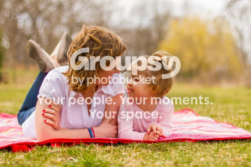
Unfortunately the mother daughter shot in #6, I don't have any more side room for fill.
 
#4 is my favorite! All around I think they are great images!
 
I think #2 is the best of the lot.
The rest look sort of 'unfinished.', not particularly well framed, un-managed highlights, composed for 4 x 6 (and not the more standard 4 x 5 here in US.)
The vivid bump-up didn't make it better, imo.
 
Derrel isn't talking about color vibrancy, I don't think. these have a look like they're being rendered on a device that doesn't have ENOUGH colors, so things are being rendered slightly off.

The ones of just the kid are all super cute. For more coherence in the set, you could try to get them to look more the same color, in some the color temperature seems quite different (well, moderately different) from some of the others, for no particular reason.

The ones of mom, she looks sort of unflatteringly reddish. You could try simply desaturating a bit, you would get a less vibrant look but the colors might render better in a more muted color space, and things like unflatteringly reddish skin tones are naturally reduced.

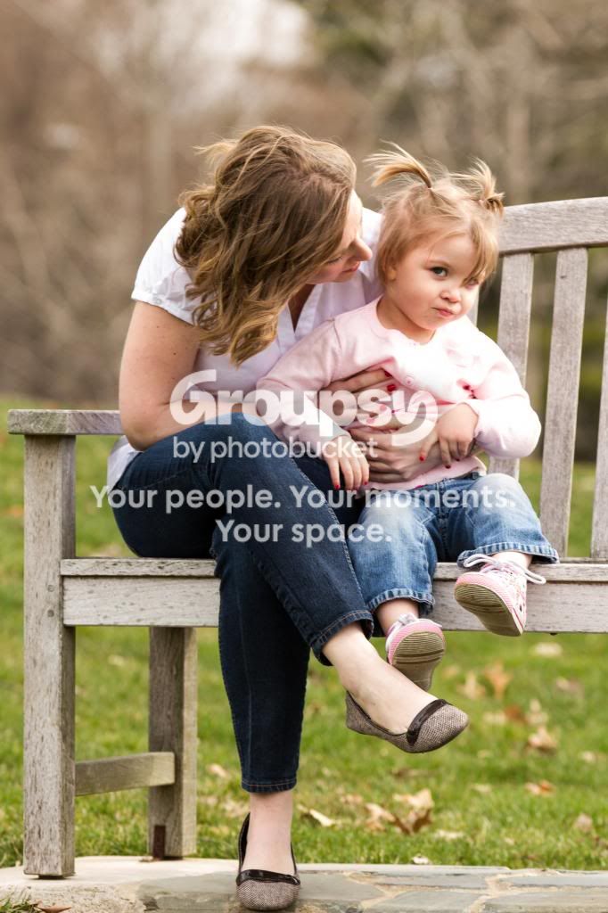
The two mom&daughter shots are mostly marred by the fact that nobody looks very comfortable in them. The last one is a super cute pose, with mom and daughter cocking their heads at the same angle, but they both look like they're sort of awkwardly posing. You're much better with the candids than the posed shots (naturally - getting "natural looking" posed photographs is HARD and mostly about rapport with the subject, not photographic know-how).
 
Derrel isn't talking about color vibrancy, I don't think. these have a look like they're being rendered on a device that doesn't have ENOUGH colors, so things are being rendered slightly off.

How is this resolved? I'm not quite sure exactly how to correct what you are suggesting. Do I need to be using a different computer? Or a different program? As stated I'm using LR4.

Thanks for any help.
 
I think #2 is the best of the lot.
The rest look sort of 'unfinished.', not particularly well framed, un-managed highlights, composed for 4 x 6 (and not the more standard 4 x 5 here in US.)
The vivid bump-up didn't make it better, imo.

Thanks Traveler. One question though, I assume when you say composed for 4x6 you mean the cropping? Why would I crop for a 4x5 when standard print size is 4x6 or 5x7? Wouldn't that lead to issues when printed?

Thanks, and sorry if I'm asking a novice question but I've never had that comment before.
 
Honestly, I have no idea! I don't really know what the problem is, if indeed there is one. The colors just feel.. squeezed and off, somehow.

A couple things you could try to see if you even agree with me:

- create a duplicate layer and blur it slightly, this will "mix things up" and may smooth out the color palette. I think the colors look better, though of course now the image is soft. Try setting this layer to quite translucent, so your image still looks pretty sharp, and see if you like the colors any better.

- desaturate quite a lot, which to my eye does in fact unsqueeze the colors a bit.

The attached does both:

$foo.webp

I shan't be offended one bit if you decide that I'm just nuts. Derrel may weigh in with a more technically useful answer!
 
Thanks for the suggestions. I think in the future, I have certainly learned a couple of things. 1. White isn't the best color choice (or light pink) on very bright days. I'm having a hard time with exposure and not blowing out the highlights, and with color control. 2. Don't 'squeeze' the frames. I have shot a lot of sports in the past, and I think I translated much of that experience into this shoot. Where a tight shot on a player is great, not so much on a nature shoot. 3. Wind sucks.

Incidently, initial feedback from the mother on 1 shot I sent her as a preview has been very positive. I think I'm going to be harder on myself/pictures than she is. I have lots to work on, thanks for the tips again!
 
I think #2 is the best of the lot.
The rest look sort of 'unfinished.', not particularly well framed, un-managed highlights, composed for 4 x 6 (and not the more standard 4 x 5 here in US.)
The vivid bump-up didn't make it better, imo.

Thanks Traveler. One question though, I assume when you say composed for 4x6 you mean the cropping? Why would I crop for a 4x5 when standard print size is 4x6 or 5x7? Wouldn't that lead to issues when printed?

Thanks, and sorry if I'm asking a novice question but I've never had that comment before.

If you compose for 4 x 6 then when you try to print larger (8 x 10) you will be cropping off important stuff.
 

Create an account or login to comment

You must be a member in order to leave a comment

Create account

Create an account on our community. It's easy!

Log in

Already have an account? Log in here.

New Topics

Back
Top Bottom