LCLimages
No longer a newbie, moving up!
- Joined
- Mar 27, 2014
- Messages
- 354
- Reaction score
- 311
- Location
- Missouri
- Can others edit my Photos
- Photos OK to edit
Shooting at f/1.8 (as in #3) can make it very easy to miss the focus, because the plane of focus is so shallow. Unfortunately, once you miss focus, there's not much that can save the shot.
All of the below is JMHO and YMMV ;-) And if you know the information already, sorry for repeating it
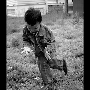
TBH - the comp on all 4 of these look like you put the camera to your eye and pushed the button. They all have a snapshot feel. I would suggest reading some information on composition. I started out in photography taking pictures of my kids. After I learned how to work my first dSLR, and how to change aperture/shutter/ISO, I fiddled around for a while just pushing the shutter button (and hanging out at f/1.8 all the time until I decided there aren't many real life situations where f/1.8 is useful). Once I started really, consciously putting an effort at paying attention to where my subject is in relation to the light and background, I started getting a lot more keepers from my kids' sessions, and also started to find it MUCH easier to notice things like trees in the background that appear to be growing out of subjects' heads, etc.
Some guidelines I've learned to follow...
I hear "portraits should be portrait orientation" all the time but I do break that one or keep a horizontal one myself at times, for various reasons, but generally that's a pretty good idea.
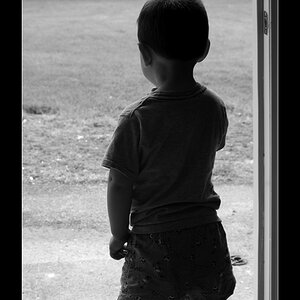
Eyes in a frame... if the subject's eyes are looking one way in a frame instead of at the camera, leave space in that side of the frame, or show that they're looking at something. Don't let their eyes look "out of the frame."
The Rule of Thirds -
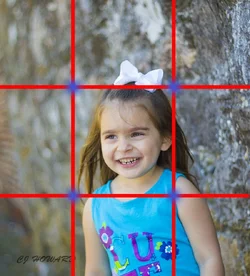
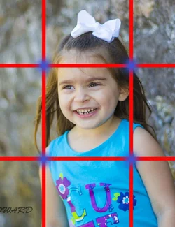
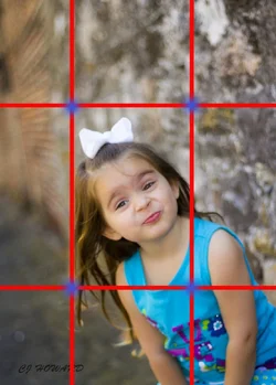
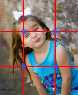
Generally you want the important parts of your image - for example the eyes of the person in this case - in or close to the thirds of the image. Of course there are times to break this, for artistic purposes, but in shots like yours, where the girl is the subject and nothing else really is, the composition is more pleasing to the eye without a bunch of negative space. When a viewer scans the image, a lot of unnecessary negative space leaves the viewer's brain a bit "lost" if that makes sense. I played with your girl's images... drew rough grids and re-cropped to show how the new crops follow this idea and why they are more pleasing to look at. Nothing scientific or exact about these
All of the below is JMHO and YMMV ;-) And if you know the information already, sorry for repeating it
TBH - the comp on all 4 of these look like you put the camera to your eye and pushed the button. They all have a snapshot feel. I would suggest reading some information on composition. I started out in photography taking pictures of my kids. After I learned how to work my first dSLR, and how to change aperture/shutter/ISO, I fiddled around for a while just pushing the shutter button (and hanging out at f/1.8 all the time until I decided there aren't many real life situations where f/1.8 is useful). Once I started really, consciously putting an effort at paying attention to where my subject is in relation to the light and background, I started getting a lot more keepers from my kids' sessions, and also started to find it MUCH easier to notice things like trees in the background that appear to be growing out of subjects' heads, etc.
Some guidelines I've learned to follow...
I hear "portraits should be portrait orientation" all the time but I do break that one or keep a horizontal one myself at times, for various reasons, but generally that's a pretty good idea.
Eyes in a frame... if the subject's eyes are looking one way in a frame instead of at the camera, leave space in that side of the frame, or show that they're looking at something. Don't let their eyes look "out of the frame."
The Rule of Thirds -
Generally you want the important parts of your image - for example the eyes of the person in this case - in or close to the thirds of the image. Of course there are times to break this, for artistic purposes, but in shots like yours, where the girl is the subject and nothing else really is, the composition is more pleasing to the eye without a bunch of negative space. When a viewer scans the image, a lot of unnecessary negative space leaves the viewer's brain a bit "lost" if that makes sense. I played with your girl's images... drew rough grids and re-cropped to show how the new crops follow this idea and why they are more pleasing to look at. Nothing scientific or exact about these



![[No title]](/data/xfmg/thumbnail/38/38263-ad5e4c9e677626ddb5b1e7cdf9ebe40e.jpg?1734172152)