C&C per req:
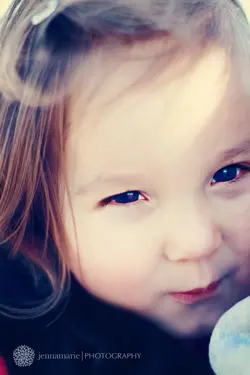
1. Not fond of this composition. The focus appears to be somwhere other than the eyes, which have been seem to have been processed so much that the pupils appear blue. The large, blue object lower left is very distracting, and the skin has almost no detail. This looks like something shot wide open with a 1.4/1.8 (I can't verify EXIF at the moment). Just because you have lens that opens to 1.4 or 1.8 doesn't mean you should shoot it there.
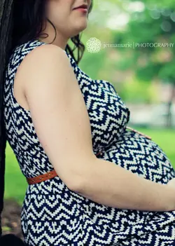
2. Generally the object of materinty photography is to show off the pregnancy to advantage. In this case you've "amputated" it with this crop. Additionally, while it is acceptable to crop limbs if necessary, one should NEVER do it at/near a joint (wrist) or along a lateral axis. I also don't like the 'half a face'.
3. This is a cute idea, but I find it over-saturated and the highlights on the pink trousers are far too hot, and there is almost no detail in the socks/shoes. Additionally, the awkward crop of her right knee is disconcerting.
4. This is a cute shot; I think if it were leveled and had some of the empty space image left cropped it would be much stronger. It does need to go back for a rework on the conversion however; your whites are blown and many of the shadows too deep. Did you use any supplemental lighting here? A single OCF low and right would have helped immensely.
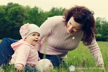
5. Not bad; the strongest of the group IMO. Unfortunately, once it's leveled, I think that the child will lose her right finger tips.
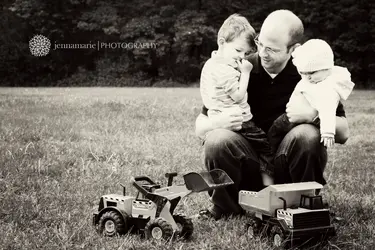
6. I do not understand why you have the child fully image right and cropped to the point of losing most of her left arm, yet have all the dead space image left. Additionally, the highlights here appear BADLY blown especially on her had and right sleeve.
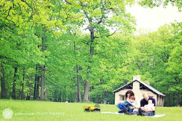
7. This one doesn't work for me at all. There are basically two ways to approach an image like this. One is with the subjects occupying the bulk of the image, and the other with the scene occupying the bulk of the image. In this case you've got sort of half-way between, and given that the scene is rather uninteresting (ie no grand scenic view) I don't feel it was the right choice. Additionally, the image leans, suffers from a blown sky, and their placement in front of the house gives the whole image an odd perspective.
Overall, these aren't bad shots, but they all have issues, most of which should not be present in professional-quality work. Things such as a blown sky or tilted horizon are not acceptable. I understand you're claiming artistic license as far as composition and processing, but to be perfectly frank, I'm not sure yet that you understand enough about the rules to break them in quite such a cavalier fashion. I would strongly recommend seeking out a mentor, and a position as a second-shooter for a year or two to hone your skills. Best of luck!
Just my $00.02 worth - your mileage may vary.
~John
")


![[No title]](/data/xfmg/thumbnail/33/33025-0e4fc16dd87a477880f7aa74466d4f56.jpg?1734163021)


![[No title]](/data/xfmg/thumbnail/33/33342-79274d7e5cdf3e52939255e1cd89f2d0.jpg?1734163237)


![[No title]](/data/xfmg/thumbnail/32/32006-4103e122cb8d7b8d8e41a423124446b7.jpg?1734160802)

