My first model from Model Mayhem....C&C Requested!!

NCAFLeo88

TPF Noob!
Joined
Oct 21, 2010
Messages
210
Reaction score
4
Location
Charlotte, NC
Can others edit my Photos
Photos OK to edit
What happened to his skin tone in #2?

He looks like he has BOOBIES in #3 :lol: I'm sorry... I can't help thinking that. It was the first thing I saw in that one. :lmao: The way he's sort of hunching over and facing straight forward... I dunno what it is... but it looks like he got implants. :lol:
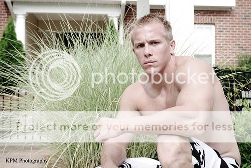
Background in #4 is no good.

#5 is probably the best one IMO, because he looks like he belongs there. :lol:

I don't like the pose in number 6, the colors, how everything is blown out, etc.

I don't like the houses in #7 either. Your WB seems off in this one too.
 
What happened to his skin tone in #2?

I just dropped the saturation way down. Just liked the effect that it had on this particular pose.


#5 is probably the best one IMO, because he looks like he belongs there. :lol:

Yeah lol. He is a total gym rat.

I don't like the pose in number 6, the colors, how everything is blown out, etc.

Yeah, this one was really blurry, so instead of throwing it out, I tried to be a little artistic with it. Did I fail?

I don't like the houses in #7 either. Your WB seems off in this one too.

Yeah, we were shooting at an apartment community. I do see now that the colors are off. I'll fix that one. Thanks!
 
Your main problem;
The location.

#5 is BY FAR the best one.
The ONLY thing I would do to it would be crop it tighter to take some ceilling out.

the rest, you should have used a larger aperture (f2.8 for example, if you could.) in order to blur the background but keep the model Sharp, this would make the location problem slightly more obsolete.

The PP you done on #2 and #6 don't work well, #2 pp has potential mind you if you kept a little more saturation within the image.

#7 and #4 just looks a little bit snap shot-ish

#3, as erose said, looks like he has boobs, it is also a bit blurry looking.

#1 would have looked MUCH better (although it looks alright) if you just used a larger aperture.

Edit:

Just done a quick edit to #2, hope you don't mind (if you do I'll take it down)

Untitled-3.jpg


I done;
I used curves to clip the blacks, this added a tad more definition in his muscles, i then dragged the curve up to brighten the image (to compensate for clipping the blacks) I set the opacity of the adjustment layer to 60% to reduce the effects.

I used Vibrance and increased to 50 to bring out the colours a little more (vibrance is weaker than saturation)

I bumped the contrast up to 25 just to get a bit more definition

I then used a black and white gradient mask to get a bit more contrast again and set it to luminosity so it only affected the light levels.
I then set that layer to 60% too, in order to reduce the effects.

I grouped these into the 1 folder / group then set an overall opacity of 60% to it all to reduce the effects again as not to over-do the effect.
 
Last edited:
Yeah, this one was really blurry, so instead of throwing it out, I tried to be a little artistic with it. Did I fail?
Never try to "be artistic"' with a blurry photo. Just throw it out. The old adage "**** in, **** out"Comes to mind. Also, "You can't polish a turd" XD
 
#5 is the only one i like. You should have either blown out the window, or expose the window with more flash. Nothing in the middle!
 
#4 is my pick for a shot but it has problems:

Subject is not sharp,
Should have more space in front of subject , not behind,
Keep his feet & lose the space above his head,
Way too much depth of field.
 
Raccoon eyes (dark eye sockets) in almost all of them. Investigate fill light, posing, subject separation from background, and what makes a model photogenic, because that model isn't photogenic.
 
# 5 is the best in my opinion I can see it in a Men's Health Magazine. I'm just a beginner myself but your WB is off in a few of the photos. Please forgive me, but # 6 is a little corny and I don't particularly care for the cropping in it, but excellent choice on the model he is pretty hot.
 
Yeah, this one was really blurry, so instead of throwing it out, I tried to be a little artistic with it. Did I fail?
Never try to "be artistic"' with a blurry photo. Just throw it out. The old adage "**** in, **** out"Comes to mind. Also, "You can't polish a turd" XD
Mythbusters would like to disagree with that turd saying. They actually did polish a turd and it looked really shiny.
 
I was in starbucks and clicked on this thread not knowing it was a shirtless dude and the guy next/behind me was screen creeping on me 100% at the time, im assuming he didn't know i was browsing a photography forum but i guess now he thinks i was browsing a beefcake forum hahaha weird. Oh well, i got a kick out of it.

-Nick
 
I like the background in #3, but I think the pose could have been a little different. I like #5 a lot, but that bright light in the left window is kind of distracting. Maybe just keep on eye out for better backgrounds too =D
 
Some where on here are the 25 rules for portrait photography ........... the first two he seems to be slumped over ... but over all they look good !
 
I like #5 a lot, but that bright light in the left window is kind of distracting. Maybe just keep on eye out for better backgrounds too =D

Would a UV Filter cut down the problems with a blown out background like that? I've been having issues with that and I don't know how to fix it. If the background looks right, the model is underexposed. HELP!!
 

Most reactions

New Topics

Back
Top