My first photoshoot.

DoshKel

TPF Noob!
Joined
May 4, 2007
Messages
111
Reaction score
0
Location
Florida
Can others edit my Photos
Photos NOT OK to edit
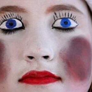
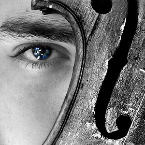
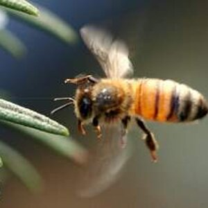
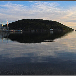
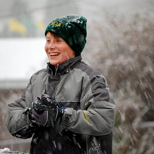
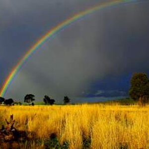
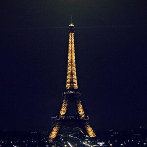
I went out and did a small photoshoot. It was really just practice. Non-paying and stuff, and I really only got these 11 shots that I really liked. Tell me what you think. I edited them a little, but I don't know how to use GIMP very well and I don't have Photoshop. Just messed with the levels and sharpness.

1)
3001545774_4e8f0ae005.jpg


2)
3000706353_ed0bdc573a.jpg


3)
3001543156_4274833b4e.jpg


4)
3001541624_ee89bb19b9.jpg


5)
3001540056_67d17c46d7.jpg


6)
3000699973_7331b68780.jpg


7)
3000698603_d7dd032775.jpg


8)
3001535398_0e16176bbc.jpg


9)
3001534298_93a7bb18db.jpg


10)
3001532922_1a521ec25b.jpg


11)
3000693787_d591d3bd42.jpg


Tell me what else you think I should do to the pictures and how you thought they came out. Not sure I think they are at the level I want them to be at. Be harsh! Thanks.
 
Last edited:
#1. I don't think the composition works all that well here. Even though it's busy, there's lots of negative space. Subject is underexposed.

#2. Hot spots, blown out and unflattering shadows ruin this. Exposure is off even for areas being in the shadows. 'Thing' in the left corner (window blind strings?) should be cloned out.

#3. I'd like to see the subject either more or less exposed. The blown out bits, which usually work against an image aren't bad here, but the subject is still stuck between not properly exposed and not silhouette. A decent image overall. Good pose, pretty decent use of symmetry.

#4. Not digging the composition and I think you might have gone a bit overboard with the sharpening (look at her legs and their black halos).

#5. I think you pretty much nailed this one but I would like to see more detail of the hair. Exposure, lighting, expression... all good in this image.

#6. Pose and angle ruins this image.

#7. This is a neat shot but it's got a few flaws -- the half a jeep, the very straight shadow down her arm, the busy squiggles in the upper left corner. I want to like this image, but my eyes keep getting drawn away from the subject.

#8. The composition isn't doing it for me in this one either. Just ho-hum.

#9. Again not impressed with the composition. Too much negative space that isn't well used.

#10. Good exposure on this one, nice soft shadows. Looks fun, but the expression not so great. Head centered and I think by cropping this into the upper 3rd of the frame would make this a stronger image.

#11. Still not digging the centered composition but technically this image is pretty good (exposure, etc) and that background is going to be challenging to work into any portrait or posed shot. I don't think it works here.
 
Thats exactly what I'm looking for rufus. Thanks a lot :). Now I just gotta figure out how to fix the issues haha...
 
Great job for your first!

Turn up your flash. Needs more light on her face.

Good poses, and great practice model.

-Hayley
 
Thanks :).

Here's one of the original images before post processing. The edits do look better right? Haha.

3006511642_1f5d759dcf.jpg

my.php
 
Last edited:

Most reactions

New Topics

Back
Top