heheh... I like 1, 2 and 3 for the most part. I like the composition. #1 made me chuckle a bit (in an appreciative sort of way), I got a real sense of personality from both 1 and 3... whether real or perceived, I don't know.
On 2 the sky was a little more washed out than I would like, but not bad.
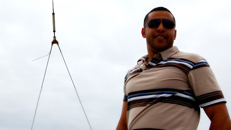
4 didn't do too much for me as the sky lacked any interest and that wire thing was kind of distracting. It -almost- looked like a quick snapshot, whereas the others seemed to portray more than just a pic of the person.
just my thoughts, your mileage may vary, offer void in missourri... esp. if you can't spell missourri.
OK... here it goes.
I should start off by saying in all of these, you did a great job exposing (sp?) the subject and getting sharp focuses.
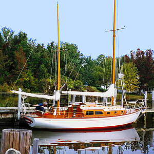
#1 I seems to me that the subject is the guys face, correct? Centered composision usually doesn't work and I don't think it works here either. I also feel that the sail is also a sub focal point and if you were to crop this so that the dudes' face was lying on the bottom right third in a 2x3 crop ratio this shot has a lot of potential. You will probably find on here that a lot of people don't like selective coloring (me being one), but I feel in this particular case that is helping the comp.
#2 watch out where you point the camera. try not to cut off body parts in awkard places (try not to cut off at joints i.e. elbows, knees, shoulders etc.). This is a good excample of an awkard cut. Half of the shoulder, and only part of the top of her leg is showing. The horizon is not level and that is hurting this picture. For this one, it might have been better to have cut all the legs off up to say the middle of the waist, and have her whole left side (arm and all) showing. I do like how much open space is in front of her, but just the fact that she is cut in weird places kind of hurts this one.
#3 same as #2 as part of her butt and elbow are missing.
#4 This one could be improved (other than the fact that his left elbow is cut off) by cloning out the wire and bringing up the levels in his face.
I like #1 the best. I love the contrast. The sympolic contrast that is.....guy with a dew rag on a sailboat.....you cant get much more contrast than that. But the shot works because of that...for me. It's a clash of stereotypes. I dont personaly buy into them...... but I recognize them when I see them.
I like 1, 2 and 3, but I think that in 2 you could've cloned out the helicopter in the sky; it kind of grabs your attention before the woman does. 1 is positioned really well, and I like the way the sail is very grey and without alot of contrast.

")