My First Portrait Shoot: Critique Please!

Over Exposed

TPF Noob!
Joined
Nov 5, 2008
Messages
212
Reaction score
34
Location
Asheville, NC
Can others edit my Photos
Photos NOT OK to edit
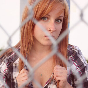
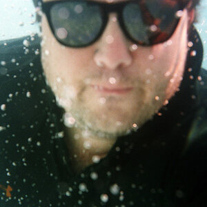
Technically, this is my first true portrait shoot. All shots were done on a D200 with a 50mm 1.8.

1.
5178983842_c293c9125e_z.jpg


2.
5178378941_ce423d79c2_z.jpg


3.
5178379607_18b5ef037f_z.jpg


4.
5178984314_13ca1596e0_z.jpg


5.
5178378553_8b49309875_z.jpg


6.
5178378339_1773106b11_z.jpg
 
Wow. Where to begin?

Lighting, posing, framing, expressions, wardrobe, hair, equipment.... so much to talk about.

How about you choose one of these you like best for critique?

-Pete
 
... white-balance, background...

Way too many factors and images for which to provide detailed critique, so I'll give you some general impressions/thoughts:

-Always try and avoid cropping little bits of people off such as the toes in 1 & 2

-Ideally subjects shouldn't look like they are on their way to the gallows (3, 4, 5)

-Working with natural light can produce some great images, but you need either perfect natural light, or help. In this case a fill flash or reflectors were needed
 
I think shot #3 is the best result. The warm evening lighting is causing a very strong color cast, but I think that's appropriate,given the time of day and the extreme warmth of the light that was present. I'm not sure what tirediron meant by on the way to the gallows in shots 3,4,and 5--it's only shot 5 that has her looking terrified! In 3 she looks pensive or contemplative, in 4 she looks doubtful,and in shot 5 she looks well...I dunno, but it's not good!

This kind of light lasts only a short while on many days...I'm not so sure that fill is needed...this is a wonderful "kind" of natural light, but it is extreme. It makes the shadows appear very deep and dark,and when the shadow placement is not flattering, as in 5 and 6, it is,well, unflattering. Speaking of unflattering, shot #6 is a definite kill-file type of frame,and I would be embarrassed to see it on the web if I were her.
 
I think number 1-2 and 3-4 a kinda similar but her expression on 1 and 3 are the best imo, i would warm them down a little bit

exposure seems right on the spot. i dont mind the arms and foot cut on number 1, some people says dont cut peoples parts but in somes case i like it and it works for me on this one
 
I think the feet in shots 1 & 2 are an element I would leave out. Too distracting.
 
Thanks for the feedback folks!

I usually try not to crop out body parts, but for some reason I liked that distance best that day. I do have a shot facing head on without the feet I can post with nothing cropped I believe and without the distraction mentioned by Yawa.

The last shot was a "just for fun" shot. She wanted something goofy for her FB page so I snapped that for her.

Christie, would you mind picking either 3 or 4, depending on which you think is stronger and give me your thoughts? I checked out your site, very impressive!

Tirediron, what do you mean by 'on the way to the gallows'?

iRay, agreed on #5. I had a lot of other potentially cools shots that might have made the finals had a fill been used.

Thanks again everyone, the feedback is much appreciated!
 
Christie, would you mind picking either 3 or 4, depending on which you think is stronger and give me your thoughts?

First, thanks for the kind words about my site.

3 and 4 are virtually the same, so the following applies to both. If I had to choose one over the other, I think I have to go with 3 as her eyes are more open... even though 4 has a bit more foreground.

As already covered, what strikes me first is the color balance. I prefer to print people a little on the warm side, but this is much too warm. And you have light of differing color temperatures. It's most apparent on her forearms where the light is cooler.

Next is the quality of light. You have her in direct sun, creating hard-edged shadows. Shadows are necessary to communicate shape and texture, but a softer, diffused light source (like the open sky) will cause softer shadows, more flattering for portraiture. And, it's likely the ratio of highlight to shadow intensity would be less (shadows not as dark).

Her hair is a wreck. A brush would have done the most good. Also, pull it back off her neck. Have it fall either in front of or behind her shoulders, and not clinging to them.

The pose could be refined. It's a good start, but move her elbows out and away a bit. This will give you diagonal lines rather than vertical, relax her shoulders and allow her to bring her hands in closer to her and away from the camera.

I like the framing in 4 over 3. The building in the background isn't adding anything good to the composition.

The 50mm is fine for full length, but a longer focal length would help here. You'd have less distortion and fewer background troubles.

Finally, the wardrobe. The long-sleeved V-neck is a good choice. I would like a tone that photographs a bit deeper than her skin tones. That little crimp at the V of her collar is distracting. I usually ask her to make this kind of adjustment. A necklace might have been nice. I advise customers to remember to accessorize, mentioning ear rings and necklaces.

And I don't know if you did or not, but once I get this far and have my ass down on the ground, I make a full range of expressions. I explain they will have the opportunity to reject any smiles later, but let shoot some so they will have that choice.

I hope this helps.

-Pete
 
WB is fine to me, it's a matter of taste.
The last two i'd delete. Third one from the bottom repeats the previous one. Don't crop the arms. you are on the right track!
 
Wow Pete, thank you SO much. Incredibly helpful to say the very least. I'm certainly grateful.
 
I thought the feet would be fun, but I am really starting to see how they are distracting. Thanks again for the feedback. :thumbup:

Edit: Sheesh, now that I look at them again, the hair really is a total mess in most of these shots.
 

Most reactions

Back
Top