yugamu
TPF Noob!
- Joined
- Apr 3, 2008
- Messages
- 213
- Reaction score
- 0
- Location
- Abq, NM
- Website
- www.flickr.com
- Can others edit my Photos
- Photos OK to edit
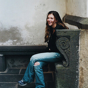
Hello. This is the very first attempt at any type of portraits and I need some help. All helpful hints and suggestions are very much appreciated.
-Josh
New Pics on Post #13
1).

2).

3).

4).
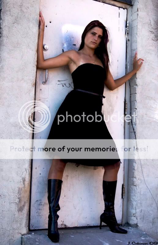
5).

-Josh
New Pics on Post #13
1).
2).
3).
4).
5).
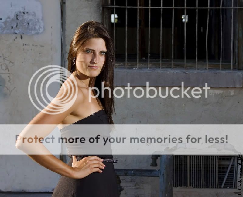
") The only things I would try to change is getting rid of the pole and altering the composition, but even then, a couple of shadows are working to frame her.
The only things I would try to change is getting rid of the pole and altering the composition, but even then, a couple of shadows are working to frame her.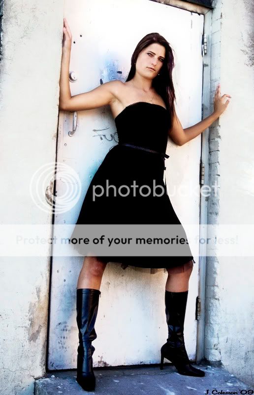


![[No title]](/data/xfmg/thumbnail/42/42268-15c1c02cec1d71208987fc7c7ec7784c.jpg?1619740077)
![[No title]](/data/xfmg/thumbnail/37/37602-1ef8dbb1c2d0e4ff347ee65d328c3603.jpg?1619738147)