My first semi successful HDR/landscape.

JustJazzie

Been spending a lot of time on here!
Joined
Jan 21, 2013
Messages
3,793
Reaction score
1,732
Location
Bailey, Colorado
Can others edit my Photos
Photos OK to edit
Didn't know weather to stick this in the HDR section or the landscape? Hopefully I picked the right place.

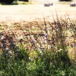
We drove an hour up the road to this BEAUTIFUL location. I was really hoping to stay until sunset, but the kiddos were not having it after such a busy day. So in between trying to keep the toddler from jumping in the lake, I tried to fire off a few bracketed shots. These first two were my first semi successful HDR processing, and I threw the third in because I am wondering which has the best composition. Are the first two over cooked? I probably shouldn't be editing after such a long day so my eyes are probably off. Anyways, C&C appreciated as always. ~Jazzie

$14155812548_f9cba491e4_c.jpg$14342464165_a94ccc3aa2_c.jpg$14341670644_2cde65fdcb_c.jpg
 
I think the third one has the best composition in terms of total, overall interest and things to look at and enjoy. I like the background's SIZE and presence in #3; in the others the background drops off in size. In #1 the background is far away and mostly green hills. In #2, the background appears close,and there's 'stuff going on', to look at. What I do not like about #2 is the road or path that just bisects the whole frame.
 
I think the third one has the best composition in terms of total, overall interest and things to look at and enjoy. I like the background's SIZE and presence in #3; in the others the background drops off in size. In #1 the background is far away and mostly green hills. In #2, the background appears close,and there's 'stuff going on', to look at. What I do not like about #2 is the road or path that just bisects the whole frame.
I really struggle with landscapes and figuring out "how much" of the frame to add..... If I have a subject in the background, it's easier. Since my subject in these was mostly the walkway- It was an even tougher choice! In a perfect world, I would have had the lighting of number two, but the framing of number three. Funny how the light changes faster than the time it takes a 2 year old to try and jump into a lake. :giggle:
 
Someone suggested that this might be a better crop, perhaps "leading" towards the grassy plant. Is it just as bad as the first? What do you think?
 

Attachments

  • $image-338975551.jpg
    $image-338975551.jpg
    58.4 KB · Views: 121
I think those are beautiful photos! I love the view :)
 
Someone suggested that this might be a better crop, perhaps "leading" towards the grassy plant. Is it just as bad as the first? What do you think?

I do not think that's really much of an improvement; placing the grassy plant at the edge of the frame just makes my eye Zzzzip! right to the plant. The plant is very prominent, and so is the light distant hillside above it, so the left side of the frame edge really has a lot of visual weight. The roadway is widest at the closest point, then tapers down rapidly, so it's like a big, giant arrow, pointing left! left! left! and then the payoff is a small, grassy plant... I dunno, that's just not really that interesting of a visual payoff for me. Honestly, I think that location would be tough to make look interesting, from that perspective.

Also, we are seeing a VERY small image here on-screen; if these shots were enlarged and printed say, 30 inches wide, we'd be literally SEEING detail that might add some interest. And that's kind of a subject all on its own, but I think it's worth considering. Have you ever seen a really exciting thumbnail image? You know, one that looks good really small? SOme images look good, small. Others look boring. TO me, seen small, the best images is the third one, since it has the pointy peaks; it has some visual variety, some repeating shapes; the others lack variety, and are kind of bland, without any really strong, dominant shapes. In #3, the hills are shown MAGNIFIED due to a longer focal length being used, which compresses the distance and makes the background objects physically LARGER in the final image.

Shot #1 and shot #3 share some objects; in #1 the foreground objects appear bigger because it was shot "from closer up". In shot #3, you've moved farther away, but zoomed in to a longer focal length, and that makes the background, the hills, physically larger. #1 is a wide-angfle landscape, #3 is a telephoto landscape. In this location, I prefer #3's more-compressed, magnified look at the landscape.
 
I am just getting ready to try my first HDR photo, I have been reading a lot on it!
 
I do not think that's really much of an improvement; placing the grassy plant at the edge of the frame just makes my eye Zzzzip! right to the plant. The plant is very prominent, and so is the light distant hillside above it, so the left side of the frame edge really has a lot of visual weight. The roadway is widest at the closest point, then tapers down rapidly, so it's like a big, giant arrow, pointing left! left! left! and then the payoff is a small, grassy plant... I dunno, that's just not really that interesting of a visual payoff for me. Honestly, I think that location would be tough to make look interesting, from that perspective. Also, we are seeing a VERY small image here on-screen; if these shots were enlarged and printed say, 30 inches wide, we'd be literally SEEING detail that might add some interest. And that's kind of a subject all on its own, but I think it's worth considering. Have you ever seen a really exciting thumbnail image? You know, one that looks good really small? SOme images look good, small. Others look boring. TO me, seen small, the best images is the third one, since it has the pointy peaks; it has some visual variety, some repeating shapes; the others lack variety, and are kind of bland, without any really strong, dominant shapes. In #3, the hills are shown MAGNIFIED due to a longer focal length being used, which compresses the distance and makes the background objects physically LARGER in the final image. Shot #1 and shot #3 share some objects; in #1 the foreground objects appear bigger because it was shot "from closer up". In shot #3, you've moved farther away, but zoomed in to a longer focal length, and that makes the background, the hills, physically larger. #1 is a wide-angfle landscape, #3 is a telephoto landscape. In this location, I prefer #3's more-compressed, magnified look at the landscape.

Thanks again for your insights! I think you're right about the 3rd being the strongest composition, the lighting is just all wrong so I'm not super happy with any of these really, though they did come out better than the sunset hdr I attempted the night before at my house.

I wish I had been there for sunrise, there was another mountian that was BEAUTIFUL, snow capped, with the lake in front of it. But the sun was setting right behind it, so by the time I was ready to shoot it, it was completely back lit, and you couldn't see a thing. I guess I'll just try try try again!
 
JustJazzie, would you really want to improve your composition? These are snapshots. Rules are meant to be broken. However you must know the rules or it's just like throwing spaghetti on the wall, hoping some will stick. Here is the most important rule of composition. Ever. Rule of thirds - Wikipedia, the free encyclopedia
An example: If you draw the tic tac toe, the nun and woman are at lower left point.
nun-assisi_zps4d8df9f7.jpg
[/URL][/IMG]
 

Most reactions

New Topics

Back
Top