What's new

My Second Portrait Shoot- All comments welcome

Nikon_Josh

TPF Noob!
Joined
May 30, 2011
Messages
936
Reaction score
95
Location
Surrey, UK
Can others edit my Photos
Photos OK to edit
Hi all,

Would like to know your thoughts on my third portrait shoot, the lighting was quite harsh with the sun high in the sky, but I tried to work best with what I had. But we did do a few in the evening aswell... All natural light, this was also my first shoot with the Sigma 50 1.4. I do love this lens, the bokeh is something else!

All constructive comments welcome. ;)
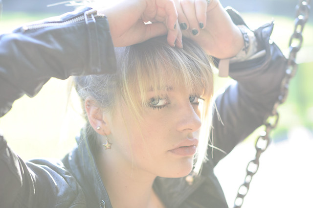

Lily_Swing_Portrait_2 by Foto_Art_, on Flickr
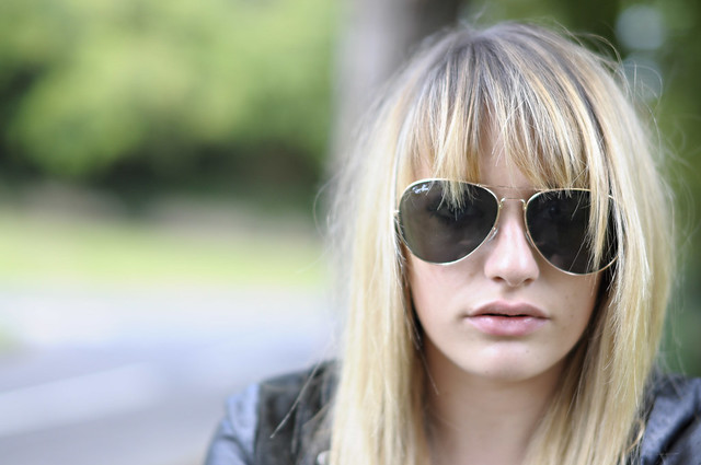

Lily_Closeup by Foto_Art_, on Flickr
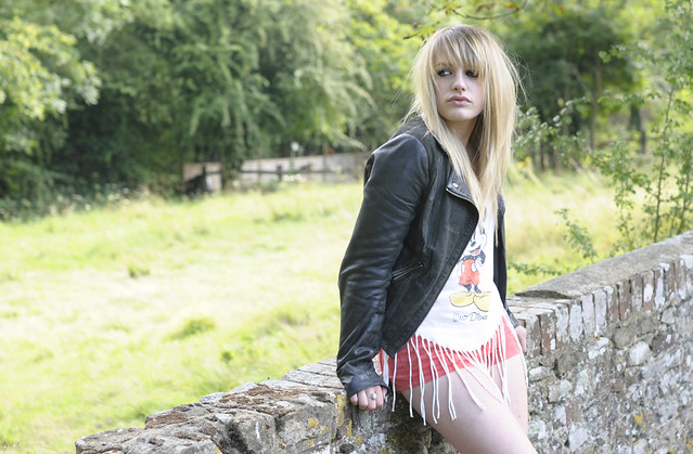

Lily_Wall_Lean by Foto_Art_, on Flickr
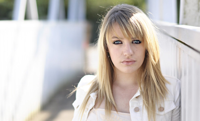

Lily_Bridge_Headshot by Foto_Art_, on Flickr
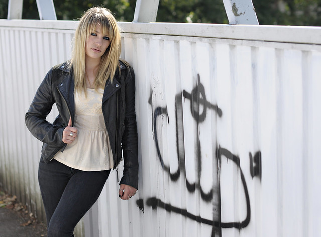

Lily_Graffiti_Portrait by Foto_Art_, on Flickr
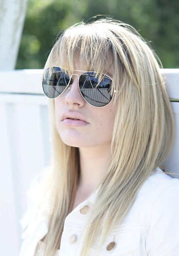

Lily_Cool_Shades by Foto_Art_, on Flickr
 
I like the 3rd and 4th the best but I wish she would have changed her expression in a few of the photos, just to add variety and change the mood some. The last one seems a tad overexposed and the first one .. I'm not sure what that haze is over the pic, I kinda don't like it but then I do want to keep looking at it.
 
Comments per req:

1. I like the idea here, and I like the lighting/flare, but the composition does NOT work IMO. Cropping her chin and her right arm really hurts the imgage. I think this would have worked MUCH better shot in vertical (Portarit) orientation.

2. Okay... a'splain me this Lucy... Why do you have her shoved all the way over to one side? Again I think this would have worked better shot in portrait. Additionally, I think you should have increased your aperture; you are only working with a DoF of 3-4 inches and you can see that her hair is in focus, but her chin & lips are soft.

3. Too much background, not enough subject. You've got shadow in the eye area and blown highlights on the shirt/legs. A reflector or speedlight was needed here to reduce the image's dynamic range.

4. Very nice... but, think vertical!

5. Try to avoid cropping limbs at/near/through joints.

6. Nice, again though supplemental light was needed; the crown of her head is severly blown.

Just my $00.02 worth - your mileage may vary.

~John
 
Thanks very much Shadow, the Flare was intentional in the first one as I took the photo directly into the sun. Thanks for feedback.

Comments per req:

1. I like the idea here, and I like the lighting/flare, but the composition does NOT work IMO. Cropping her chin and her right arm really hurts the imgage. I think this would have worked MUCH better shot in vertical (Portarit) orientation.

2. Okay... a'splain me this Lucy... Why do you have her shoved all the way over to one side? Again I think this would have worked better shot in portrait. Additionally, I think you should have increased your aperture; you are only working with a DoF of 3-4 inches and you can see that her hair is in focus, but her chin & lips are soft.

3. Too much background, not enough subject. You've got shadow in the eye area and blown highlights on the shirt/legs. A reflector or speedlight was needed here to reduce the image's dynamic range.

4. Very nice... but, think vertical!

5. Try to avoid cropping limbs at/near/through joints.

6. Nice, again though supplemental light was needed; the crown of her head is severly blown.

Just my $00.02 worth - your mileage may vary.

~John

Thanks John, this is the sort of feedback I like. It pushes me to re evaluate and seek to improve!

It is interesting to see a different perspective. I agree I think I do need to be more careful about cropping joints etc... Part of the idea of moving the subject to the edge of image was an idea inspired by a well known german photographer on Flickr who appears to take all his portraits in this manner. I'm still not sure whether it is a good style or not, but at the moment I'm experimenting. The shallow DOF was intentional as well on Photo 2, you think the face should be completely sharp? I did this as an artistic effect really. Also you are correct, about the highlights being blown out in the final image. Something I could easily have avoided in hindsight, without any additional lighting.

I'm glad you like image 4, as this is probably my favorite from that day. Really proud of that one!

I think I need to pick up a book though that talks about the complete technical side of portrait photography, because I still struggle to find perfect compositions. Maybe I do need to do more verticle (Portrait) orientation shots?

Anyway, alot for me to consider!
 
The 4th one is great. I like that one!
 
However unusual, I really like the first one.

But it is unusual and since there are so many threads that are mis-titled, I have to ask a question before I respond to your inquiry: are those really intended only as portraits or are they meant more as possible shots for a model's port?
 
Overall, you need to make the color more pop. Increase the contrast, make the WB warmer, increase saturation of green. Stuff like that.
 
4 & 5 are the clear winners for me. the other ones look a bit bland and washed out to me. next time, wait for the better light, it's totally worth it!
 
Thanks alot for the feedback guys. I have only just checked back to see if any comments were added!
 
4 is okay. but honestly your model kind of ruins most of these. whats up with her facial expressions? Did she just get some botox or something?
 

Create an account or login to comment

You must be a member in order to leave a comment

Create account

Create an account on our community. It's easy!

Log in

Already have an account? Log in here.

Back
Top Bottom