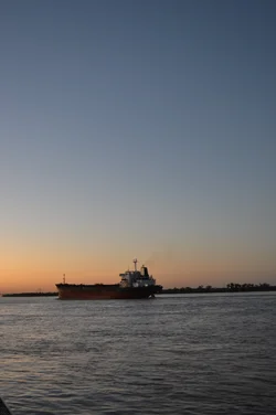
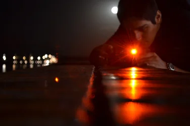
#1: kindly correct the tilt seen in horizon
#2:This is a different stuff...but it would have been better with that light seen over his head is some what distant from his head....
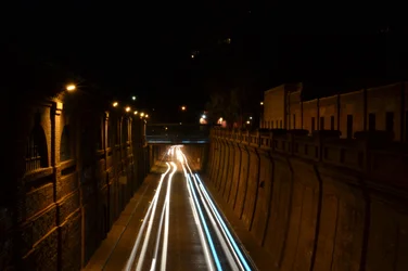
#3: Light streaks are too centered
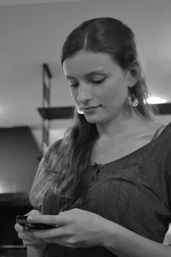
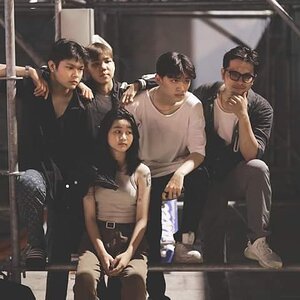
#4: I like her posing
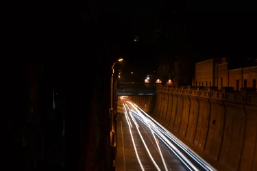
light streaks originating from one corner and reaching near to center is a good idea; but see one half of the image is immersed in the darkness which still affects the balance i am afraid






![[No title]](/data/xfmg/thumbnail/36/36679-b3112c1f4841912cbaa9edc11e6852fe.jpg?1734169174)

![[No title]](/data/xfmg/thumbnail/36/36301-27972c0474532c2ef657014362950733.jpg?1734168626)
![[No title]](/data/xfmg/thumbnail/32/32157-d34c504b7ccf1335e959a8a2be6cfacc.jpg?1734161046)
![[No title]](/data/xfmg/thumbnail/37/37103-871e5d39d6f585e3019a4e25eb2ee935.jpg?1734169829)