I'm just throwing this out there so you don't feel discouraged - many of us seasoned TPFers have seen so many flower photos that critiquing them is about as fun as heading to the dentist for a root canal.
Having said that I'll at least mention a couple of things I noted:
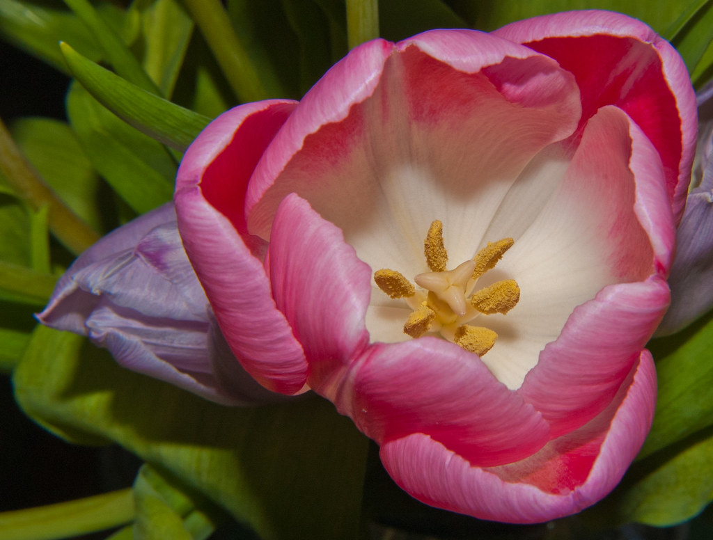
Saturation is fine, exposure is good, composition is nice. You have very strong chromatic aberration all over, its that blue tint outlining the flower and leaves. Other than that stuff this is a somewhat bland shot, you're shooting down on the flower, no interesting depth of field use, very little depth in the image in general, and I mean the flower itself is a tulip. Pretty flower, but we're all very familiar with them.
That is what I would say as a critique stand point as an artist, however if you are asking me about a more technical stand point - let's say you're selling this photo to a seed company so they can put this picture on a bag of their tulip seeds - in that case this is actually exactly what they want. Plain, simple, focuses on the flower, the only thing you need to fix is the chromatic aberration.
Hope you find this a bit helpful.