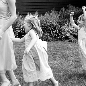
What do you guys think of this as a business card design for me? The name of the business/website is pretty much in stone since I really like it, and I got LizM's permission to use the portrait I drew of her daughter Samantha for the design.
It's great, but I would be tempted to think about removing the boxy zig-zag and moving "of" to the next line.
Also, might be different for you, but here most business card printers can't print right to the edge with something like this if they are sheet printing (without overspill).
I actually like the box thing that rob doesn't like... go figure.
But I don't like the wordiness of what you've got written there.
What about "Jon Watson Drawings and Photography"??
Good looking card Jon. I would leave the "Z" box and remove "of" or change it to what Vicky said above. I would be a little concerned about the pic at the card edge. Maybe feather it out at the edge to minimize it. Good work dude!
Yes, the wording sounds more like a book title. Does that make sense?
What are you trying to say with this card? You want your name out there as the artist, right? So it should read more like "Jon Watson - Artist/Photographer" Or arranged however you wish.
I'm another that likes the z thing, but I'm also gonna agree with the wordiness...I like Terri's phrasing best so far. Personally I think it's best to keep things short and to the point .
Hmm, thanks for the input guys. I like Terri's idea... Jon Watson, Artist/Photographer, or something similar. And I'm rather hooked on teh Z thingy myself. =P