I like that you are trying unusual points of view. By choosing these perspectives you created images that could tend towards the more abstract, which I like to see occasionally. However...
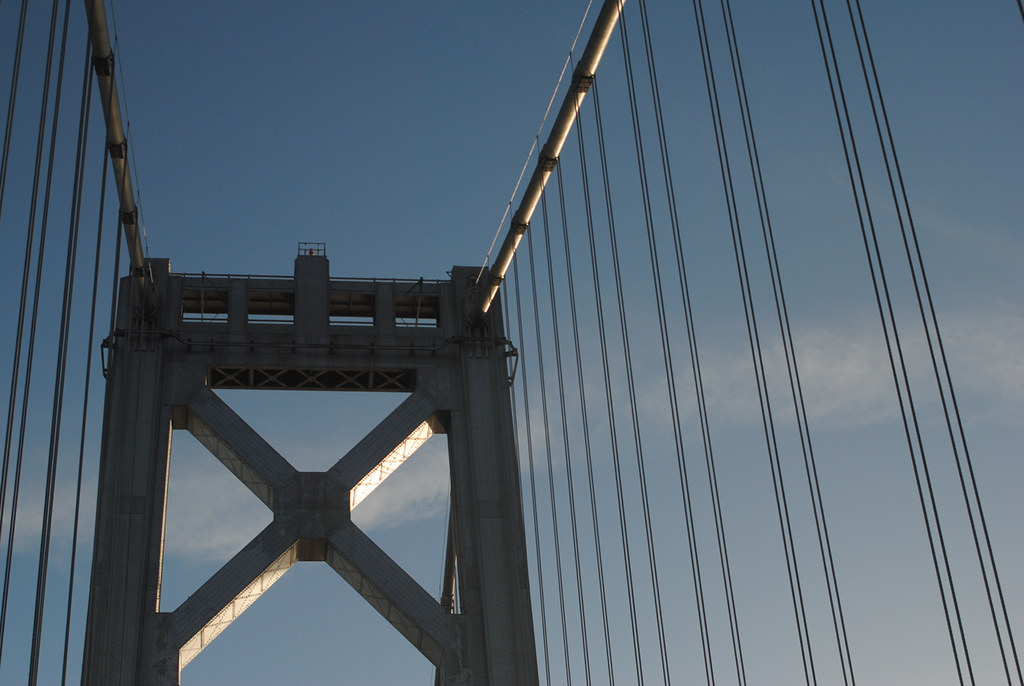
*The lighting in #1 is unfortunate. With only the undersides of the two cross members and one upper cable getting good light, the whole image comes off as a dim and dingy. I'm curious how the sun hits the bridge at different times of day. I suspect that if you can get the light so that it either illuminates more of the tower facade or brightens the sky behind it then this would work really well as a black-and-white.
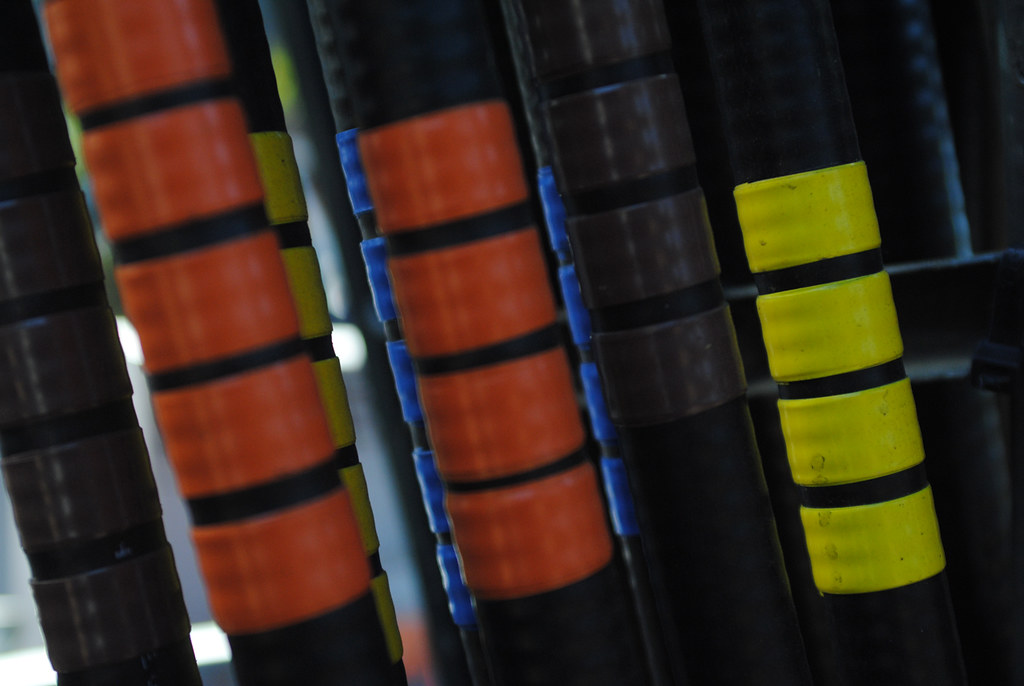
*The lighting is again unfortunate in #3 - the brightest areas are the background on the left and the blue wraps. If you had been able to add light from the right the front row of wraps would have stood out better, particularly the yellow on the far right. I'm also torn on your choice of focal plane. I like that you chose something off-center, I'm just not sure that having that one element so far off to the side (with a couple of the second row instances almost in focus by default/coincidence) while so many other elements are out of focus works for the image as a whole.
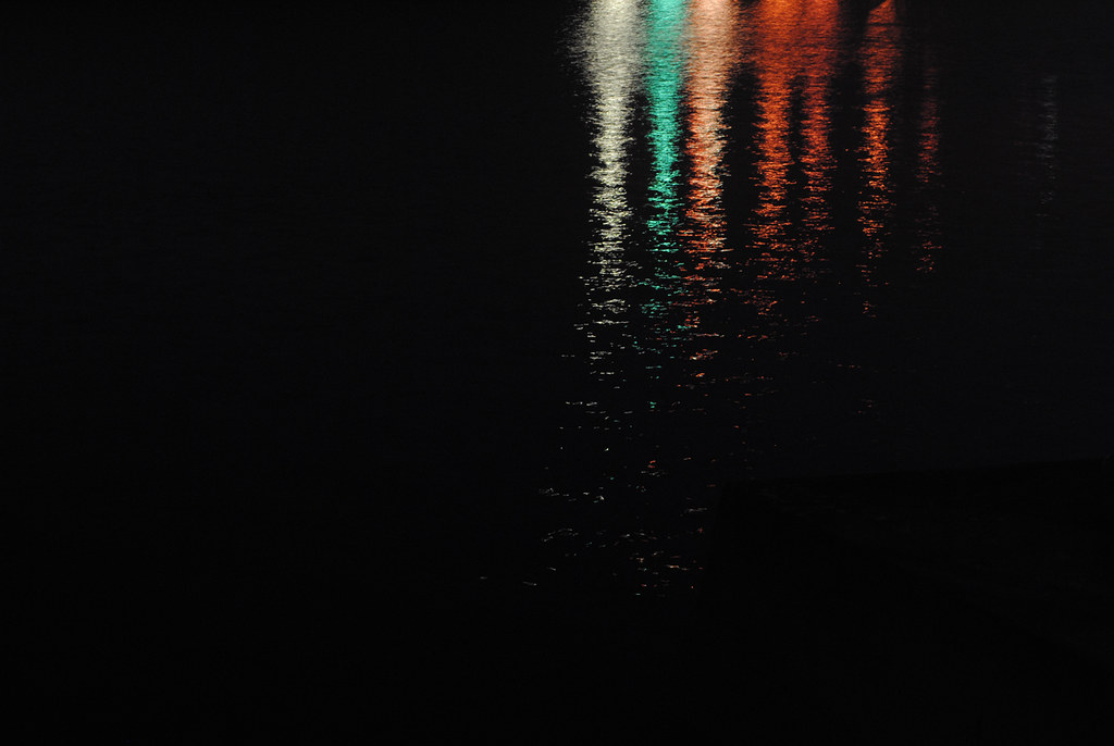
*I saved #2 for last, because I absolutely love this capture! Great use of negative space. I bet that if this had been done with paint on canvas instead of light on a digital camera sensor it would be hanging in a gallery. The only (very minor) nitpick is that the "columns" of light look ever so slightly off from vertical. I'd try rotating it just a touch.
Overall a very nice set...I think you have a great eye. Just a little more attention to how the light is falling (and I know, sometimes you just can't control that) and you'll be all set.






![[No title]](/data/xfmg/thumbnail/35/35875-613296cbb015a9d4bc5b47aca161290e.jpg?1734167609)
![[No title]](/data/xfmg/thumbnail/35/35959-c7e267b1e7e08d889fe1a4fa28766c11.jpg?1734167798)