What's new

New here, trying the C&C out..kinda scared!

ALB0528

TPF Noob!
Joined
Oct 10, 2012
Messages
3
Reaction score
0
Location
Arkansas
Can others edit my Photos
Photos OK to edit
Ok, so I am new here and just looking to get some feedback...kinda scared because I did read through some posts on other folks.
I am all for learning any tips though, which is why I am here. Thanks!
 

Attachments

  • $76291_10151109982010958_1262108201_n.webp
    $76291_10151109982010958_1262108201_n.webp
    41.5 KB · Views: 137
  • $384236_10151111089750958_654396319_n.webp
    $384236_10151111089750958_654396319_n.webp
    97.3 KB · Views: 123
  • $hog1avery.webp
    $hog1avery.webp
    617.4 KB · Views: 141
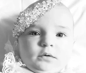
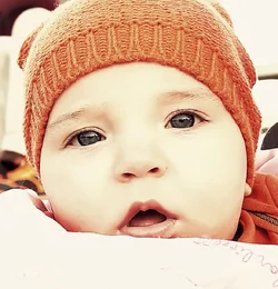
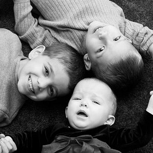
The first two are interesting, but kind of creepy. You're very close in, with what feels like it might be a moderately wide lens, and you've done something to emphasize the daylights out of the eyes. They're kind of creeping me out, but they're definitely *interesting*. I am going to assume that the overall light tones are a deliberate choice, as is the eye emphasis (sharpening? other local contrast changes?).

The light in the first one is quite nice, very soft, quite light tonally but you didn't lose the edge of the baby's face against the background (quite). The framing is very very tight, and the lens feels wide, to the perspective is pretty unconventional and not flattering per se. But definitely an interesting look.

The light is flatter in the second one, and you've done something to the colors which isn't very attractive. Some vintage filter, maybe? It looks like a cold toned photo that's aged badly. Again, tight framing etc. I assume all this is deliberate, so what we're left with is unconventional, somewhat interesting, not very flattering again. I don't think the color processing is very good -- it doesn't support the image in any way I can fathom, it just "looks cool".

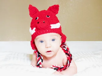
The third one is much more conventionally framed, but the focus is noplace, and the framing is not very interesting. Even the exposure looks worse, things appear to be flatly blown out, not dancing around near blown-out. This one looks a lot more like a not terribly good snapshot. Maybe that one should get the vintage treatment?

 
They all look overexposed.... and I was just creamed another thread, so don't take it personal. If you really want honest c&c, this is a good place. You just have to evaluate whose opinion will help you and whose to leave alone. :)
The focus and color is off in number 3 and the eyes look overdone in all three.... but the baby is BEAUTIFUL :)
 
hahaha sorry my baby's eyes creep you out! I am SOOOOOO new to all of this, so to hear what you all have to say it great, I appreciate it!!
Idk why but yes, for some reason I tend to like the over exposed look...eekkk! I'm trying my best to learn! Thanks again for the input!!!
 
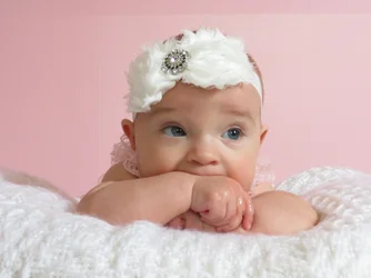
How about this one? Nothing done to it...
 

Attachments

  • $IMG_0765.webp
    $IMG_0765.webp
    202 KB · Views: 149
What a cutie!! I don't find the eyes creepy. I agree though, the first 2 are overexposed. 3 is soft. I like your processing in 2, but i think the crop is too tight. I think you've over sharpened the eyes. PP is such an art and so easily overdone. Keep at it!
 
I think the exposure is much nicer. The focus still seems soft... baby is still beautiful :)
 
i love #4 but you should retry that shot with tack sharp focusing. it is really soft. maybe you focused and recomposed at a large aperature? i would work on getting sharper images but they look very nice so far!
 
#4 is great. I would even the skin tones and remove the glare from her slobbering on her fingers... But I love the photograph.


I think you are experienced enough to know that your first three are on the high side of the histogram. You don't need any of us to tell you that.
 

Create an account or login to comment

You must be a member in order to leave a comment

Create account

Create an account on our community. It's easy!

Log in

Already have an account? Log in here.

New Topics

Back
Top Bottom