New to Portraits. ALWAYS appreciate C&C.

TKD

TPF Noob!
Joined
Nov 7, 2013
Messages
54
Reaction score
5
Location
Iowa
Can others edit my Photos
Photos OK to edit
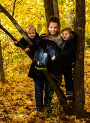
New to portraits. Took a class recently that required some portraits. Class is over. I felt I did average.
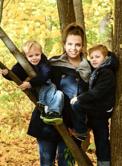
Nikon D7000 All at ISO 200 First two are f/7.1 1/250 Third is F7/1 1/100 I've done mild processing on them, cropping, warmed the face on the first two with tone. Third I dialed down the yellows, reds, oranges, and cropped.

The last two I feel I got what I was looking for, basically but, next time would move him out more to give a better break between him and the background, better definition of DOF. In this location moving him much would have put him in harsh light, so I was restricted, not an excuse. Wasn't allowed to use reflectors for the class but feel it could have added light to eliminate the shadow on the right side of face on chin and cheek.

First shot I like but…..I think a reflector could have helped with light on the faces. Sometimes I've seen reflectors leave a dull light on the faces.

Gosh, I hope I post these correctly. :confused:

I will listen to all help. Thank you. $Portrait-3.jpg$Portrait-2.jpg$Portrait-1.jpg

 
Any particular reason you chose f/7.1 for these three shots? With that you were limiting a lot of light (you didn't need the extra DOF with a smaller aperture) and coupled with iso 200 you underexposed these.

On the first shot, did you brighten the girls face or was that a sun-spot through the trees? If yes, try to avoid that.

The boy on the wall, I don't think you *needed* a reflector, but properly setting up the shot in the first place would have helped. Again, the aperture was a bit small and the iso too low. Look how much better the third looks once you went down to 1/100 vs 1/250. Had you went to iso 400-800, or f/5.6, the exposure would have been more ideal and he wouldn't look so gray.
 
All of these would have really benefitted from a fill light of some source, especially the first. You have a bright background and predominately dark subjects. While their faces are bright, there's little detail visible in the clothing, giving them a 'floating head' look. A single speedlight, just off to the right would have taken this from okay to 'wow'. Also, swatch your composition; you have a tree growing out of Mom's head! The two shots of the boy are under-exposed and the lack of fill and [I assume] bright light behind you have caused him to squint and made his eye's look rather dark and dead ('raccoon eyes').

I can't imagine why you wouldn't be allowed to use reflectors in a portraiture class, but your instructor, IMO, did you a great dis-service. These are nice, but far short of what they could have been.

Just my $00.02 worth - your mileage may vary.

~John
 
My edit. I like the pose for the family!
 

Attachments

  • $Portrait-3.JPG
    $Portrait-3.JPG
    150.3 KB · Views: 99
In the group shot, the light on mom's face looks uneven, which I find distracting; not sure if this is due to post-processing or mottled sunlight in the actual scene (I'm assuming the latter).

The shots of the boy have pleasant facial expressions but underexposed on the face. I'd prefer these to be shot in vertical orientation. Also, you should sweat the details in portraits--watch out for little things like that part of his jacket cutting into his right cheek.
 
Any particular reason you chose f/7.1 for these three shots? With that you were limiting a lot of light (you didn't need the extra DOF with a smaller aperture) and coupled with iso 200 you underexposed these.

On the first shot, did you brighten the girls face or was that a sun-spot through the trees? If yes, try to avoid that.

The boy on the wall, I don't think you *needed* a reflector, but properly setting up the shot in the first place would have helped. Again, the aperture was a bit small and the iso too low. Look how much better the third looks once you went down to 1/100 vs 1/250. Had you went to iso 400-800, or f/5.6, the exposure would have been more ideal and he wouldn't look so gray.


Thank you. I see what you mean. Forgot to say class assignment was to leave ISO on 200. But you are right, don't have any idea why I chose 7.1. Thanks. Doppled light was the lighting on her. Great suggestions. Thank you.
 
All of these would have really benefitted from a fill light of some source, especially the first. You have a bright background and predominately dark subjects. While their faces are bright, there's little detail visible in the clothing, giving them a 'floating head' look. A single speedlight, just off to the right would have taken this from okay to 'wow'. Also, swatch your composition; you have a tree growing out of Mom's head! The two shots of the boy are under-exposed and the lack of fill and [I assume] bright light behind you have caused him to squint and made his eye's look rather dark and dead ('raccoon eyes').

I can't imagine why you wouldn't be allowed to use reflectors in a portraiture class, but your instructor, IMO, did you a great dis-service. These are nice, but far short of what they could have been.

Just my $00.02 worth - your mileage may vary.

~John

I see what you mean but it was an 8 week course and she was trying to give us as much "learnin'" as she could to do better SOOC shots. My first attempt at portraits because it is not my strong suit (if I have one). Really appreciate the advice. Will definitely use all of it.
 
My edit. I like the pose for the family!


Wow, that does help! Now, directions? Did you add more light to everything or just faces? Looks like everything.
Thanks!
 
Dappled light is difficult to use, especially when shooting more than one person. For me, these all seem to be underexposed, especially the last two. If I were you, I would try shooting around f4, or lower(if you wanna get artsy and have a shallow DOF, but only use this when shooting one person).

In terms of posing, the family/group shot is my favorite. And as others have said, these would benefit from fill light (be it artificial or from a reflector).

It's a good start--keep shooting!

Jake
 
In the group shot, the light on mom's face looks uneven, which I find distracting; not sure if this is due to post-processing or mottled sunlight in the actual scene (I'm assuming the latter).

The shots of the boy have pleasant facial expressions but underexposed on the face. I'd prefer these to be shot in vertical orientation. Also, you should sweat the details in portraits--watch out for little things like that part of his jacket cutting into his right cheek.


Thanks. Yea those things were bothering me also. Vertical would have been a better view. Thanks for your time!
 
My edit. I like the pose for the family!


Wow, that does help! Now, directions? Did you add more light to everything or just faces? Looks like everything.
Thanks!
Used LR3, added bout 1/2 stop exposure, +22 bump fill light -3 clarity -10 vibrance -3 saturation
Also used the adjustment brush to drop exposure on the background -.20

I really like this shot, the expression on the faces, great smile on mom. Dislike the tree coming out of moms head as already mentioned.
 
Thank you. I see what you mean. Forgot to say class assignment was to leave ISO on 200. But you are right, don't have any idea why I chose 7.1. Thanks. Doppled light was the lighting on her. Great suggestions. Thank you.

Not quite sure this class did you a service; why in the world would you only shoot at 200 iso? I could see that in a studio...

But that's such an arbitrary limitation.
 
Dappled light is challenging to use, but I thought the group shot was actually pretty well-done, considering just how VERY tricky it can be to take people pics in such light. What I liked about it is the bright, yellow leaves as a massive amount of "location"...very much it says "fall". The older brother is standing, in a very dynamic pose, with one foot UP on the tree. Little bro is hanging on to a forked branch. Mom's in the back, visually supporting the two kids. The mom's face is in a light patch, as are little brother's jeans, and big bro's hand...it's **almost** like a classic painting, in the way each person has a part of his or her person in the shafts of light. I see a lot of what looks like noise reduction when I view the full-sized image, but I think if the file is sound at the fundamental level, that a very skilled Photoshop massaging of the group shot could make an almost-excellent photo out of it. Again, yeah...dappled light...generally looked at askance by most people, but even if it is accidental, I see something that could be mistaken for real,true artistry of the highest order, in the way the figures are placed in this pose.
 
Dappled light is difficult to use, especially when shooting more than one person. For me, these all seem to be underexposed, especially the last two. If I were you, I would try shooting around f4, or lower(if you wanna get artsy and have a shallow DOF, but only use this when shooting one person).

In terms of posing, the family/group shot is my favorite. And as others have said, these would benefit from fill light (be it artificial or from a reflector).

It's a good start--keep shooting!

Jake


Thank you Jake. I do tend to go to the dark side on shots. Bad habit. Appreciate the comments and time!
 
My edit. I like the pose for the family!


Wow, that does help! Now, directions? Did you add more light to everything or just faces? Looks like everything.
Thanks!
Used LR3, added bout 1/2 stop exposure, +22 bump fill light -3 clarity -10 vibrance -3 saturation
Also used the adjustment brush to drop exposure on the background -.20

I really like this shot, the expression on the faces, great smile on mom. Dislike the tree coming out of moms head as already mentioned.


Thank you, I'll apply that on LR5 and see if I can resemble your results!
 

Most reactions

Back
Top