What's new

Noob. Any advice on how to fix this image would be appreciated.

RachelRose53

TPF Noob!
Joined
Sep 18, 2013
Messages
44
Reaction score
2
Location
Florida
Can others edit my Photos
Photos OK to edit
I hope this is the correct way to offer up work for criticism, with the images here instead of as links. This is my first time trying this.

I am learning how to use my Canon t3i, and also Photoshop. Plus trying to develop compositional skills. This is the first image I thought had enough compositional merit to send out to be printed. But looking at the print I think I have more work to do on it.

Taken with my 18-135 kit lens. That and an inexpensive 50mm are all I have so far.

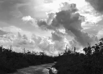
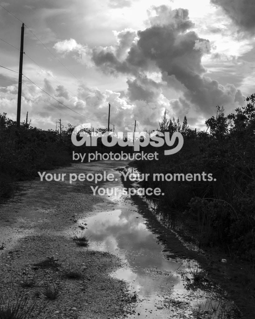
Here's the one I had printed. I toned the bushes very dark to give the image tonal range, but I can see weird ghosts of the foliage in the darkness, and I think it looks wrong, maybe I went too dark. Or not dark enough:


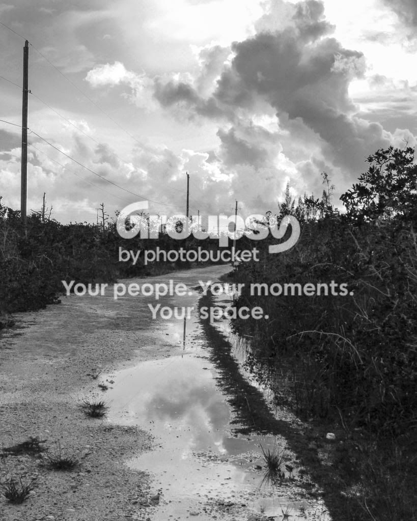
This is one version I didn't darken so much. I thought the foliage makes the photo look busy and it lacked impact as a result, so didn't sent it out to print:


Like I said, I am a complete noob, so feel free to suggest anything. I have lots to learn. Thanks.
 
Last edited:
I would take the top image and rotate it counter-clockwise until the telephone pole on the left appeared perfectly straight up and down. I would then add some digital "fill light" to the shadows (depending on your specific software this might be done with another control,labeled differently than "fill light"...). I think the shadows are a bit too dark.

Anyway, rotate it so the pole is straight up and down.

Conversely, the SKY and clouds are dramatic, and the reflection on the ground is a neat element too. You could also go DARKER with this shot, and make it more of a graphical shot, the poles, the clouds, the puddle being the main things. There is no one,single way to approach this shot.
 
Okay...here's a rework. I rotated and cropped. I darkened the whole image. Then, I took a brush in Lightroom and selectively "dodged" (lightened),
the blackberry bushes on both sides of the road.

I then lightened the long,narrow strip of water that runs on the right hand side. I then lightened the reflection of the whitest whites in the puddle. This was a quick 30-second edit.

View attachment 57812

It was interesting to me how the dodging on the right hand side made that one, single kind of droopy plant show up so,so much!
 
Last edited:
Derrel, I was not able to open your attachment. I got an "invalid attachment message. I'd really like to see it.

I never thought of rotating so that the pole would be straight! But it makes sense now that you say it. Just goes to show how much I have to learn.

Why do you think the attachment won't open? I would love to see what you did. I kind of get the idea from your description, but I'd like to see it. Thank you for taking the time to post and for the time you spent editing. Thirty seconds for you... it wouldn't be for me!
 
I would print those bushes damn near black, with just a hint of texture in 'em. This is how the first version looks on the lousy display I am currently using, and I dig it.

This is about the clouds, the reflection of the clouds, and the curve of the road. Well done, by the way. I like this picture quite a lot.

Straightening the telephone pole is probably a good idea too.
 
Thank you, amolitor. Now that I can see what you have done, Derrell, and then read amolitor's comments, I can understand what you mean when you said there was more than one way to approach this image.

I am going to go back to my .psd file, and play with it, trying to approximate Derrell's rework and then try a version with all the foliage very dark, see which looks better to me.

Straightening that pole! It really does make the image more resolved looking.
 
I agree with amolitor that the clouds, and the reflection of the clouds in the puddle, is a good place for this picture to be focused on. As a way to make the cloud/puddle reflection stronger, I deliberately LIGHTENED that narrow strip of water that runs along the right hand side of the main puddle; by making that strip of water brighter, it draws the eye there, and brings the eye "closer" to the main reflection of the clouds in the puddle. Look at the original, and you can see that that narrow strip of water is dull; with a small dodging brush, I lightened it up quite a bit.

Light when seen next to dark draws a lot of visual attention. That's the same reason I dodged some of the white spots in the puddle reflection...to make some BRIGHT, white spots in the puddle reflection...compare the dodged puddle in my re-work to the original...in a shot like this, it's easy to find dar/light junctions, and to hit those with the dodging brushes and make some "pop!" that's not really there to begin with.
 
I agree with everything said so far. Also, that cloud in the upper right corner is distracting to me. I know it is natural, but it is so straight it looks as though something was blocking the image. My eye goes directly to it. maybe lighten it a bit. Overall, a nice bw photo.
 
I see exactly what you mean by that cloud, JT, now you point it out. It looks too much like a neat corner. I'll see what I can do to mitigate that.

Yes, Derrell, I did see how you lightened those elements.

These comments are a great lesson for me on examining an image for small but important details.
 
I think the first one is a little dark, but I like the sky in that one since it seems to have more contrast. I agree about that edge of a cloud in the upper right - it might be worth thinking about where to cut off an object like the cloud or whether to frame your shot so it's not in the picture at all. I also thought the first one looked as if the camera wasn't quite straight. I like seeing some texture in the foliage in the second one but the sky doesn't quite have as much pop.

I learned with B&W film and darkroom work to adjust for a 'black' black and a 'white' white somewhere in the photo (usually not highlights), then adjust from there and I still usually use that as a guideline. You might want to play around with it and try different adjustments with the contrast.

I think puddles with reflections can make for interesting photographs, and I like the way you got the road (sidewalk?) curving off into the distance. Next time you could try changing your vantage point while you're taking pictures, sometimes it doesn't take moving that much to get a different image in your viewfinder/viewscreen. With reflections if you move around some you can change what you see reflected; I noticed one has part of a pole reflected and it might be interesting another time to get different views with different objects reflected. You saw something interesting to photograph and you seem to be on the right track.
 
Worked on the image. Here are the two versions. One is darker than the other. I think straightening the pole and dodging that cloud were excellent suggestions (although I don't know how excellently I did at fixing the cloud).

I see more and more that it isn't enough to know the basics of post editing. It's knowing what to do. I suppose that just comes with practice and looking at a lot of other people's work.

Thanks to everyone for the comments.

Here is the lighter one:


A slightly more dramatic version. I did also lighten up the long puddle along the side of the road, though it may not show up so well:

 
Last edited:
Ya' done good, Robin! I prefer the second, more-dramatic one. It has an old-fashioned appeal to it.
 
Thank you, Derrel! Like I said, the comments were invaluable.
 
I toned the bushes very dark to give the image tonal range

Darkening the bushings adds contrast not tonal range. Tonal Range and contrast are NOT the same thing.
Elements of Composition ? Contrast and Tonal Range | Will Hey Photography

By darkening the the bushes you have created more contrast between the bushes and the road and especially between the bushes and the sky.

Your image basically has two parts to it. a Dramatic sky and a noisy unattractive foreground. I'm sorry but your foreground composition does not do it or me, I feel that it actually distracts the viewer and takes away from the image.

$Edit.webp

Dropping the horizon helps emphasize the sky more in the image. I didn't cut out the road completely because I do like the leading line it gives into the sky.

I also did a supper quick job of removing the power lines and poles because they were the most distracting thing in the image.
 
Interesting edit! Thanks for taking the time. For me, the focus of the image was the sky and reflection of the sky in the puddle, it was what inspired me to photograph the scene. But it is very interesting to see the image approached the way that you did it.

Thank you for the link to the article!
 

Create an account or login to comment

You must be a member in order to leave a comment

Create account

Create an account on our community. It's easy!

Log in

Already have an account? Log in here.

New Topics

Back
Top Bottom