Not giving up on still life

Benjo255

No longer a newbie, moving up!
Joined
Dec 16, 2014
Messages
662
Reaction score
345
Location
Legnano (ITALY)
Can others edit my Photos
Photos OK to edit
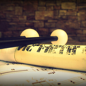
Another still life in light painting.
This time I tried to make a cohesive composition, I paid attention not to enlight distracting elements and tried to give a more consistent background other than my usual blue cloth...and...well, waiting for your comments (and which one do you prefer).

1.
PosateCapodanno2015.jpg


2.
PosateCapodanno2015-2.jpg
 
I like the composition of the first one better. It's a good angle that makes the reflections more interesting.
 
The table and wall are nice but the subject is lacking. I suggest a bowl of fruit or something with similar tones and textures. The silverware could work if there were less of them, more visible and perhaps a plate or a bowl rather thank a bright blue sponge.

Still life's work well when the subjects are all within the same tonal range. The bright points should be the highlights of that range.
 
I know it may sound as paper over the cracks and I know still life is rarely BW, but I think this conversion may exalt lights and make the difference of tones less evident.
What do you think?
PosateCapodannoBW.jpg
 
I like your idea and I think it has great possibilities. You do have to decide what the subject is, because in my humble opinion, I would get rid of the blue accessory as I find it distracting. I also like it that the wall is not showing. If you get rid of the blue thing, then you could put a few utensils in its place and make it look like they are scattered, i.e., arranged a bit randomly as if they were awaiting their turn to be placed in the holder, or they had just been removed from the holder awaiting placement in a drawer or on a table. My .02 ¢ worth FWIW.

WesternGuy
 
Last edited:
I like the first one best, too. Now that he says it, I see runnah's point on the bright blue sponge. The black and white is less intriguing for me (less warmth). I saw your earlier post and I'm enjoying this progression.
 
My turn, Good exposure, contrast and it's sharp.
Now, for the negatives. I agree, I don't think the sponge(?) is needed.
There are water marks on the work surface and caddy
Lastly, I'd try different angles and use the pattern on the work surface. The way it is, the caddy is apparently haphazardly placed over the lines of the work surface.
Much better then the food attempt :icon_thumbsup:
 
I like this shot. It reminds me of when I worked In a kitchen. Kinda the end of the night as the dishes were being finished and the counters were wiped down. Time to flirt with the waitresses! Works for me. I see about the blue tho. I think a white kitchen towel would fit perfect.
 
I don't know if you have a facebook account or not, but if you do, you might want to check out this still life photography group page, its an open group so you don't have to join it to browse. There are many good examples there. Another great example of still life & light painting is Harold Ross.

This attempt was better than than the last, but - I agree with what others have said, especially the blue sponge ;)
 
Oh, #1 is better. It has very strong diagonals, interesting hard surfaces, was well as vertical and horizontal elements. Also I happen to like the yellow cast of the light. Do not change a thing.

Now you're getting it. :biggrin-new:
 
I'm not a fan of the sponge either. Replacing it in the first image with something shiny and/or metallic would be better or perhaps just eliminating it and moving the basket out from the wall a little and cropping a bit on the right.
 
Thahk you! Little steps toward improving!
Thank you for all the feedbacks.
A queston for Rick:
There are water marks on the work surface and caddy
I thought it was appropriate to leave them. I thought about cleaning them cristal clean, but isn't still life of this kind rapresenting object as they are? I mean: in a wood table of fruit in a wood basket is expected to find rifts and imperfection in the wood, so...isn't expected to find watermarks on a steel surface in a kitchen sink? Mine is not a defense, just to understand better.
 
It has very strong diagonals, interesting hard surfaces, was well as vertical and horizontal elements. Also I happen to like the yellow cast of the light. Do not change a thing.

Now you're getting it.

Thank you very much! As soon as I'm getting this kind of feedbacks together with critiques, it means I'm improving.
Thank you everybody for feedbacks! I never really found such a useful community!
The italian forum I used to post on was no feedback at all or just poor positive feedbacks like "Good shot!".
I really appreciate, thank you!
 
Heck Benjo, I don't know. I know one time I had watermarks on a glass of milk and I'm still licking my wounds...LOL
Now I find myself looking for that kind of thing, and because of that, they stick out like a snowball on a black road and I find myself staring at them. If it's right or wrong, I really don't know.
 
From your feedbacks, anyway, I discovered my 27mm fuji (n.1) is better than the 50mm nikon (n. 2) for this kind of stuff. Just a flying consideration on gear.
 

Most reactions

Back
Top